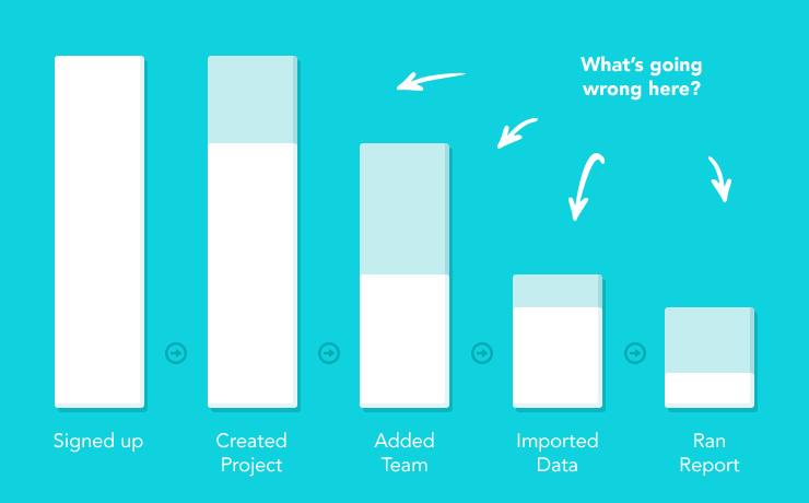
Conversion rates and usage patterns will cause you many a sleepless night. Your team deploys a new feature or flow, posts the announcement, then sits back and waits for glory. Instead, you get nothing.
The question you immediately ask is “Why aren’t people using it?”, but that’s not the right question. “How can I find out all the reasons why people are using it and prioritise them?” is verbose, but a more useful question.
5 Whys Can Help & Hurt

Sakichi Toyoda created the 5 Whystechnique to stop people solving symptoms and instead tackle root causes. When presented with a problem, you simply ask ‘Why’ 5 times, and then solve the root problem. Apply this correctly and you ensure the problem won’t return.
Jared Spool points out danger of assuming you know the answer to ‘Why’ without verifying. The diagram above sure looks neat and tidy, but it carries massive assumptions. In reality it’s more like this:

There are lots of potential answers to each why, and as you repeat the question, you extrapolate. There are hundreds of paths through the application of 5 Whys, and using recent anecdotes to make on-the-spot calls is a lousy way to make product decisions.
Research Informs Improvements

When your users aren’t doing something—whether it’s checking out, using a feature, or inviting a friend—it pays to understand the root cause. Ask them.

A/B tests help you tweak your way to a local maxima, but leave you without real understanding. Change a button from green to red, and you will see a minute difference in throughput… but that difference is rooted in aesthetics, not in a user’s desire, motivation, or understanding of the benefit.
Rank The Problems

Understand and quantify the root cause. This prioritises your problems. This lets you define projects in terms of user experience e.g. “A new sign-up should be able to successfully generate a report without contacting support” (which you can run user tests for), and metrics “Number of support requests per report generated should decrease” (which you can monitor).
If the problems are mostly with user motivation, you’re better off killing the feature, and then studying why it ever got built. Chances are you’re bad at saying no. If they’re mostly interface related, then you should consider a new design (rather than pivoting from a broken one).
If your design does nothing but confuse customers, it’s because you didn’t get user feedback before you shipped. Why did that happen? How can you solve that? Consistently asking why helps companies understand, and solve, high level problems when they’re still small. As a start-up you want to grow everything, except your problems. Problems don’t scale well.
