It is becoming increasingly apparent product design for apps and the web may have a lot more in common with animation than with print, and designers will need to adapt their skills and tools.
This article discusses designing for change, the third of three key trends in product design that I discussed during a keynote I gave earlier this year at FOWD. Here are the other two: designing systems rather than destinations, designing for personalisation.
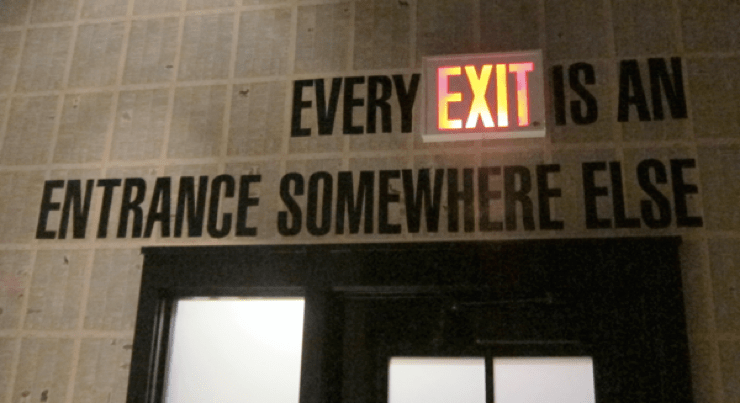
The photo above is from the Ace Hotel in New York and embodies a very important idea. No experience is static, everyone comes to something from somewhere, and goes somewhere else afterwards. This is critically important for people building products. The Internet is a medium where change is a primary attribute. Things scroll, move, transition, animate in and out, adapt. States change, and people move around, just as they do in physical spaces. Designers for the medium of the Internet are dealing with change, and with time, and it’s clear that not enough designers are thinking about the implications of that.
The Social Life of Small Urban Spaces is a fascinating study by William Whyte of how people congregate in the plaza outside the Seagram Building in New York City. Whyte was trying to learn why some public squares are full of people all the time, why some are full of people only sometimes, and why some are always empty. Why is it that people want to spend time in some of these places, but not all of them?
The sign of a great building or public space is often how it responds to people moving through it. Buildings are for people, and the greatest architects think about how the building adapts to changes as people pass through it in different ways. For example Grand Central Station in New York, seamlessly dealing with constant incomprehensible change; three quarters of a million people pass through on a typical day, over a million during busy periods.

Town squares like the one below are commonplace all over Europe.

This one isn’t particularly beautiful or novel, but the experience of this square is incredible. One of the main reasons that experience is so wonderful is because of how you approach and enter the square. You come from here.

You walk down a narrow street and the square opens up in front of you. It’s a really beautiful transition which makes the space feel incredible. A beautifully designed transition creates that experience.
Web and product designers have a lot to learn from architecture and urban planning. There are direct implications for the work we do, building on the Internet, working with screens. How do people move through what we design? How do we design the transition between states? Between places?
One common factor here is designing with time, and one of the biggest problems in our industry is that we predominantly use tools that can’t deal with time.

Marshall McLuhan taught us that when we create tools, the tool itself in turn changes what we do. Different tools for the same job can lead to very different outcomes. This is where we are at with the tools we use most commonly for our craft. Our tools shape us. Photoshop is still widespread but it is a tool for dealing with static images. It doesn’t deal with movement, or time. It is a very bad tool for designing and managing change.
Take a wander across the websites and apps you use and you’ll see this. For example, the BBC website just looks to me like it was designed in Photoshop. You can almost see the grid overlaid, the layers, Photoshop chrome and toolbars.

As a design profession, we can do better. We have this incredible invention before us, and we’re not doing it justice. Thankfully things are changing, and we’re seeing new tools emerge like Origami and Framer, that deal with time. But designers launch head first into these tools, acquiring the skill without thinking about the broader context. How many people learning Origami are also reading about what makes a great transitional experience, learning from the great works in architecture and urban planning?
I feel very lucky to have my job, at this time. We are literally inventing and building the future. The internet is so young, and we are just starting to figure this out. This is still the very beginning.
This post and the previous two articles in the series, Creating systems not destinations and Personalization and the new product canvas, were based on a keynote I gave earlier this year at FOWD.
