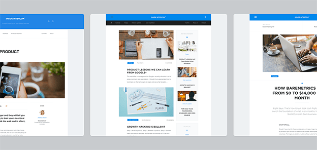
Earlier this year we began investing in our blog, by hiring a full time editor and deliberately increasing our publishing frequency. Today marks another step with the launch of a brand new design for Inside Intercom.
We’re proud to have increased the frequency of publication without dropping the standard. Every company is a media company these days but there’s risks associated with scaling content:
- Content calendars can force you to drop your standards, as they assume quality can be scheduled. It can’t. You can’t simply calendar “have a moment of clarity and insight – 5 mins” that leads to you writing about the end of apps (as we know them)
- Focusing too much on content production can mean you’re no longer doing the work that gives you the insights you need to write useful posts. To compensate for this company blogs end up focusing on reactions to daily news events, or writing bland “all theory, no practice” type articles with a bunch of truisms thrown in.
- Your blog design, which worked great for a post a week, no longer works either for the frequency of publication, or for the volume of content you’ve amassed.
It was the third one that bit us. We’re about to cross 200 articles on this blog (this is 199), yet until today the only way they were browsable was in reverse chronological order. If you really enjoyed one post, it was hard to find others like it. Hence the redesign.
Here’s some of the main things we’ve changed:
- Categories – the main topics we cover are now in the primary nav and there’s an index page for each of them – Business, Customer Success, Design, Engineering, Product Strategy and Intercom Updates.
- Tags – these allow us to expose more of the depth of what we cover – want to see everything we’ve written about jobs-to-be-done? No problem.
- Author pages – designers should read everything that Paul Adams writes, and now you can.
- Search – If none of the above help, we’ve finally added a search tool.
- Mobile – we’re a day late here, but not a dollar short. The design is fully responsive and looks great on mobile.
Credit for the design goes to Frantisek Kusovsky (some earlier iterations provide the image at the top of this post) and a special thanks to Jeff Kriege for design input, and David Barrett and Daniel Husar for turning that design into a reality. Here’s to the next 200.
