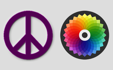
A beautiful product that solves a problem no one has will fail. An ugly product that solves a real problem well can succeed.
There has been a fantastic response to the post on the Dribbblisation of Design, many people agreeing with the premise and adding to it, some disagreeing and offering counter points. I want to respond to people’s commentary, explain the original motivation for the post which wasn’t about Dribbble specifically, and talk about how we hire designers.
There is a vicious cycle of misunderstanding design
For years the importance of great design in software development was underestimated and misunderstood. Designers the world over lamented that their colleagues in Product Management and Engineering were asking them for a visual treatment of something already defined. They mockingly referred to themselves as “Photoshop monkeys”. Designers in the “Photoshop monkey” role were always looking out for a new team, a new job. They knew this wasn’t what design was about.
Many people worked tirelessly for years to change this misunderstanding, to explain that design was not about how something looks, but how it works. Steve Jobs said it best:
Most people make the mistake of thinking design is what it looks like. People think it’s this veneer — that the designers are handed this box and told, ‘Make it look good!’ That’s not what we think design is. It’s not just what it looks like and feels like. Design is how it works.
Slowly but surely, software companies realised that design led companies were outperforming competitors, Apple being the most obvious and most profitable example.
This increase in understanding the power of great design has led to more and more design jobs, and more and more companies knowing they need great design to compete. However, these same companies don’t really understand what they need, it’s a new discipline to them, and so go to places like Dribbble to find “good designers”. But Dribbble isn’t representative of what design really is. And therein lies the vicious cycle:
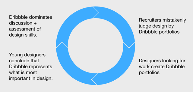
The aggregate results of this vicious cycle moves our craft backwards because it perpetuates a misunderstanding of design, the myth that design is primarily about aesthetics. So visual designers are hired by these recruiters, expecting them to be great product designers, setting everyone up to fail.
Visual design doesn’t exist in a vacuum
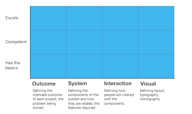
In the first post, I walked through four layers of design:
-
- The intended outcome of the design work.
- The design of the required components.
- The detailed interactions.
- The visual layer.
I believe that none of these layers exist independently. The best designers understand all four layers, and that the best visual designers understand how to design fantastic interactions. In my experience the best designers I have worked with were brilliant at one or two of these layers, and very, very good at the others. With the ability to design on different layers, the sum is far greater than the individual parts.
Evaluate designers against the layers that you need
When I hire designers, I’m typically looking for people who excel at two of these layers, with a huge appetite and passion for learning about the other layers. Most recently this was the profile of designer I was looking for:
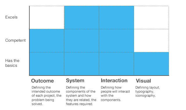
At a minimum visual designers should look something like this:
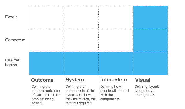
Before saying ‘We need a designer!’, think about what kind of designer you need. For start-ups, a very product design oriented CEO will need something different than a finance/analystics oriented CEO. And by the way, before concluding that you need everything :) know that this person is incredibly rare:
You can’t separate visual design from interaction design
Visual design is intertwined with the design of the interactions. Loops, state changes, changes in data. This is not print design. How something looks should be serving how it works. If you’re a visual designer who wants to better understand the interaction layer, I highly recommend Dan Saffer’s book Microinteractions.
Some commenters put forward that visual design is the primary thing that draws people in and is therefore the most important layer. This is not how I think about it. Visual design is certainly incredibly important, but people are also drawn to something with a promise of value – what the product is, what value it could deliver – in other words the work of the higher level design layers. Time and again we have witnessed ugly looking products succeed (for example, Craigslist), and beautiful looking products fail (for example Color). Things that look good may draw people in, but those people won’t stick around when things are poorly designed beyond the visual layer. All the layers are critically important.
Dribbble isn’t what people say it is, it’s what people use it for
Finally let’s talk about Dribbble specifically. The first post wasn’t an attack on Dribbble as a product (and I would love Dan and his team to offer their opinion on what they are building), it was the broader themes that mattered. It is the vicious cycle of misunderstanding design that needs to be broken.
Regarding the reaction from people supporting Dribbble, the main point for me is that Dribbble isn’t what people say it is, it’s what people use it for. As anyone who builds a platform for expression knows, you cannot predict how people will use it. The platform then reacts, adapts, evolves. People say Dribbble is “a showcase site”, “a show and tell”, “a Twitter for designers”, “a place to design things so you don’t have to worry about real world constraints”. None of these explanations make much sense to me. If it is about showing ongoing work and brevity, then I’d expect to see a lot more rough work, sketches, half baked things. Yet most things on Dribbble are pixel perfect executions. If it is about visual inspiration, then that’s great but that’s more art than design, and certainly not a primary place to find great designers. Great art workers, great graphic artists, certainly. But not designers.
The best reasoning I saw was that Dribbble was like an advert, as a way to drive recruiters to your website – which shows your thinking, your sketches, your process.
Being popular on Dribbble doesn’t make you a great designer
There is certainly some fantastic designers on Dribbble, and examples of work on Dribbble that focuses on non visual design layers, (thanks for the examples DC Townson and Alex). But they are the exception. In most cases, a popular Dribbble portfolio is simply evidence that you are expert with graphics software, that you understand current visual design trends, and in some cases that you are good at one of the four layers of design. But there is no causality between Dribbble popularity and shipping great design work.
All that matters here is that we break the cycle
I don’t care so much about Dribbble, or any one portfolio site. I care most about breaking the cycle. I worry that young designers don’t get exposure to the true power of great design. I care that these same young designers aren’t hired into a job that is set up for them to fail, that they don’t unknowingly design products no-one wants, or interactions no-one understands. I care that the companies who invest in design don’t fail because they misunderstood what they needed. This is about design education, and above all else, the idea that design is fundamentally about how something works, not how it looks.
