Before joining Google Ventures, Braden led design for several Google products, including Gmail, Google Apps for Business, Google Spreadsheets, and Google Trends. He brings a unique perspective to his design work having started his career as an engineer – he previously built virtual reality simulators at the Beckman Institute, and interactive visualizations at Lucent Technologies.
I visited Braden recently at Google Ventures, Google’s independent investment arm, which has backed more than 300 companies including Uber, Nest, Slack, Foundation Medicine, Flatiron Health, and One Medical Group. The conversation covered GV’s work with startups, the process of design sprints, sketching and prototyping, and the future of product design. You can listen to it in full below.
If you like what you hear, check out more episodes. You can subscribe on iTunes, Stitcher, or over at Soundcloud, or grab the RSS feed, if you’d like to automatically receive new episodes which will feature interviews with our favourite thinkers and do-ers from the startup world.
If you’d rather not listen to a podcast, a lightly edited version of the conversation follows below.
Des: For the sake for our listeners, could you briefly introduce yourself?
Braden: Sure. I’m a design partner at Google Ventures so my job is basically to help startups build better products.
Google Ventures invests in startups all around the ecosystem. We’ve invested in almost 300 companies here in the US. We’ve opened a European fund, and we have over $2 billion under management. There’s five designers on our design team here and 300 startups to help, so we’re pretty busy.
Des: So you’re just a casual in-house designer for 60 companies, is that it?
Braden: Well, we realized pretty early on that we weren’t going to be able to do all the design work for our portfolio. At the beginning there there was maybe five companies and that felt pretty easy. I could just go to a company for a month and help them out a bit and then go to the next company for a month, but then it scaled beyond that. Now we try to help in all sorts of ways, but mostly it’s about figuring out how to help the company be good at design or help them understand what design is.
Design At Startups
Des: Are venture capital firms hiring designers, is that a thing these days?
Braden: It seems to be kind of a trend. I got into it about five years ago, and since then there’s been this run of venture capital funds hiring designers. Irene Au is at Khosla [Ventures], John Maeda is at Kleiner Perkins and there’s a couple of other firms that have hired full-time designers.
Des: Is this an acknowledgment by VC firms that design has massive multiplicative value for companies?
Braden: I think so. Originally when I started in this, founders knew design was important, but they weren’t quite sure how to get it. Actually, I think five years ago, they heard design was important but they didn’t quite believe it. Now fast forward to today they really believe it, and they need it, and it’s a serious thing that they need to figure out. But they’re still a little bit in the dark if they’ve never worked with design, particularly at the core of their business, like figuring out what the product is.
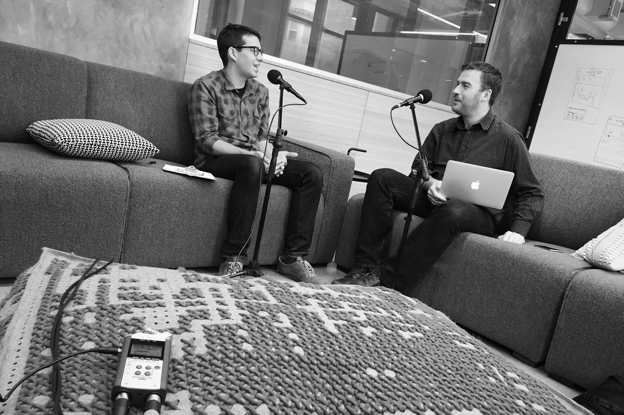
Des (right) and Braden recording at Google Ventures
Des: You didn’t start in a design role at Google Venture. I presume you were in Google beforehand, is that right?
Braden: Yes, I’ll be at Google for 10 years now in September. I remember back when there was only a couple of designers. We all sat in one place.
Des: Wow, that’s cool. Back then, did you work on any products people would know or use?
Braden: Yeah, I started on Gmail chat. One of my first projects was designing those little emoticons that turn sideways. I think that’s all they trusted with me at first.
Des: Are any of those still live today?
Braden: I don’t think so, which is kind of a shame. I liked how they came in just like your normal type, and then they turned so it was a sort of surprise that it was going to be an emoticon, or emoji I guess we call them today.
I also worked on Google Enterprise, which at the time was just called Gmail for your Domain but we figured out how to package and sell a lot of the products that were part of Google Apps. I also worked on Google Docs and Gmail for a long time. Google Trends was my 20% time project, which is fun as well.
Des: What does your day-to-day look like?
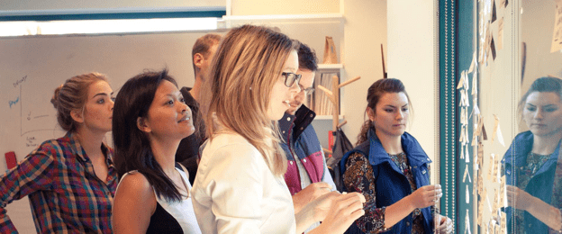
Braden: It changes a lot from day-to-day, but let’s see. Mondays are usually office hours, so I meet with tons of companies, and we talk about everything from their design process to what their hiring needs might be, to doing a design critique for them right then and there, or pretty much any kind of question or stress or challenge that they’re having.
Des: These would be current companies that Google Ventures has backed, right?
Braden: Yes. We do a lot of help with hiring for companies, so if you’re a CEO, and you need to go and hire a designer, you probably haven’t interviewed a lot of designers. Our team actually has interviewed a lot of designers, so we can help you get a read on someone’s skillset and figure out whether it’s a match for your company. Then we also do a lot of events for the designers in our portfolio. There’s many designers working at these startups, but often it can feel a little bit lonely if you’re the only designer at a startup, and it can be pretty helpful to come in and talk to other people.
We’ll run design critiques for groups of people. We’ll do events where we talk about everything from how to use InVision to design hiring and things like that. Then sometimes we’ll do a deep dive with the team, so we’ll spend a week with a company, and that’s called a design sprint.
The Design Sprint
Des: Design sprints are something Google Ventures has published a lot about. I believe you have a book coming out on it. What’s a design sprint?
Braden: It’s a bunch of things. In one way, it’s a way to get through a lot of the core parts of the design process in just five days. The first day is understanding everything about your customer the best you can. The second day is sketching a lot of ideas. The third day is deciding which ideas you actually want to test and put them into a storyboard form. The fourth day is prototyping. The last day, Friday, is testing with customers. That’s all just good design process, and we cram it into a week for a couple of reasons. One, it’s a nice package that you can go in and work with the team for that amount of time. But also, it gives a team a chance to see the whole design process in one go, and see how useful it can be and then decide like, “Wow, if that was useful, can we put parts of that into our day-to-day practice?”
Des: Is it only designers involved or is everyone from a company involved?
Braden: We usually pull in about four to six people from the company and then a couple of our designers. We try to fill any skill gaps. So if a startup doesn’t have anyone to do front-end engineering, we can help with a little prototyping. If they don’t have any designers to do visual design, we can help with that. If no one can copy write really well, we can help there too.
Des: Would it be typical one of your companies might have four to six persons? Smallish start-ups, for the most part?
Braden: It’s over the whole map, actually. Sometimes we work with really big companies that are just about to IPO and sometimes we work with literally two people in their basement.
Des: I presume people who are IPO-ing, they have a chunk of ideas of how to do this stuff already, but in the case of two people in their basement, would they come to you with an idea, or do they come to you with their existing product and ask for help to improve it?
Braden: Usually, founders come with an idea already. That’s a big change from where designers normally want to get involved. Designers want to go out and do a bunch of ethnographic research and come back and tell you what the need is. Usually founders come with a need. They’re like, “We believe this is true. Come and help us.” The typical design process doesn’t work well here, where you’d hear someone say, “This is my plan. I’m going to make a button to order pizza.” You’re like, “Okay, interesting. I’ll go talk to a lot of people.” You come back and it turns out that they don’t want the button to order pizza, right? That’s not going to work well because founders are great at being headstrong and pushing forward when a lot of people say no, so what you have to do instead is listen to that and take that energy on.
Say, “okay, got it. Button for ordering pizza. Let’s try that.” Embrace it. Try to build it. Maybe sneak in some of your ideas as well, and very quickly help that entrepreneur get feedback from real customers.
I’m pretty humble because there’s so many times where I’ve thought, “that’s a crazy idea, but hey, let’s test it because there’s no stopping you,” so we test it. Then sometimes it actually works. Sometimes it doesn’t work. We’ve gotten another idea in there, and then it’s easier to sit with someone and say, “Oh, well, we tried this, and it didn’t work. What are we going to do next?”. Versus “I learned that your idea is bad”, which is a very different way of framing it.
Des: Do you qualify the ideas at all? If someone comes to you and it’s something ridiculous like a button for ordering a cat. But when someone comes to you with a pretty headstrong idea on something that you think is probably not a great idea, do you try to redirect or do you just say, “We’re on board. We’ll see what we can do.”?
Braden: First of all, luckily, I get to work with companies that have really good ideas for the most part. In cases where it’s hard for me to think about how I would give feedback, I just assume for a moment I’m on that team. Let’s assume that I started this six months ago. I’m a co-founder. What would I do in this case? It’s very rarely, stop. It’s usually, well, I’m really worried about this risk and this risk and this risk. If that’s the case, what could we go and do to measure that?
Learning By Building
Des: What’s the actual output of a design sprint?
Braden: The biggest output is learning on a bunch of dimensions. The first is that you’ve learned about the customers up-front. You’ve built a bunch of stuff, and you’ve learned by building, which is a key part of design. You’ve put that design work in front of customers, and you’ve learned which ideas work and which ideas don’t work. You’ve gotten the chance to go through a complete design process and you can learn what that process will do for the rest of your business.
Des: If you had your own start-up would you have them work in design sprints?
Braden: Yeah, I think that design sprints work for all sorts of things. It’s remarkable to me since we’ve written these articles online that we’ve seen all sorts of teams, start-ups, and design agencies run their own design sprints from the small amount of instructions we’ve put out there. My view is that there’s not one way to do a design process. It’s like cooking in a kitchen. There’s a thousand different ways to make a cake. What we’re publishing is one way to make a cake that we think is pretty tasty cake. If you’ve never cooked before, it’d be a good recipe to try, but I enjoy the fact that we’re all trying to figure out the best way to work as product designers. I think these methodologies will be much more fit and mature within the next five years. Think back ten years, and how design fit with business, and it was pure chaos.
Now there’s starting to be interesting and more common ways where design, engineering, and product all fit together and learn how to work. I assume in the next decade it’ll look a lot more like engineering. It’s like, “oh, yeah, I know Agile. I know this methodology.” A bunch of people can come together and work together and have expectations about who does what and how it all fits together.
Too Pretty Sketches
Des: What is the relationship of a design sprint with engineering?
Braden: Usually we have an engineer in the room from the beginning. It’s important to understand what’s easy, what’s hard, what’s impossible, or what’s even possible, to begin with.
Des: Is that their contribution, or would you also have them sketch and ideate and stuff?
Braden: Yeah, we make everyone in the sprint draw pictures and sketch and do all that stuff.
Des: Does that get awkward?
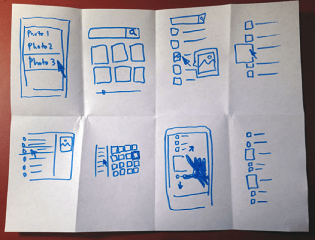
Braden: Usually on the second day you get this fear in people’s eyes when we say, “Okay, we’ve done all the unpacking. We kind of understand what the biggest challenges are. Today, we’re going to sketch.” I get that, because my background is engineering and I came to design through the idea of building things for people. I was never good at drawing, but then the goal is to get ideas from people and to take away all the other barriers. We do a lot of things to help that. We point out that when you’re drawing sketches for UIs, it’s mostly boxes and writing copy. It’s not that hard. Second, we give people Post-it notes to sketch on. We have them draw three separate Post-it notes. That helps for a number of reasons because if you mess up one Post-it note, you can crinkle it up and throw it away without having to screw up your whole drawing.
More importantly, I think it makes you think about like a little comic strip. This happens, and then this happens, and then this happens. It’s like a little vignette or a little story.
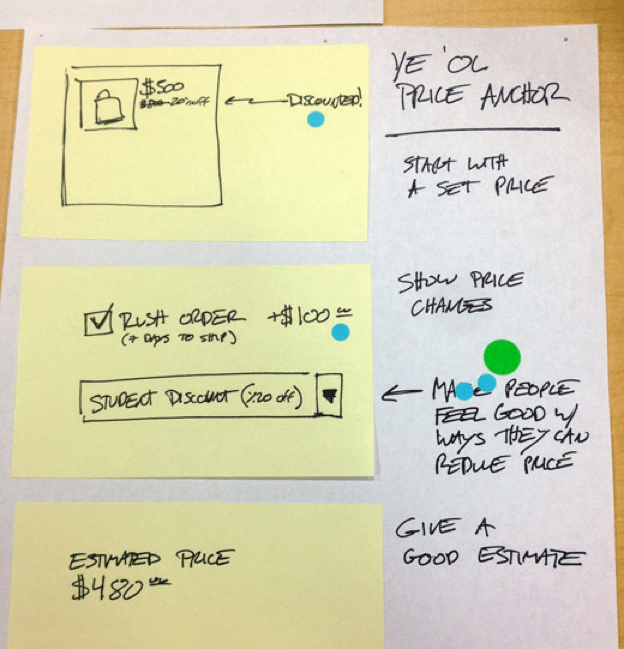
That focuses you so much more on the value you’re delivering to people and the interaction with people, which is the important part of the idea, than the structure or the icons or the layout. That’s less important. Someone with good UI design skills can go and put that all together, but that core idea needs to be good. That story format focuses everyone on the idea.
Des: It’s also interesting how somewhat attractive or pretty sketches can actually mask a pretty bad idea.
Braden: Early on, because I had gotten a little bit better at UI sketching, I had a 20% gray marker, I had a little highlighter, and I would start sketching stuff to make my ideas look better. Jake, (design partner at Google Ventures), was like, “You need to cut that out, because your ideas are looking better and some of these other ideas are actually better, but they don’t look as good. We want to keep things even.” That’s true.
What To Prototype
Des: I think it was Bill Buxton who once said “your idea should never look any more complete than it is in your head”. So the very second I find myself filling in boxes and shading things, I ask myself “what are you actually doing here?” It’s interesting.
In terms of these sketches, that helps get the ideas on paper, but what’s the shift from there to prototyping?
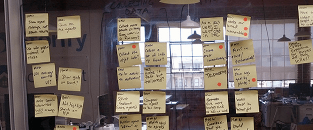
Braden: We’ll usually do the first day figuring out what the challenges are. The second day we’ll sketch a lot of these tiny storyboards with just three different frames. Then the third day, this kind of decide day, is all about how do we take those individual sketches, and put them into a storyboard that we can use as a blueprint for building the prototype. That third day is really around stitching everything together. It’s hard for a number of reasons. You have to probably throw out some ideas and tell people, “your idea’s good, but we’re just not going to use it this week”. The way that we do that is through this voting procedure that we use a lot in a sprint. We give out these little sticky dots and have everyone go around and vote on the parts of the sketch that they like. At first they have unlimited votes, so it’s more of a heat map. Then we do a critique. What that allows us to do is skip over the sketches that almost didn’t get any votes. We can narrow in on the parts of the sketch that people really liked and talk about them.
Des: I’m sure someone could listen to that and say it sounds an awful lot like design by committee.
Braden: Well, then the next step that we do is this thing called super votes, where we give everyone two stickers, and we say, “Okay, now if we only prototyped two things, what would they be?” We usually take the decider, and it might be the CEO, it might be the product manager. In some cases, we’ve had teams where the CEO said, “No, the customer support person knows the most about this problem. They get the super vote.” Then everyone has to put their currency on the ideas they think are best going to solve the problem we’re working on.
That rarely comes out to be design by committee. Usually ideas lump up in this way that is important. Sometimes you’ll get this chance where it’s like, “Wow, the team is over here, and the decider is over here. What’re we going to do?” In those cases, we can actually build two prototypes. We’ll take the wisdom of the crowd and do that, and we’ll take the founder’s intuition, and we’ll do that. We’ll put these prototypes next to each other and have customers sort of shop between them. Maybe you’ll put some competitors in, you’ll put these two prototypes in and say, “How are these different? Who are these built for?” If they say, “Oh, this one’s built for me”, then you get it.
Des: It sounds like the decide day is almost like a crash course in product management in that you’re picking what way you’re actually going to solve the problem, right? Is there a suitable size product or project for a design sprint? I could think of some products which would be too complex to try and tackle the entire domain in one sprint. In those cases, do you just hone in on a specific workflow and does that bake in assumptions about the rest of the system?
Braden: We usually, on the first day, draw out a customer journey. We draw some customer types on the left side of the board, and then from those types, we’ll draw “what does this person do next? What do they do next? What do they do next?” At a very, very high level, we get a sense of the important flows and pathways in the product. Then we talk about everything we know about the customer. We pull out some challenges and do that same voting exercise on them. Then we’ll take the biggest challenges we’ve identified, and we put them on the journey. That helps us of scope it and say, “Well, it looks like some of the biggest risks and the biggest challenges are in this section of the journey. Let’s sketch there.” That’s usually where most of the sketching and the prototyping happens, but then when we show it to customers, we usually have to fake a little bit more of it to get them into context.
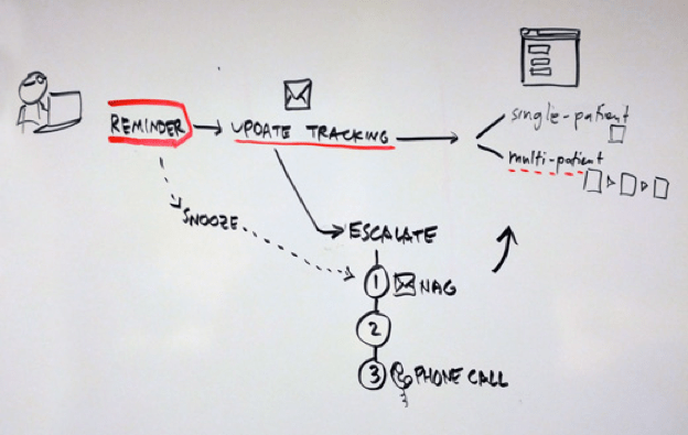
You can’t just show up with a picture of your thing and say, “what do you think of the screen?” You have to help people imagine what it’s like to use it. Then we’ll usually go back and either take screen shots out of the current product or very quickly put something together for the early screens. But what we’re really doing is leading customers through to that moment that we hope works well.
How Real Is Your Prototype?
Des: When you talk about the final deliverable there and trying to present it in some real context for users, I’ve seen variations of prototypes which are purely paper all the way through to interactive wireframes, and then almost fully-interactive HTML/CSS prototypes. Do you have a preference or do you like to let it be decided by type of project?
Braden: I think of it as you’re making your product more real. Hopefully every time you do, you learn a little bit from it. I think there is a line on a graph of how real is it and how much are we learning. There’s some methods that fall a little low below that line. We were talking about sketching. I think that’s great. You can get your ideas out fast. It’s very democratic. Everyone on the team can do it. Paper prototyping, I feel it takes a lot of time to actually stitch together, and it isn’t any better than actually just doing a rough kind of mock-up of it. One of our sweet spots is mid-fidelity. It’s not low-fidelity like paper prototyping. It’s not wireframes. It’s real enough that customers probably think it’s real, but it’s not beautiful, so designers are usually very embarrassed by it.
They’re like, “oh, if I just had one more day, I could make this look good”. We don’t have one more day, because we’re going to show it to customers. It turns out it doesn’t matter. All of the things that we really worry about as designers, are things like is that stroke on that icon exactly right? When all that stuff is there it will add to the delight for customers, but usually the stuff that you need to figure out at a startup is “are we even building the right thing?”
If you’re trying to answer that question, you don’t need to worry about the stroke on the icon. This is one of the things I love about the sprint is that it forces you to move very, very fast, and it feels so uncomfortable both to make those decisions we talked about on Wednesday like, “Oh, we got to throw out ideas, and we don’t have any data,” or as a designer, prototyping on Thursday, where you’re like, “Oh, if I had just a little bit more time, I could make this good.” It turns out that if the purpose of the whole thing is learning, you don’t have the data really to make the right decisions, you’re really going in the dark. What I like about that tight timeframe is that it pushes you through the stuff that you don’t know about and gets you very quickly to learning.
Des: The key attributes you mentioned – fast to create, interactive, and reasonably real to users – it seems to me would almost instantly relegate fancy paper prototypes, fancy interactive wireframes, all that sort of stuff. Do you see there is a purpose still for those?
Braden: Yeah, I think there’s absolutely a purpose for those other kinds of prototypes. There’s this mid-fi prototype that we like, an InVision or Flinto type, where you wire up a couple of screens. You can build it really fast. The visuals shouldn’t be too good.
The next level of stuff I really like is when you can get real data in the product. It’s something I learned on Gmail. We would design these things, and everyone was like, “that’s great.” Then at the time, the engineers had this this really cool JSON interface we could grab internally, so we could put our own email in there. You could very quickly build a prototype with our ideas. Once you saw your own mail in your design, it was like, “Whoa, that’s horrible. No way.” It was amazing to me how it changed from something you loved to something you hated just by seeing your own data in there.
That’s been true over and over as we’ve done other things. If people don’t like it in mock-up form, they’re probably not going to like it with real data. But even if they do like it in mock-up form, when you put their real data in, it can change a lot of things. It can point out core data problems. In some cases, we’ve found like, “Oh, we don’t even have the right data here. Now we have to go solve that issue.” So, I like real data prototypes.
Then the last set of tests that I think are really helpful is right before you launch. You think it’s great. You’ve tested it a bunch, but there’s all sorts of little bugs that you’ll find typically when you show it customers. It’s much easier to fix those the week before launch than the week after launch.
The Power of User Research
Des: User research is something I know you are passionate about. Do you think startups respect it enough or do it enough?
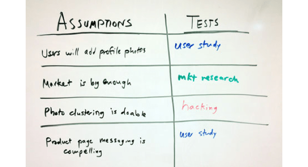
Braden: I don’t think they do it enough. In some ways the easiest thing we do for startups is help them see what their customers are doing with their product. I’ll give you an example. I was talking to a founder the other day. He had a rough prototype together. He said, “I can’t wait to get this out and launch so we can get feedback from our customers.” I said, “what if we could get you feedback from your customers before you launch?” He said, “that would be great. How do I do that?” I said, “Well, there’s this thing called user research.” Actually, you can get a lot of good feedback and answer a good segment of your questions without actually having to launch, which means you’re not solidifying your product. You can still stay very flexible.
It won’t answer things for certain, like you won’t know exactly how many people will click or buy or do whatever. But if your target customer doesn’t like your idea in an interview, chances are they also won’t like it on their own.
Des: Take the push a button to order a holiday or order a pizza-type product, how would you go about researching for that?
Braden: I think there’s lots of reasons why people don’t do customer research. We’ve heard “get out of the building” a lot, right? Just get out of the building and talk to your customers. That’s usually where the conversation stops. What I’ve found is that a lot of teams, when they go out and talk to customers, it feels more randomized. “I talked to ten people. They all told me different stuff, and I kind of fuzzily remember what some people said, and this one story sticks in my mind.” That’s not very helpful. What you’re really trying to do with customer research, when you’re trying to evaluate whether this idea is good or not, is to see patterns.
If you talk to a random set of people and ask them all different questions and don’t have any real method to figure out and think through what you heard, it’s going to just feel more randomized. Those are the three things that we try to control. First, we try to think about who your target customer is, and how can we get many of them that are very similar to each other, like right in your target demographic, or psychographic, or whatever. The second is, how do you put together an interview script so you ask the right type of questions, questions that will answer what you’re trying to figure out but also ones that people can answer truthfully and honestly, and give you good data from. Third, how you listen to all those interviews and make sense of them and help the team understand all the stuff that was heard, pull out the patterns and create actions from that.
Usage Trumps Research
Des: After you launch is the first time you can see things like usage behavior, metrics. Do you take that alongside the research you did before or does it trump it?
Braden: At some level, it trumps it, right, because if everything looked good in research, and then you launched it, and no one uses it, what are the chances it’s actually good? Reality is here. It’s not working. I think it’s always a balance. A/B testing, optimization and behavioral metrics in general tell you what your current customers are doing with the product, but it doesn’t tell you why they’re doing it. Stuff isn’t working; you often don’t know how to fix it. More importantly I think for startups is after you’ve launched, and you’re rolling along, things are kind of okay, part of what you want to do usually is grow your customer base. Looking at your behavioral metrics, it only shows you what your current customers are doing with the product, not what the customers you don’t have want from your product.
If someone heard about your product at a cocktail party, and is like, “yeah, that doesn’t sound like it’s for me,” or they went to your website and loaded it once and was like, “yeah, this doesn’t seem like it’s for me. Close.” Those are the people you really want to figure out why do they not think this product is for them. No amount of number crunching or looking at the logs is going to teach you that stuff. It’s only by going to talk to people.
Getting Better At Hiring Designers
Des: You spoke earlier about how CEOs of startups have probably never hired a designer. You’ve probably interviewed thousands, maybe hundreds at least.
Braden: I think in the hundreds.
Des: Do you try to teach them how to do it, or do you just step in and get them started with the first couple of hires?
Braden: We do both. The first thing we try to help them understand is that design is a board discipline. There’s fashion designers and automotive designers and industrial designers, and that’s just in the big scale. Even within product designers, there are people that are better at interaction design, or visual design, or all these little tinier skills, these more granular skills, so what we do with them is take an audit. What are all the design skills that might be appropriate? Which ones does your company really need? If you’re a company that needs to communicate trust, you might need visual design to create a brand and a feeling of trust in your product. If that isn’t as important, then you don’t need visual design as much.
Then you look at what skills do we currently have in our company. Then the delta between that, the difference, is the skills you should hire for. Once you have those tinier skills, then you can write your job description, and you can go and interview people on those skills.
Des: Are there interview skills or techniques you’ll teach, or how does one make a company better at interviewing for designers?
Braden: Well, we often do it with a company so they can see our style, but the biggest thing that I look for is when designers come in, and they bring in their work, is I ask them what problem they were trying to solve, what they did to solve it, and how they know it worked. It’s amazing how often designers can’t tell you about that full closed loop. When people can tell you that full closed loop, it feels really good because I’m sure they’ve been building instincts. “I tried this thing. This is my way I tried to solve it, and it didn’t work. I tried this other thing, and it did work.” Okay, great. Often, design is in a consultant-like relationship with people. My job as a designer is to make you happy. You tell me something that I should build, and when I build it that makes you happy, I’m done. I’m either like, I’m back at another client, or I feel good because my manager’s happy.
Des: One other difference between consultancy design and in-house product design is that there’s a long-term ownership that is inherent when you’re actually the product designer on Gmail or something. If you make a mistake, you’re going to know about it, and it’s on you to fix it. You don’t get to hand over your PDF and run out the door with your bag of cash.
Braden: There’s accountability, right? If you launch this thing, and then it doesn’t increase sign-ups or increase retention or whatever, it’s on you. The other way to look at it is you have to fix it now. You learn a lot in that fixing. I’ve been humbled so many times by stuff I thought would work, and we did research, and it didn’t work. Or, we did research, and it did work then we launched it, but it didn’t work. It’s so hard to build things for people.
Good Design Will Be Everyone’s Job
Des: Maybe lastly, we’ll just talk about the future of design. There is so much great product design, but a lot of it is funneled into beautiful consumer apps. Are there areas where you think we’re badly missing great product design? Do you still encounter these moments where it feels like you’re stepping back into the 90s?
Braden: I know this is not going to be a satisfying answer, but I think it’s hard to know when design is good or bad because good design is often invisible. I know that’s just a thing people say a lot, but it’s easy to point out where the visual design is good because we can all see it. We know that looks amazing.
There is this company that I worked with a couple of years ago that were doing coupons. Their site looked a little crazy. We said, “We can make this better.” We redesigned all the visual design. We did user studies, and we improved some of the usability problems with it. We put it back in front of customers, and they looked at this new, fancy visual design that looked really good, and they said, “Wait, who’s behind this thing? Are people making money off of me?” We realized that we screwed it up. We tried to make it beautiful for us, but in doing so, we broke the product.
All that being said, I think the place to work on design are the places where designers aren’t. What’s the hockey thing – skate to where the puck is going? I think that tends to be more in places where adoption is hard and where switching costs are high. So it might be business to business. It might be health. It might be areas like that.
Des: You started as an engineer, so you worked through designs. And now you sort of have a 10,000 foot view from your position. Where do you see the whole discipline going?
Braden: Like I said earlier, design will be better at all of our methodologies. Think back to the early days of engineering where you would go to an engineering team and say, “I’d like you to build this.” They’d say, “no problem. We’ll have it done in six months.” At six months, they’re like, “We’re halfway done, and it’s like totally buggy and horrible. It doesn’t work at all.”
Two years later, it finally ships, and it still has a lot of bugs in it. You’re like, “that was a bad time for engineering”. For the most part, engineers have figured that out. Like, you say, “hey, I need this thing built”. They’re like, “yep, it’ll probably take this long, and we’ve got this Agile methodology and all these other things to keep it us on track and to build it iteratively.” There’s a few exceptions – Twitter had it’s bumpy time there – but for the most part, engineers can build what needs to get built now. It’s remarkable. As a discipline, they’re very good at it.
When you look at product management, product design, there’s so many times where we say, “Oh, people will love this. We’re going to ship this. It’s going to be amazing.” And we’re wrong a lot. A fair amount of time, we’re wrong. That’s very similar to the way engineering was a while ago. I think that the things that changed in engineering in terms of the disciplines that they have and their methodologies and becoming more standardized, and finding stuff that works, I think that’ll happen for the rest of design.
Des: What does that look like? More structured process?
Braden: Well, back in the day of engineering, one of the big challenges was quality. People would write code, and there were lots of bugs. Then they introduced a quality team. They said, “these are people writing the code, and these are people writing the tests. You, the first group, you get bonuses when we ship on time, and the second group, you get bonuses when there’s no bugs.” Those people never really got along very well, and we didn’t have quality software. At some point, the software people said, “you know what, software quality is everyone’s job”. We can’t just put it off into this side team over there and make it their job. Today, you’ll see engineers writing tests, which is crazy compared to the viewpoint of a decade or two ago.
Fast-forward to today, right, we’ve got engineering teams that are kind of humming along, but we care about a different kind of quality. We care about product quality. Now we put a team over in the corner. We call it the design team. We say, “you’re in charge of making the product something people want to use being a high quality. Everyone else here is responsible for shipping on-time.” It’s the same exact thing again.
What I imagine will change about it is that we’ll again have to realize is that quality is everyone’s job. It’s not just the designer’s job. It’s not just the product designer’s job. It’s everyone’s job. What will shift, I think, will be that people will start to incorporate parts of design into their job in ways that otherwise they wouldn’t think was part of their job today. Just like engineers write unit tests today as part of their job, I think people will be spending more time doing things like design sprints or watching customer interviews or doing design critiques. Not everyone needs to know fonts and be good at Photoshop, but there are probably a couple of design activities that everyone will learn to do as part of their job.
Des: It’s an optimistic world. I hope we get there.
Braden: I do too. I think we will.
Des: Thank you so much for your time, Braden.
Braden: Thank you, Des.
Further reading:
- Google Ventures’ articles and resources on design sprints
- How We Design At Intercom
For more conversations on design, product management, marketing and other startup topics, check out all the episodes of the Inside Intercom Podcast here.