Customers will always surprise you with the creative ways they use your product. It’s not deliberate on their behalf though. They’re just adapting your product to their needs.
Peter Drucker is famous for saying, “The customer rarely buys what the company thinks it’s selling”. The implication of this quote is that to improve a product you must first understand what it is being used for.
Let’s explain with an example.
Not long after we launched Intercom, we added a map feature, so you could see where your customers were around the world. (Worth noting: We kept the feature live for 3 years but recently sunset it – it was popular for reasons I’ll describe below, but ultimately it was not a use case we were continuing to focus on for the product.)

It was a classic “this is pretty cool but we don’t know why” type feature. And we could see by its traffic, it became popular quickly. But marketing the map as a feature was difficult, because it was hard to work out why you’d use it.
- Work out where you had most customers? Nope, lots of products already do that.
- See who is in a given city? No, our user list does that much better.
- See how many users you have in a given country? No, our user list does that better too.
So what does it do, aside from look impressive? We looked at 3 ways it was used:
People like to show it off at trade shows & conferences (see the laptop)

People like to show it off on Twitter:

People like to show it off to investors:

So what does it do? It looks impressive. It makes our customers look impressive. That’s what it does.
Improvement based on usage
If we tried to improve the map before we knew how it was used, we’d try to make a better map. Here’s the types of things we would have focussed on:
- geographical accuracy
- clustering
- better country/city borders
- drag to create “regions”
- various other cartographical improvements
All of those “improvements” would have taken us weeks/months and would have resulted in a worse product. Because the customer wasn’t buying what we thought we were selling. It’s not a map. It’s a show piece.
What would make it better at that job?
- A map that’s designed to look good, first and foremost
- A map that hides sensitive data automatically, making it shareable
- A map that’s easy for customers to share
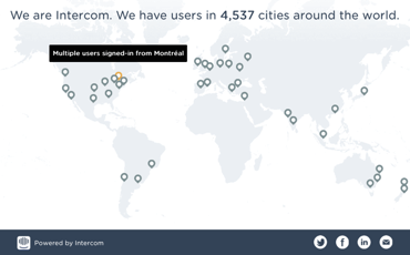
So that’s exactly what we created. We offered our customers the chance to publicise a beautiful animated map, and gave a unique shareable URL to them:

A worse “map” does a better job
When you focus purely on how a feature is used, ignoring the “category” it’s in, or “type of feature” it is, you quickly learn how to improve it, and those improvements resonate immediately…

Look here for even more customer reaction to the shareable map.
Credit to Hongyuan for design and Eoin and Patrick for developing the feature. If you’ve any feedback or thoughts on it they’d love to hear it.
Our fourth book, Intercom on Jobs-to-be-Done, is a collection of our best thoughts and ideas on the topic. The goal: help you understand what needs customers meet with your product, and how to ultimately improve upon that experience.

