Simply signing up users means nothing if you’re not helping them understand how they can actually achieve what you’ve promised. Even the strongest customer testimonials won’t prevent churn if people don’t understand how to use your product.
That’s why we built Product Tours to assist with the job of customer onboarding within your product, alongside our best-in-class in-app messaging and knowledge base products. Let’s dig into the best ways to build an effective onboarding flow, plus a few common issues to look out for.
But first, let’s start with a quick definition.
What is user onboarding?
User onboarding is the process of introducing new users to your product and helping them get the most out of it. It’s a pivotal experience that, if designed well, results in the user becoming an advocate for your brand and sticking around for the long haul. Done poorly, your hard-won user can quickly become a churn stat.
Here’s the proof. ProfitWell’s research of almost 500 software products shows that customers with a positive perception of their onboarding experience are far less likely to churn within the first 21 days of using a new product.
“Customers with a positive perception of their onboarding experience are far less likely to churn within the first 21 days of using a new product”
The same research also shows that users with a positive onboarding experience are up to 21% more likely to pay for a mobile app. Onboarding isn’t just good for your acquisition strategy — it’s also good for your wallet.
So what makes an onboarding experience positive?
You know your product has struck a chord when your users react with an “aha!” while using it. But there’s no one-size-fits-all path to that “aha” moment — the approach differs by product and for more complex products, by each user’s goals.
From our research looking at hundreds of onboarding flows, the best way to identify your product’s unique “aha” moments is to talk to your users and look for descriptions charged with “positive emotional energy” as they recall their first experiences with your product. Once you’ve pinpointed these moments of delight, you can build a ramp-up product experience around them.
Now, much has been written about the recommended UI patterns and components for onboarding flows, such as welcome messages, pre-filled empty states and of course, product tours. Just keep in mind that onboarding at its core is a learning process, so use education techniques to teach users and build their confidence, such as the following:
1. Start simple
Introduce concepts and vocabulary that might be new to your users and explain how they bring value to their business. For instance, in Intercom, we use videos to explain the high level steps users will be taking to get their Inbox set up and start chatting with their customers.
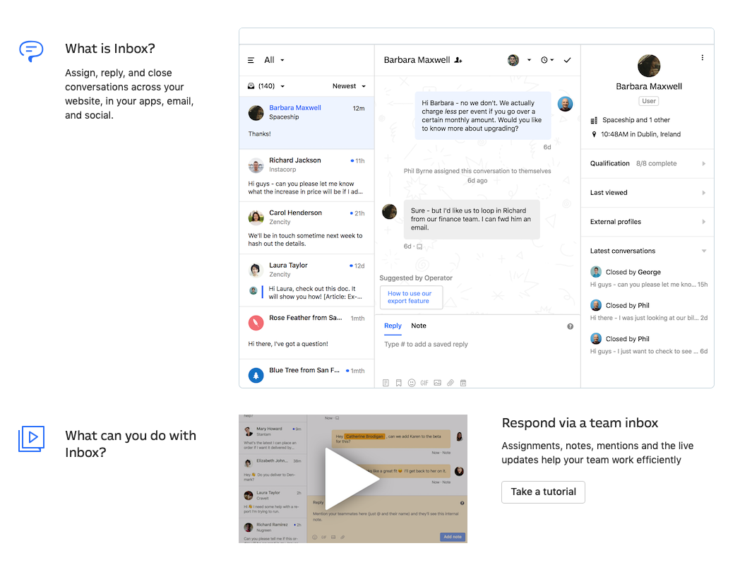
Onboarding guide for Intercom’s Inbox product
2. Show and tell
Get users to learn by doing by using interactive guides that prompt users to click key areas in your UI. Video is also a powerful medium especially for complex products that require a little more explanation. With Product Tours, you can create interactive guides in minutes as well as video tours that mimic the experience of a live demo.
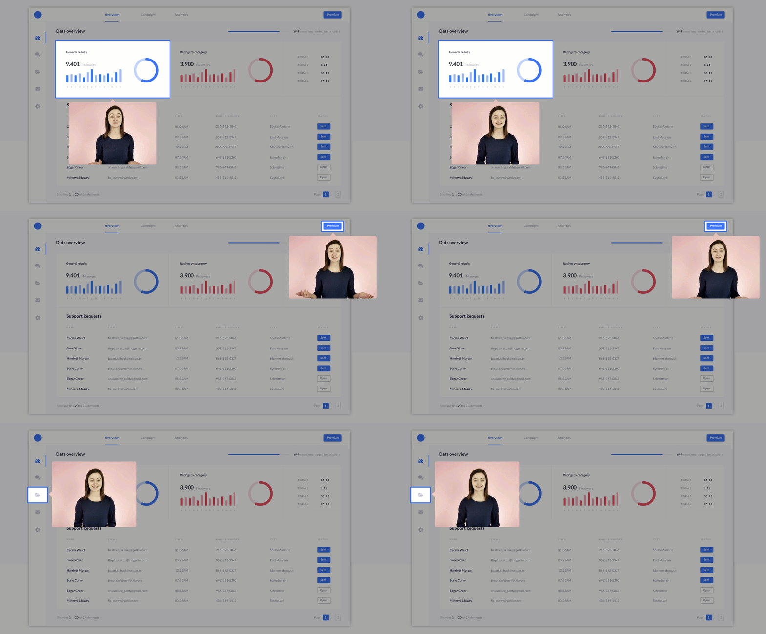
Example of a video tour and click-to-advance functionality
3. Be contextual
Consider what your users might have already done in your website or product, and what expectations or prior knowledge they might already possess. These questions will help you step into your user’s shoes:
- How complex is your product? If you have a few core features, you can probably explore them all in a single onboarding flow. But for more complex products, you’ll want to hone in on the features that matter to your user’s primary goal.
- How much have users invested upfront? The more expensive the product, the more you need to focus on getting users to experience value quickly. It could be as simple as showing them early on how your product will look on their website. A poor onboarding experience can lead to refunds or cancellations that you can’t afford.
- How savvy are your users? Are they power users experienced with a wide variety of SaaS products and applications, or are they brand new to your kind of tool? The answer will determine how much reassurance you need to build in or context you need to provide.
“Onboarding at its core is a learning process, so use education techniques to teach users and build their confidence”
Avoid these user onboarding mistakes
Some common missteps often prevent onboarding flows from being the best they could be. Look out for the following:
Mistake #1: Planning your onboarding last
Is onboarding the last thing you add before launch? It shouldn’t be. If you make onboarding an afterthought in your design process, it will almost certainly feel like an afterthought to your users.
Scott Belsky, chief product officer at Adobe, describes why the new user’s “first mile” should not be planned at the last minute:
In a world of moving fast and pushing out a “minimum viable product,” the first mile of a product’s user experience is almost always an afterthought. The welcome tour, the onboarding, the explanatory copy, the empty states, and the defaults of your product make up the first mile. Ironically, these crucial components of initial engagement that make up the “top of your funnel” for engaging new users are typically addressed in haste as a product is launched. In some teams, I have even seen these pieces outsourced or delegated to a single engineer or designer to figure out on her own.
Think about how you’re going to onboard users to each feature as you’re developing, designing and implementing it. Write your UI copy and onboarding tooltips as you’re designing the app. It’ll make the final onboarding experience feel much more natural and help it better match the rest of your work.
Mistake #2: Designing onboarding by committee
Cracks in the onboarding flow often show up when multiple teams are involved in building a product – and each one is responsible for designing onboarding for their own portion. Rather than a single unified experience, disparate design patterns and messages start to emerge.
The solution is to treat onboarding as a product itself, a constant concern for a single team. That’s the approach we take here at Intercom, where our Team Onboarding is responsible for designing frameworks, principles and components that allow other teams to easily create user onboarding flows for their old and new features while maintaining a cohesive experience throughout the product.
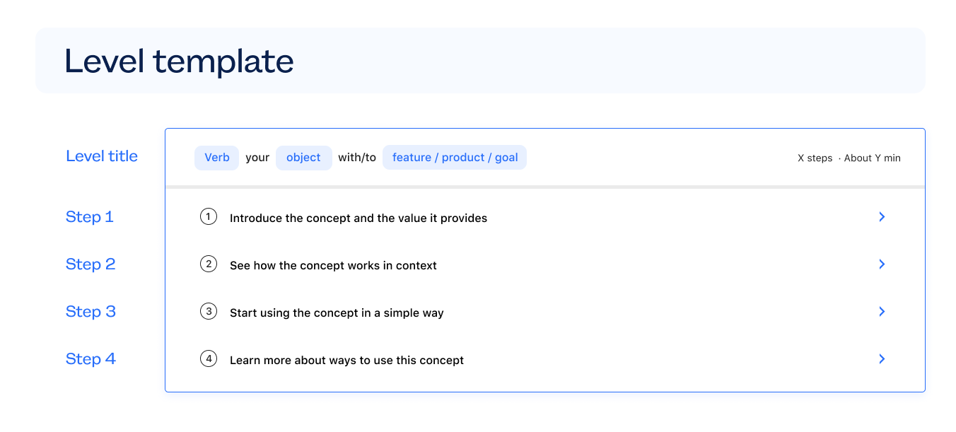
Team Onboarding templates
Mistake #3: Catering to the average user
The larger your product, the more likely it tackles multiple use cases and attracts a wide range of users. So instead of assuming all users share a common goal, guide them to their individual “aha” moment by asking a question or two. For example, QuickBooks asks new users what they want to accomplish with the app during onboarding and then adjusts the experience to match:
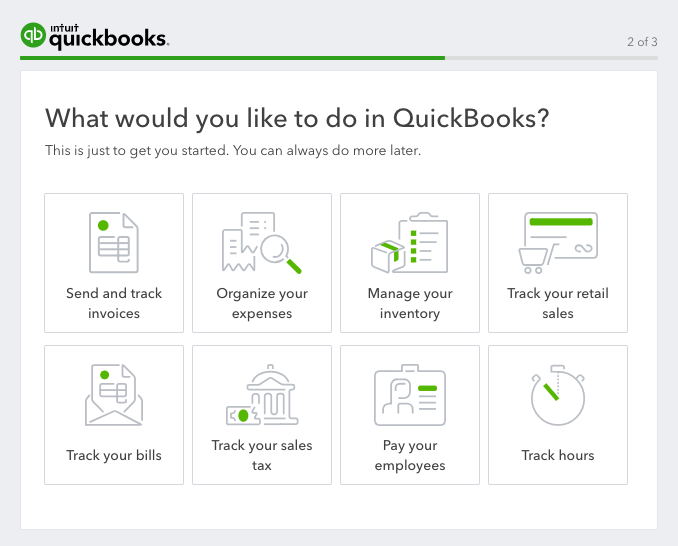
Pinterest also takes a similar approach by asking new users about the topics they care about early on in its onboarding flow. Casey Winters, the company’s former growth lead, shares how they’ve iterated on this question over the years:
If you need to understand something about the person to be able to show them value, ask for that. For Pinterest, we need to know what you’re interested in to be able to show you value. First, we asked you to follow people that share your interests, and then you would see what things they’re pinning. Eventually we switched to, “What topics do you care about? We’ll show you the best content in those topics.” That worked pretty well. Pinterest is always seeing if there’s a better way to do that, to connect people to the value even faster.
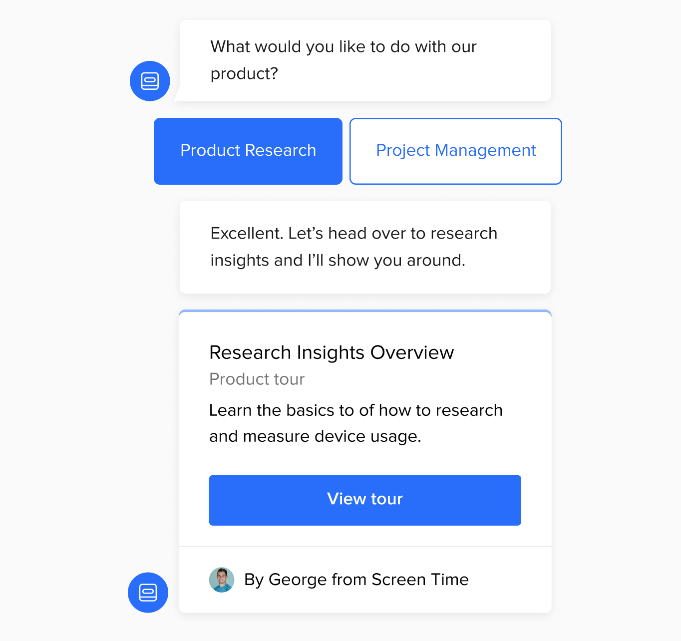
If you use Intercom, you can use Custom Bots to quickly ask about your new user’s intent and offer the best tour based on their reply.
Mistake #4: Ignoring early warning signs of churn
Waiting to beg users to stay until they are ready to leave is waiting too long. You should be actively looking for signs of churn — even during onboarding.
If you detect that users aren’t taking the critical steps towards your product’s “aha” moments and thus aren’t grasping your value proposition, plan a follow-up action that can be automatically triggered. You might want to have an auto-message pop up in-app to check if the user needs help. Or send a personalized welcome email and nudge users in the direction of your video tutorials — specifically the one about accomplishing the onboarding task.
Mistake #5: Sending time-based onboarding messages (or no messages at all)
Got an onboarding message campaign running? Great! Active, contextual messaging during the onboarding process goes a long way to eliminate confusion and re-engage users who are thinking about trying alternatives.
But too often, teams set these messages to be sent based on the number of days since signup. As Des says:
Just because it’s been 7 days since I started using your product, it doesn’t mean I’ve done anything useful. Similarly, I could have signed up yesterday, spent all day in your product and be fully ramped. Activity matters, usage matters.
Actively communicate with your newest users based on what they have done — or haven’t. These messages should be tailored to their activity, not simply based on when they signed up, because you can’t always guess their level of knowledge or experience. One way to do this is with Intercom’s auto-messages that can be customized based on real-time user activity.
Mistake #6: Myopically focusing on just the first visit
It’s shortsighted to assume that your user onboarding experience will be enough to convince users to come back to your app — or to teach them everything they need to know in one sitting. Think beyond that first experience to a user’s second visit and beyond. What can you do to support the people who have finished your onboarding experience and are returning to your app for the first time in hours, days, maybe even weeks?
For instance, Slack gives users a “magic link” to log in to different workspaces that they haven’t visited in a while, so they don’t have to struggle to remember yet another password.

Your returning newcomer will also appreciate it if they can find your onboarding resources in an easy-to-find, predictable location within your UI menu or settings. Offer personal, conversational support via in-app live chat in case they need hands-on guidance beyond that first walk-through — without requiring them to leave the app and lose their place.
Mistake #7: Optimizing for the single user
The way software is being bought is changing, and the buyer for a company often starts as an individual user. Collaborative, team-based SaaS products like Slack know the sooner they can connect these individual users to a team, the more momentum they build toward a premium upgrade.
Slack builds its teammate invitation right into the onboarding flow prior to letting you use the product. Since teammates are what really make Slack valuable, with a simple opt-in the app allows new users to let their teammates join. This all happens without additional permissions being requested, as long as the employees created an account using a verified company email address.

Making these connections between users and their teams can really help a whole company get onboarded to your product, and in record time.
3 classic examples of user onboarding that delivers immediate value
Social media platforms, specifically Twitter, LinkedIn and Pinterest saw phenomenal growth in part due to the way they show immediate value to new signups. It’s worth revisiting what makes their onboarding experience so effective.
1. Twitter: Offer value for users early
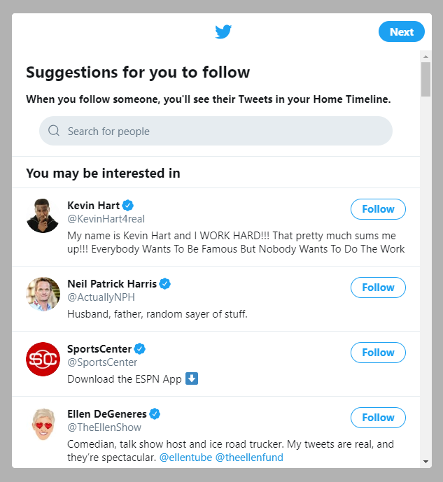
Whether or not a user follows other people on Twitter is an important retention indicator for the product. So Twitter encourages new signups to follow at least 20 other users with a single click to make sure you get the most out of the product.
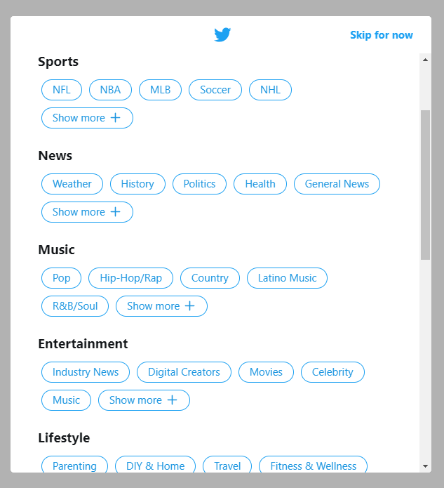
New users are also shown a checklist of topics to choose from, with some popular accounts already selected.
2. Linkedin: Allow users to onboard at their own pace
LinkedIn reduces friction during account creation by allowing users to progressively build their profiles, rather than demanding them to provide all their details on the very first login. They popularized the gamified progress bar:

By requiring just enough information during registration, they’re able to increase the odds of retention. However, if you use this approach, make sure that the progress bar is actually incentivizing users to take actions that align with their goals, not your internal activation metrics, especially for more complex products.
3. Pinterest: Trigger tutorials based on user actions
If your application relies on a new concept without established patterns of behavior, make sure new users don’t leave until they understand it — and have shown that they want to do it themselves.
For instance, it would have been easy for Pinterest to force users to click through a step-by-step tutorial on creating their first pin right at signup. But before Pinterest came along, concepts like digital “pins” and “boards” weren’t that well-known. So Pinterest doesn’t trigger its tutorials immediately: it lets users explore at their own pace and wait until they click an image in their feed to show a tutorial.

This approach to introducing tutorials gives users a sense that they’re in control of their learning and motivates them to keep going.
Successful user onboarding connects users with value — fast
At the end of the day, a great onboarding experience boils down to your ability to connect the initial steps you’re asking users with the value your product brings. The quicker you guide them to their relevant “aha” moment in your product using time-tested education techniques and modern onboarding tools like Product Tours, the more likely your brand new users will turn into long-lasting customers.
