Hot button issue: Improving accessibility in the Messenger
When building product at Intercom, we move fast so that we can deliver value to our customers and validate our solutions to their problems as early on as possible. As a result of this fast pace, we sometimes need to circle back to polish past work that can be improved and iterated on.
One recent example involved an accessibility issue in the “quick reply” buttons in our Messenger – a seemingly small detail in its own right, but one that we were able to revisit and improve to ensure we met the highest web accessibility standards.
The old way
Quick reply buttons offer users a range of options that allow them to pick a topic and easily begin their interaction in the Messenger. In the previous design, the quick reply buttons had a default state and then a hover state when a user moved their cursor over the button. Once clicked, a conversation would be triggered and the button would enter an active state, which was the same appearance as its hover state.
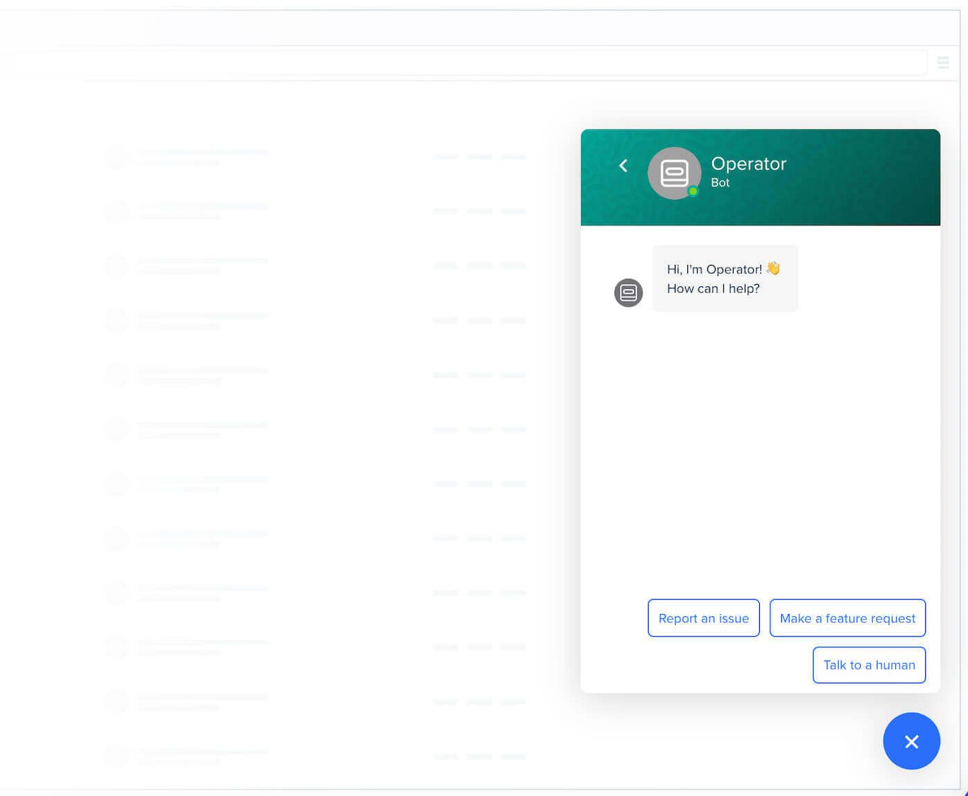
How quick reply buttons used to appear in the Intercom Messenger when in their default inactive state
To style their Messenger and personalize it to their own brand, customers can choose two different colors, a background color for team profile and other backgrounds, and an action color for use in buttons, links and highlights.
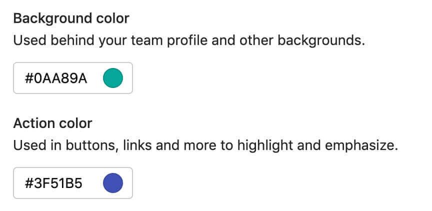
Color choices in Messenger settings
In their default state, the quick reply buttons always had a white background, and the action color was used for the text and border of the buttons. In the hover and default states, the action color would become the solid button color.
In some cases, if the action color had a very low contrast with the white background in the default state, black was used instead for the text and border to increase legibility.

Some examples of buttons in the previous design
The goals of the improved button design
There were a number of things that we wanted to achieve with the new quick reply button design.
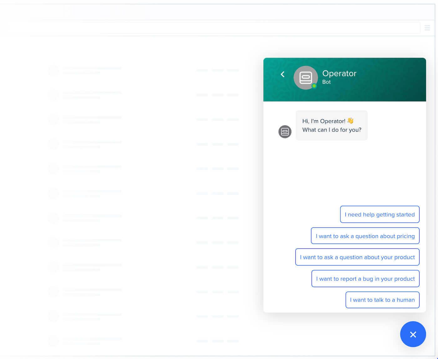
1. Improve readability
We noticed that the borders affected readability when there were a few quick reply buttons stacked together, particularly with darker action colors.
2. Improve accessibility
We have a high bar for accessibility standards in the Intercom Messenger and always try to ensure an accessibility level of conformance of AA for regular text and AAA for large text, which means meeting the highest accessibility criteria as defined by the Web Content Accessibility Guidelines (WCAG) international standard.
For quick replies, this translates to having a contrast ratio above 4.5:1 between the background and text colors. After doing a quick study of the state of quick reply buttons in the wild, we realized that the previous default state design did not meet this bar a lot of the time.

Some examples of quick replies that had poor contrast ratios. On the right is the color that was used on our own Intercom Messenger, which fell just below our desired contrast ratio.
3. Personalize quick replies regardless of the action color chosen
Previously, in an attempt to improve accessibility, when our customers selected an action color that had a very poor contrast ratio against the white background, the Intercom Messenger changed the quick reply color to black.

Some examples of colors where we defaulted the quick reply text and border to black.
Our mission is to “make internet business personal,” and whether our customers got the personalized experience that we promise depended on their choice of action color. Automatically ignoring their choice of action color was not a good enough experience.
4. Hover state = active state
Finally, to polish the user experience, we wanted the hover state of the new quick replies to always correspond with their active state. In the old design, however, those quick replies that automatically changed to black would also have the black border on hover, but not in the active state. Therefore, the hover state in these situations looked different to the active state, which was not ideal.

The solution
We were not able to find a “one size fits all” solution that would meet all the requirements listed above, so we had to take a different approach.
Default state change
The new default quick reply button design removes the border and introduces a very light background instead of the white background of the old design. To attain this subtlety, we explored levels of lightness for different colors, where lightness ranges from 0 (for black) to 1 (for white). A lightness of 0.95 seemed to be the right level for achieving the background effect we were looking for:

A sample of colors with 0.95 lightness
Also, the text color is no longer the action color, but instead both the text and the background vary depending on three different sets of logic we devised to automatically attain a contrast ratio around 4.5:1, no matter what action color the customer chooses.
The logic used is contingent on the lightness or darkness of the chosen action color. Given an action color for an app:
- If the action color lightness > 0.90
- Background color = action color darkened to a lightness level of 0.85
- Text color = action color darkened to a lightness level of 0.30

Quick reply end result for a very light action color
- If the action color lightness < 0.35
- Background color = action color lightened to a lightness level of 0.95
- Text color = action color

Quick reply end result for a dark action color
- If 0.35 ≤ action color lightness ≤ 0.90
- Background color = action color lightened to a lightness level of 0.95
- Text color = action color darkened to a lightness level of 0.30

Quick reply end result for a medium action color
Hover state consistency
In our new design, the absence of any borders means the hover state will always look the same as the active state. We intentionally built the logic such that the background color of the quick reply is never the same as the action color.
Below are some examples of the old quick reply designs versus the new ones. Observe the contrast ratios, and the difference between the hover and active state for each of them.
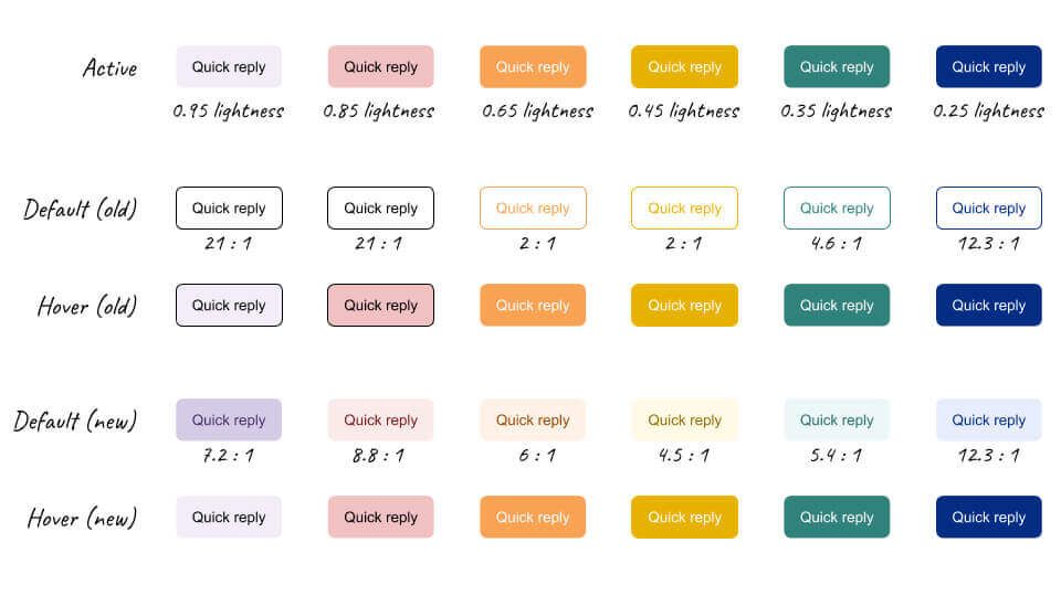
The top row represents the active state of quick replies, showing the action color. The middle rows are examples of the default and hover states in the old design, and the bottom two rows are the default and hover states of our new design.
Does the new design meet our own requirements?
✅ Improved readability
As a result of these changes, the quick replies become more subtle and simultaneously easier to read. The improved legibility is apparent in the image below:
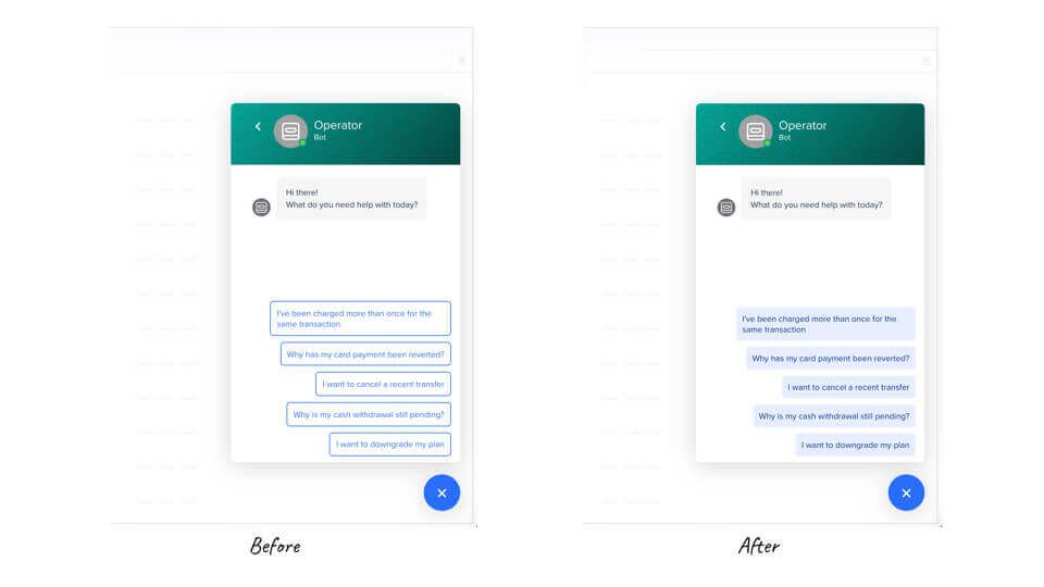
The before and after of the new quick reply buttons in the Intercom Messenger
✅ Improved accessibility
The logic described as part of our solution was built around the premise of making our quick replies as accessible as possible. Below are some examples of the massive improvement in contrast ratios of our new design versus the previous one.

Improved contrast ratios with the new design
Unfortunately, there is no perfect mathematical formula that can ensure we’ll end up with two colors with a contrast ratio above 4.5:1, especially for brighter colors, like yellow.
However, we did see a significant improvement in accessibility for many of our customers.
✅ Personalized quick replies regardless of the action color chosen
Like I mentioned at the beginning of the post, when a color had a bad contrast ratio against a white background, we used to default quick replies to being black.
With the new design, instead of compromising a personalized experience in order to ensure accessibility, we now ensure it by tuning the lightness levels of the action color for the text and background.

With the new design, when the action color choice is light, we find two shades of the color that ensure a good contrast ratio.
✅ Hover state = active state
Last but not least, the new quick reply design guarantees that the hover state will always be identical to the active once the button is clicked. This improves the design quality and user experience of our Messenger.
Spreading accessibility
With the old design, 9.9% of our customers’ messengers had a quick reply design with a contrast ratio below 4.5:1 and that therefore did not meet our desired accessibility bar. With the new design, only 2.1% of our customers’ messengers don’t meet the desired ratio – this is five times better.
We also looked at a lower ratio of 3:1, under which accessibility is very poor. For the old design, we found 5.5% of our customers’ messengers had quick replies with a contrast ratio lower than this – while with the new design, only 0.07% of those messengers had a contrast ratio lower than 3:1. This is 78 times better with the new design, a remarkable improvement.
It also demonstrates how making the web truly accessible for everyone depends on sweating a lot of details, but when you get those details right, the benefits can be felt far and wide.


