Are you being Clear, or Clever?

Situation: You’ve built a great feature that solves a real problem that you know your users have. They’re not using it though. Usually, it’s because they haven’t seen it, or they saw it and didn’t know what it did.
In my experience, it’s one of three problems:
- Your call to action is in a UI blind spot (e.g. bottom left of screen).
- It’s buried three clicks deep in your product.
- It’s badly labelled; people see it but can’t work out what it is.
If your designer had an off day, it can end up being all three.
Improving your call to action
Find prospective users (that you don’t know) and have them think out loud while using your product. Don’t direct them; just observe their usage and, at the end, ask about the feature in question. If they haven’t used it, ask them why. Was it not on the screen? Did they not understand the label? Did they think it would be somewhere else? The feedback you get will light the way to your solution.
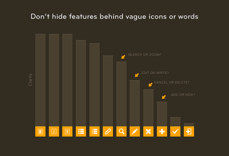
Icons are often a cause of discovery problems. Jared Spool offers three rules for them:
- Icons with text always perform better than just icons. If you can only pick one, pick text. A picture can paint a thousand words, but that’s the problem—you only want one.
- Users remember the location of buttons better than they remember the artwork. You can update an icon set with minimal complaints, but try moving your key actions around and watch your users squirm.
- If, as a product designer, you can’t quickly think of a clear and reliable icon for a task (e.g. Merge), then your customers will have no chance. It’s a good sign that you’ll need text.
Real Example: An Intercom customer saw that no new signups were using the messaging feature. He tried triggering some automatic messages to promote it and had some success. But not enough. He asked me for help. Here’s the conversation we had:
Des: “So, firstly, how do you actually create a message?”
Him: “Just click the pen icon.”
Des: “Oh! I thought that meant Edit.”
Him: “No, no, that’s the other pen icon.”
Des: “Right, I see the problem here…”
As a short-term solution we replaced the pen icon with the words “Send Message”. It wasn’t pretty, but it worked.
Key idea: Speak your users’ language. Never be subtle about important features and interactions. Double down on this by using triggered messages to promote features to those customers who haven’t used them.


