
Shortcuts to superpowers: What an emerging design pattern tells us about disruption
Main illustration: Kelsey Wroten
The world of product design is shifting once again: “Best of breed” apps are mixing decades-old ideas with modern UI patterns – and in doing so, teaching us eternal lessons about how to design for a specific market.
It’s an exciting time for product design. After an arguably fallow period, the last couple of years has seen a cohort of design-forward products that feel like they share a similar ethos, and a desire to make big leaps forward. Many share similar design patterns. All are pushing out new ideas with a speed and confidence that their larger, older competitors are unable to match.
“We’ve always felt that Intercom has been part of driving this movement, and it’s exciting to see many others joining in”
What’s more, this straight-up design innovation is happening in a somewhat-unlikely corner of the industry: business software. While most of us may have looked down our noses at the design of “enterprise software” a few years ago, some of the most interesting new products and design ideas are coming out of companies who are building tools for work. We’ve always felt that Intercom has been part of driving this movement, and it’s exciting to see many others joining in.
Smaller upstarts are building exceptional products by out-innovating lumbering incumbents. SaaS products like Airtable (better Google Sheets), Coda (better Google Docs), Slack (better IRC), Notion (better Evernote), Superhuman (better Gmail), Zoom (better Skype), Linear (better Jira), and yes, Intercom (I couldn’t possibly!) are all aimed at carving off a healthy slice of a large existing market.
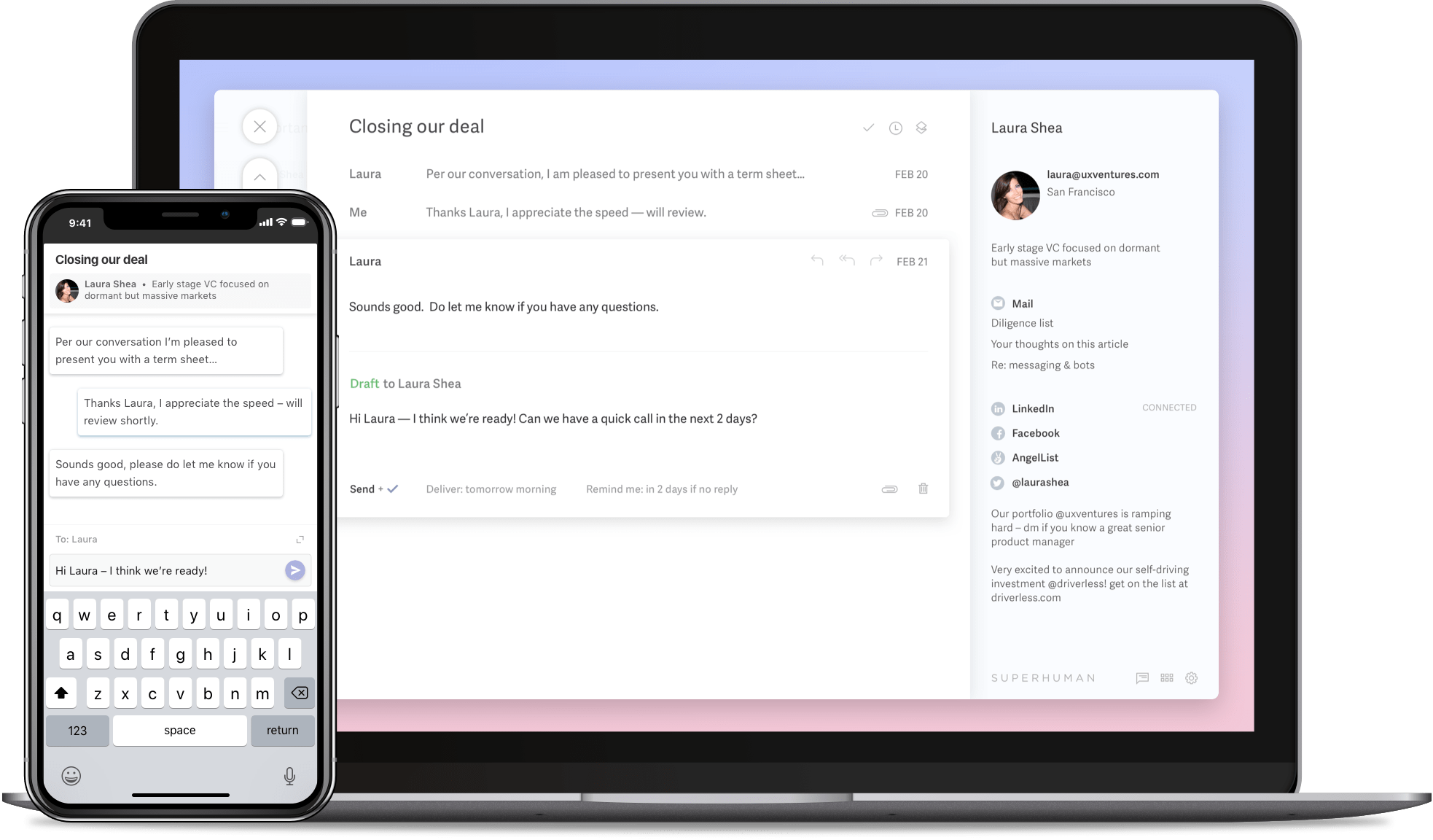
Superhuman, a Gmail competitor
People used to say that you could come up with startup ideas by replacing old Unix commands or spreadsheet hacks or a Craigslist vertical. Now it’s even simpler: choose a massively successful product with a large user base, hone in on a specific segment of their customers, and simply ship brilliant product design work aimed specifically at them. Free of the burden of having to be relevant to billions of very different customers, these “best of breed” products are now at the frontier of product design innovation.
Best of breed products
You’re probably familiar with disruption theory: essentially the strategy of smaller companies building a simpler, cheaper alternative to an existing product.
Best of breed products are similar, but come from the opposite direction: rather than cleaning up with the low end of tiny customers who want something simpler, they can cherry-pick the most sophisticated (and often most lucrative) customers from higher up the market. Think of it as disruption from above.
“Such is the enormity of the market for business software today that even a small proportion can sustain a significant business”
It’s now clear that a decent chunk of users who spend all day using (and feeling the daily frustrations of) those older tools will happily switch for even a marginal improvement, often layering several best-of-breed solutions on top of an existing mediocre one.
And such is the enormity of the market for business software today that even a small proportion can sustain a significant business. If Superhuman can win over even a tiny percent of Gmail users with a more focused product, they will be very happy indeed.
Whatever the tipping point, it’s clear that buyers are willing to pony up for a better solution. How else can you explain video conferencing service Zoom’s recent eye-watering valuation, given that a great many of the customers undoubtedly already have access to Google Hangouts or similar for free? It’s because the design of Zoom is so much better than Hangouts, that it’s worth it. Good design is good business.
But still, “good design” is pretty vague. How should designers make decisions when designing best of breed products specifically?
Designing best of breed products
Any product designer worth their salt will start by understanding two things: their audience, and their competitors.
Let’s assume that you have identified an audience of demanding, discerning users who value product quality and their own time. Let’s also assume that your main competitor is some insanely huge, successful, resource-rich company like Google who are already deeply entrenched with a broad offering like GSuite.
At first it seems like an impossible David vs. Goliath proposition, but then you quickly realise some huge advantages you hold:
- You don’t have to be all things to all people. Google has to support millions or billions of users, including less sophisticated users with legacy hardware and slower internet connections, shackling them to lowest common denominator solutions.
- You can focus on one use case. They must satisfy many.
- You are fast. They are slow.
- You know your customers intimately. They haven’t a clue who is using their product because most of the planet is using their product.
- You’re better than them at design. There are a great many talented designers working at Google, but they simply don’t have their A-players working on some obscure corner of GSuite. No disrespect meant, but in my experience it’s true.
This is liberating. You can do things they can’t. You can build product that’s fantastic just for your niche. You can cover much less surface area, but go way deeper. The ceiling of complexity that might work for your customers is probably higher, so you can build more powerful products and expect your users to take the time to learn it, because your product will give them new superpowers.
Cmd-K
Let’s look at an example. Slack, Superhuman, Stripe, and Linear all use a similar pattern to allow for keyboard input. From anywhere in these apps, you can hit Cmd-K to invoke a modal input, into which you can type an array of commands. Here’s what it looks like in Superhuman, the Gmail competitor:
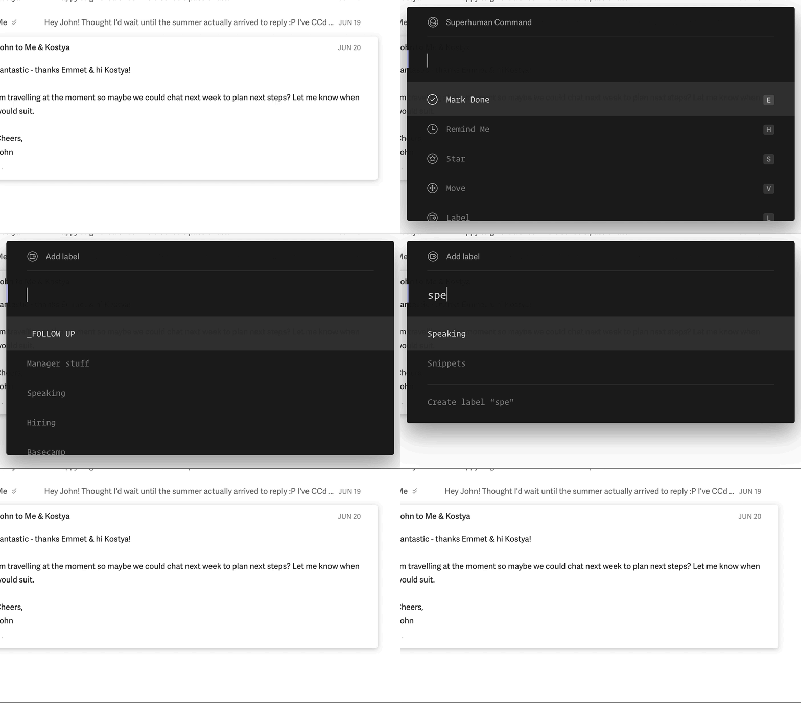
From here you can type to act on the current mail (reply, archive, remind, move), navigate the app (compose, switch inbox, search), or take actions (copy recipients, open calendar, switch theme).
I love this UI pattern: it’s fast, learnable, and makes you feel like a badass hacker from the future (an oft-overlooked feature). It’s clearly a power user feature – you could never imagine mainstream Gmail users navigating like this – but once you get used to it, you can plough through email in seconds. It’s random access navigation applied to inbox triage. And it’s good design.
Why? Because Superhuman have focused all of their efforts on people who want to be able to process large amounts of email quickly. People for whom a 20% increase in efficiency would be life-changing. For whom that gain represents $30 per month worth of value over the free thing they already use.
And so they go hard on it. They hammer home the speed point on their marketing site. The near-total reliance on keyboard navigation means that the screen UI can cut away a ton of cruft, making it faster again. Any time you attempt to use the mouse, the app almost admonishes you for doing so, teaching you the faster way.
This reasonable little message appears on screen whenever you click the “Mark as Done” button:

But here’s what you get when you simply select some text with your mouse:

And here’s how Superhuman feels about you hovering a link like some kind of goddamn caveman:

It’s even a little bit weird, but… aren’t you glad that a product today is doing something weird at all? It’s not for everyone, but it doesn’t have to be. If, however, you’re the type of person who loves this type of thing, well, you’ll love it. It’s picking a stance that’s great for some, and it’s sticking with it. That’s what a best of breed product is.
Of course, Gmail has some keyboard shortcuts. But Gmail can’t berate you for using your mouse. Best of breed apps are designed to help you get the most out of them. They don’t have to dumb things down. Design decisions are tightly connected to the product strategy and business goals (e.g. our main selling point is speed, so we’ll force our users to be as fast as possible, so that we actually deliver on our selling point).
Everything old is new again
You may be looking at this Cmd-K pattern and thinking it looks familiar. That’s because, as with all design, there’s plenty of prior art here. You might be reminded of Spotlight search (or Quicksilver, or Alfred). You might think that Superhuman vs. Gmail is essentially command-line interface vs. graphical user interface.
And you’d be right. This is where being a student of the history of software can pay off. You don’t even need to invent brand new interaction patterns to design best of breed products. Innovation doesn’t necessarily imply invention. The application of an existing solution in a new context can be highly innovative.
“The Canon Cat was an early example of what we might now call a best of breed product”
As I used Superhuman I was stuck by how much it reminded me of the work of legendary designer Jef Raskin, in particular the Canon Cat computer.
Although best known as the originator of the Macintosh project at Apple, the clearest realization of Raskin’s vision for an “information appliance” arrived in the form of 1987’s Canon Cat. (Raskin later captured his underlying ideas in his classic book, The Humane Interface.)
The Canon Cat was an early example of what we might now call a best of breed product. Perhaps the first in tech. It was a response to an existing successful mass-market incumbent that was enjoying broad appeal.
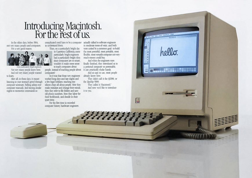
The Macintosh had succeeded by billing itself as “the computer for the rest of us” and introduced the masses to simple, accessible concepts like a GUI and a mouse. While wonderful for most novice users, Raskin was frustrated by what he saw as the trading off of power in service of broad accessibility.
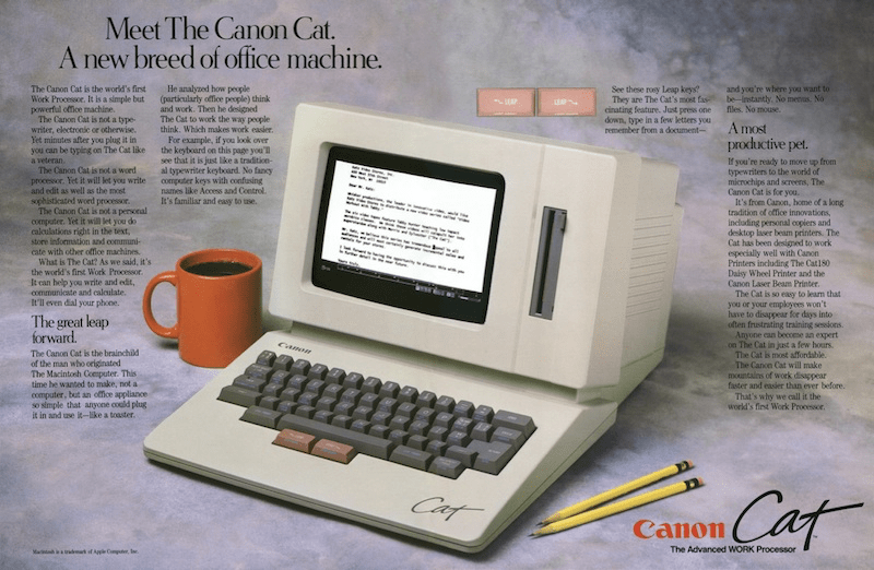
Raskin saw the opportunity to make a computer for a smaller niche audience, “particularly office people,” who wanted to “make mountains of work disappear faster and easier than ever before.” Sound familiar? By identifying a specific audience and selling point, he was able to be radically opinionated in creating a product that was far, far better for that core set of users.
As we’ve seen, best of breed products can be better by doing less. The Canon Cat did away with the mouse, an aggressive move in favour of the faster input afforded by keyboard input (just like Superhuman). It did away with the desktop metaphor and filesystem, booting straight into a single multi-purpose document that could perform word processing and spreadsheet-like calculations inline (just like Coda).
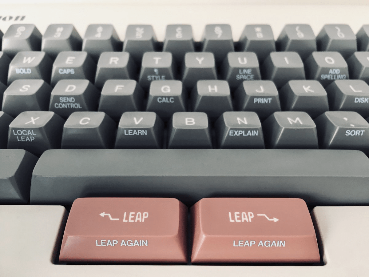
It even did away with cursor keys. But as we’ve already seen, best of breed products also add things to make the experience better. In particular, it introduced two new keys:
Photograph: Marcin Wichary
These ‘Leap’ keys don’t just perform basic cursor movement. Holding one of these modifier keys while typing will immediately shift input to the nearest instance of the typed letters – much faster than using cursor keys of a mouse. Again: kind of weird. But good weird! If you’re curious, the Internet Archive have an in-browser emulator of the Canon Cat you can play with.
If nothing else, the Canon Cat proves that products aimed at getting work done, far from being a wasteland of enterprise mediocrity, are an opportunity to push out innovative new ideas. However, the Canon Cat sold only a modest 20,000 units, certainly not a huge commercial success for a hardware device with high marginal costs. Does this relative disappointment mean that best of breed products are in fact destined for a tiny audience, and thus business failure? Not at all.
The economics of modern software development are far more efficient. A SaaS product charging the same modest audience $30 a month is pulling in north of $7m annual recurring revenue. That’s before you begin to consider that today’s addressable market is orders of magnitude larger, and the barrier to entry far lower.
The wheel turns
Technology moves in cycles. The large cycles (PCs, internet, mobile) wash over the entire industry, spurring on flurries of innovation. Yet most cycles also settle over time, as the winners and losers shake out and familiar patterns consolidate.
The emerging trend of best of breed apps is not a world-changing development. It’s not that self-important. It’s part of the seemingly endless cycle of consolidation and unbundling. It’s about solving specific problems with smart, brave, incisive design. Yet for those of us who love the craft of building software, there’s something noble and even thrilling about that.
“It’s thrilling to see the conditions today allow for different ideas, old and new, to once again succeed”
We’re moving past the era of generic, general-purpose software for the masses. Small teams can build excellent software for niche audiences and build a killer business in the process.
There have always been people willing to bring exciting, genuinely useful new ideas to market. To the extent that the Canon Cat failed, it failed because of unit economics and timing, not design. But it proved that old ideas can be new again, and it’s thrilling to see the conditions today allow for different ideas, old and new, to once again succeed.
That’s why I say it’s an exciting time for product design. We have a long and fascinating history of left-field ideas to draw from. The barrier to entry for trying new things (or resurrecting old things) has never been lower. The collision of these factors with the emergence of the best of breed market is breathing life into product design innovation. Everything old is new again.
If you’re excited by the idea of designing innovative new products; if you get excited about the idea of solving real problems through innovative design; if you clicked on the emulator link just cos you’re that type of person, you should know that we love this stuff at Intercom and we’re hiring.


