Design principles: insights are not about analytics
Anywhere there are numbers in a product, users will eventually ask for them to be visualized, but to do that effectively you have to understand how those visualizations will be used. People ask for “analytics”, but what they really need to do their job are insights.
Ever since we launched a shared inbox, we’ve been getting feature requests that fall into the blurred category of statistics/analytics/visualisations. Inbox Insights is our response and we’d like to share some of the design process and principles that informed it.
Supporting your customers with Intercom is different to traditional support platforms; it’s about conversations with customers rather than creating, tracking and closing tickets. But this shift from tickets to conversations doesn’t change the questions that people running support teams have. For example: Are you good at getting back to your customers? How do you measure team performance? Are you being efficient with your resources? How busy are you? Who are your most productive team members?
Answering these questions adequately means making sure you are tackling the right questions, and that you’re answering them in the right way. Put simply, you have to get the right data, and then get the data right. Right?
Applying the Jobs-to-be-Done theory, rather than creating archetypal customer personas, we try to understand what motivates customers to use Intercom and what jobs they are addressing with the product. This practical implementation of Jobs-to-be-Done helps us to create what we call a Job Story.
Understanding the Job to be Done
Most of our requests from customers simply listed metrics they wanted to see – things like conversation volume, response times, how many conversations they had answered as a team, and per teammate, etc.
It’s the nature of feature requests to contain the what, but not the why. But without understanding the why, you risk building an incoherent set of features that address very specific use cases or the needs of vocal customers, without solving the real problems that are common to the majority of your user base.
In this case we could have simply started spitting out the metrics requested, but we fought to understand how these numbers were being used within a business. We knew we had to dig deeper so we went back and talked some more to our customers.
The project brief
As we outlined previously, we start building product by writing the Intermission, a single page that describes exactly what problem we are trying to solve and why, and sets out the job story. The Intermission is the mission statement for the project, which is the benchmark for evaluating all our design work and ensures we never stray too far off course.
For this project, our Intermission looked like this:
Problem : Our current product doesn’t surface quantifiable information about inbox activity. People who manage support teams have no way of seeing how many conversations they are having with their users, or how busy their team are. Our opportunity is to motivate communication by showing aggregates and trends over time, showing admins an overview of team performance, and helping them predict how they might grow.
Below are the main Job Stories we identified from talking with our users:
- How big is our support workload (long and short term)?
- I want to know if our workload is increasing and at what rate, so I can scale the support team up or down accordingly.
- When are we busiest?
- I want to know when (time of day, day of week) we receive the highest volume of support requests, so I can schedule my team to respond during our busiest times.
- How good/bad are we at responding to customers?
- I want to know how long our customers are waiting for a response on average, so we can set targets to improve on.
- I want to know when (time of day and day of week) our customers are waiting the longest for a response, so I can scale/schedule my team accordingly and reduce wait times for our customers.
- Who on my team is busiest?
- I want to know how busy each member of my team is to know who my highest and lowest performing team members are.
- I want to know how much work my team are doing so I can see if they are sharing the workload.
- I want to know how many conversations my part-time contractor/intern is handling so i can review their performance.
Designing solutions to the problem
We believe in starting with the smallest step that will have the most benefit for our customers and which will teach us most about what people want to do with the feature. Using that logic, we looked at all the metrics customers asked us for, compared them to the jobs they were actually trying to do, and identified the smallest shippable piece that would deliver most value for the most people.
Two fundamental questions we identified for teams using Intercom for support were:
- “How busy are we?” (the company level view)
- “How busy are my team?” (the team level view )
At the company level, managers are trying to plan hiring. To do this they need to understand how the volume is growing, and how it’s distributed. They also want to see what the trends and patterns are like. Is today busy compared to a typical Friday? Should we normally expect a spike in contacts at lunchtime? Do we need to hire someone or is the current workload a blip? When does it make sense to hire someone in Europe, Asia, etc. Clearly how to handle the temporal element was going to be a critical design component.
When it came to designs, we explored a number of different metrics and charts to answer these two main questions.
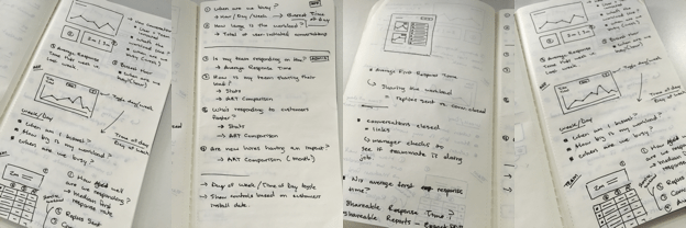
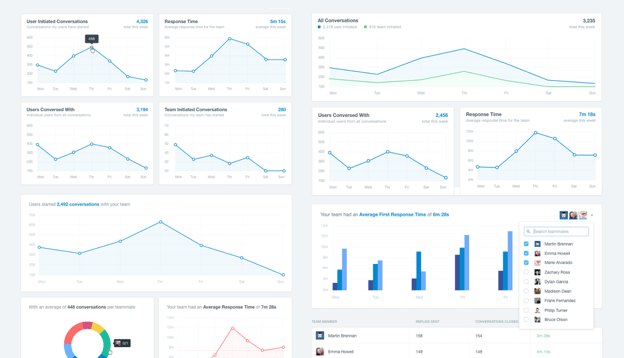
We narrowed the designs down through a series of review sessions, where we constantly evaluated each iteration against the job stories we identified. This ensured we never got distracted by graphs or animations that didn’t match the job. We then mocked up the charts using data which was representative of typical customers with both high and low support volumes, to see if they would actually answer the questions we identified. This ensured the graphics would work in the real world and not just in our design tools.
We carried our jobs stories method through to the user interface for Inbox Insights. When you visit that page you’ll see two main sections – How Busy Are We and How Busy Is My Team?
Job: How busy are we
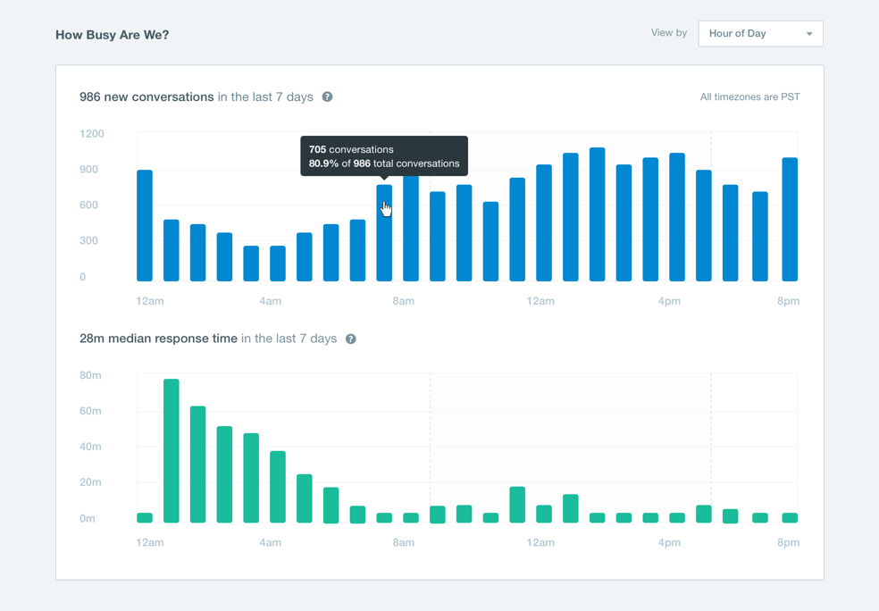
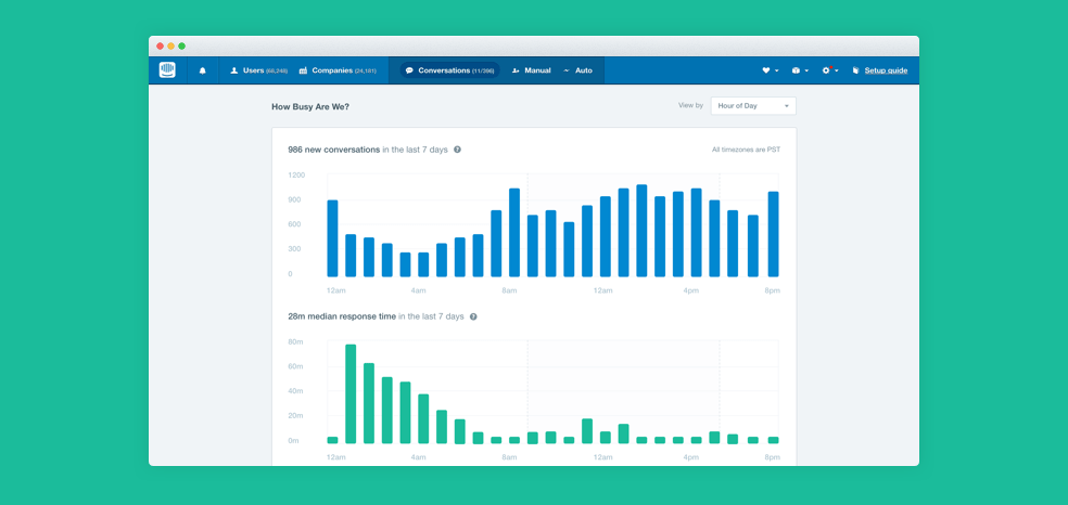
How Busy Are We shows easy to scan bar charts for new conversations and median response time.
Job: How busy are my team
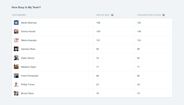
The team section shows how many replies have been sent and conversations closed by each of your teammates.
These graphs can be viewed by date to view trends (does that spike correspond to our big feature launch?), and by day of week (how busy are we on Fridays?) and time of day (do we need cover when Asia and Australia are online?) to understand your support patterns.
We believe this data should be easy for anyone to understand and not require you to read charts and tables to see how you’re doing. At the top of the page is a summary of your activity for the last four weeks in a very easy to read format.
“In the last 28 days your users started 2,124 new conversations, of which your team replied to 2,052 (86.8%) with a median first response time of 31 minutes.”
We chose median first response time – the number of minutes within which 50% of the messages received were responded to – as unlike average response time it isn’t easily skewed by a few outliers during non-business hours.
Gather Feedback and Iterate
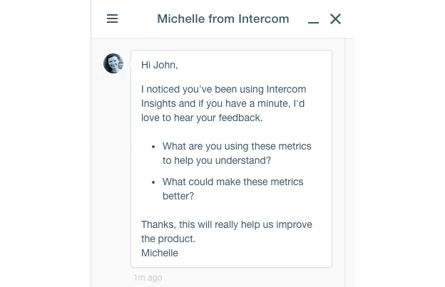
Since launch we’ve been using Intercom to gather feedback on this feature – we send an auto message to people who have used Insights more than 10 times asking them:
- What are you using these metrics to help you understand?
- What could make these metrics better?
We got really good feedback about how you’re using the feature e.g. generating weekly reports on your team, deciding if you need to hire more staff, etc. We’ve also been hearing what features you want – more date filtering, metrics on conversation tags and response times during office hours.
Inbox Insights as you see it today is our initial release. We’re not saying it’s complete, but following our principles this is a good first step. It has delivered significant value to our customers and helped us learn a lot about what’s needed next.


