Tool tips: How our design team switched to Figma
Main illustration: Ana Jaks
It’s increasingly clear that the tools we use shape the work we do in all sorts of ways, so picking the right tool for your task is absolutely critical. And even more so when you’re trying to pick a tool to be used by a diverse team spread around the world.
Our product design team consists of 19 designers who work across our offices in Dublin, London, and San Francisco. All designers are embedded in product teams, which means they have specific needs regarding communication and collaboration. Multiple time zones add to this complexity.
“As time passed and the company grew, our ecosystem of tools became prohibitively messy and limiting”
Our distributed setup caused us to make highly opinionated choices about our tools: various file storages and repositories, prototyping instruments, tools for collaboration and engineering handover. As time passed and the company grew, this ecosystem of tools became prohibitively messy and limiting. Every local team optimized for their immediate needs and didn’t support collaboration between teams and offices. The company had to pay for redundant software. Even onboarding new people to all that complexity was a pain. Something had to change.
After examining our situation and considering a few alternatives, we’ve found a solution to our problems in Figma. Here’s the story of why and how we moved to that tool.
Start with why
We were always curious about Figma as it developed a vocal, growing user base of designers, and yet slightly skeptical too. On the one hand, it was a modern, rapidly evolving tool with features that seemed to suit the needs of our design org. On the other hand, it looked immature, and its web-based nature struck us as a potential drawback for the work we do.
Because of that skepticism, we started by deeply evaluating the value it could bring to us. Some benefits were clear early on, while others became evident only after the switch.
The absence of files
Things can get really messy in a traditional file system. You need to be perfectly aligned within a team on where and how things should be stored. Otherwise, you would never find anything. In my previous company, we even had to create and maintain a formalized system for our working directory. It certainly doesn’t sound like the way we should be working in 2019.
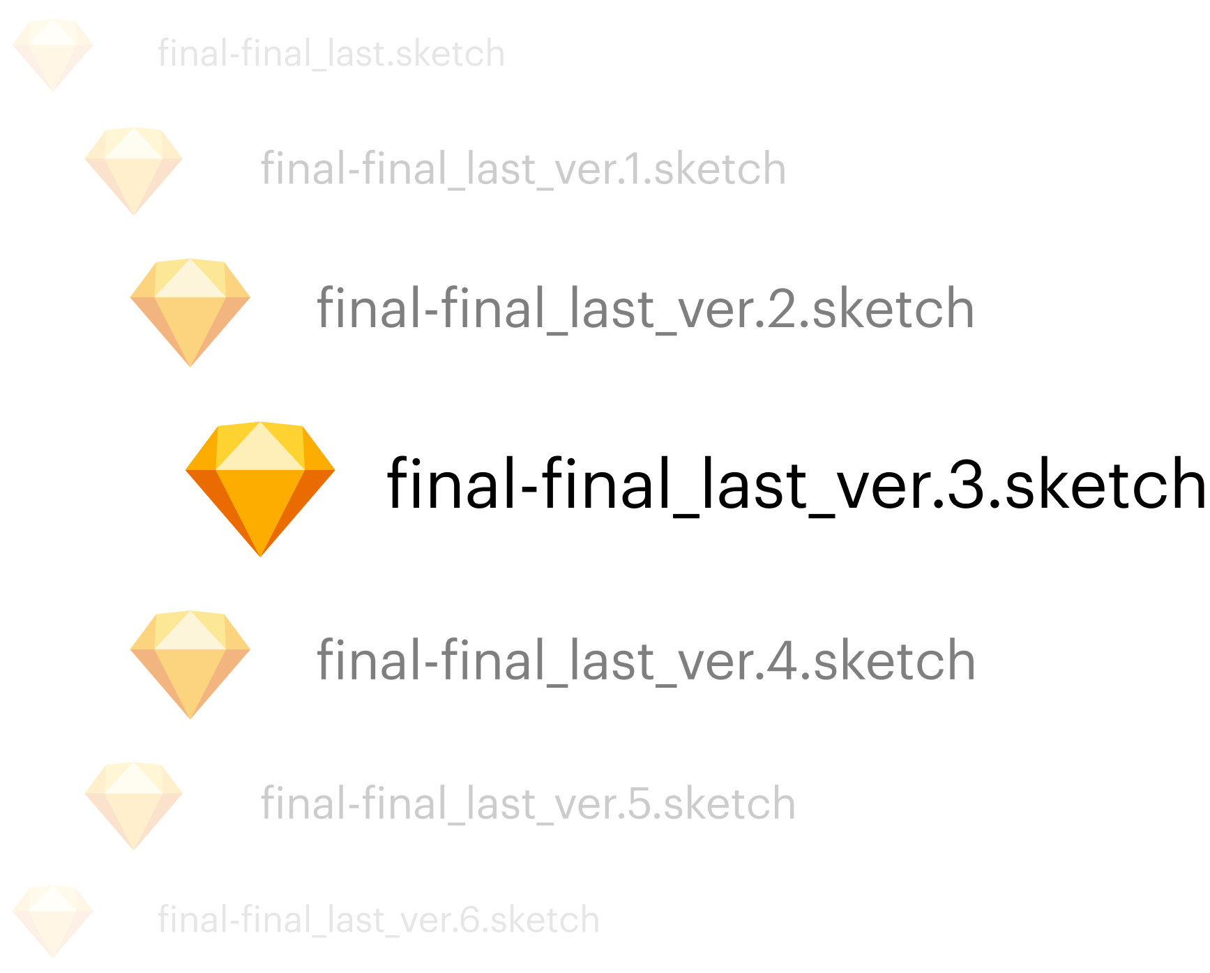
 Figma, on the other hand, gives you a transparent and almost flat document system. You can easily browse all the projects and sort them by the time of the last edit. No more “final-final-ver.99…” files, hidden inside 20 folders; no more questions about the ownership. That provides really good visibility into the team activities. And in my role as member of the design systems team, which means I need a much broader context and oversight of a greater variety of work than the rest of the design team, it was invaluable.
Collaboration
When Figma initially marketed themselves as the first collaborative design tool, I asked myself: “Why would I need that? Why would I want some manager to poke around my designs? Why would I need to work on a file simultaneously with another designer?”
It was only after the switch that I came to understand the value.
At Intercom, we do regular design critique sessions where designers get feedback on their work. The fact that multiple designers can jump into and inspect one file at the same time in Figma turned out to be a dramatic improvement for these sessions.

But it is when you start looping in engineers that the collaborative aspect of Figma truly shines. The very fact that the entire handover now happens with a single click on the “Share” button is amazing, a considerable improvement on the previous process.
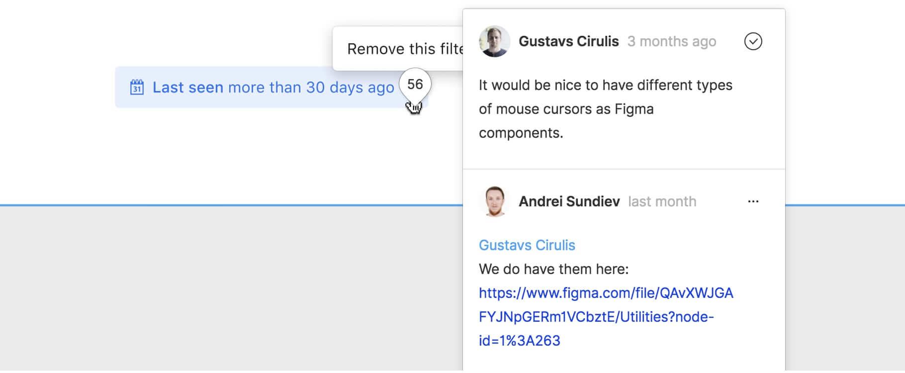
Another benefit lies in how its commenting feature works – conducting design reviews and gathering feedback, looping in managers and content designers, even asking for support, Figma brought together all these various types of communication inside the tool, and it goes even further now with plugins. This opened a whole new world of possibilities.
Document organization
Figma’s collaborative nature also changed the way we lay out and organize our files.
Using Sketch, you probably didn’t care that much about the way you laid out your file. Unless it’s your team’s master document, it will hardly ever be opened by someone else. But Figma documents are specifically built to be shared, which demands more careful organization.
We actively use Figma documents in our decision-making process. For many of us, they began to look more like little presentations rather than pure designs.
Cost-effectiveness
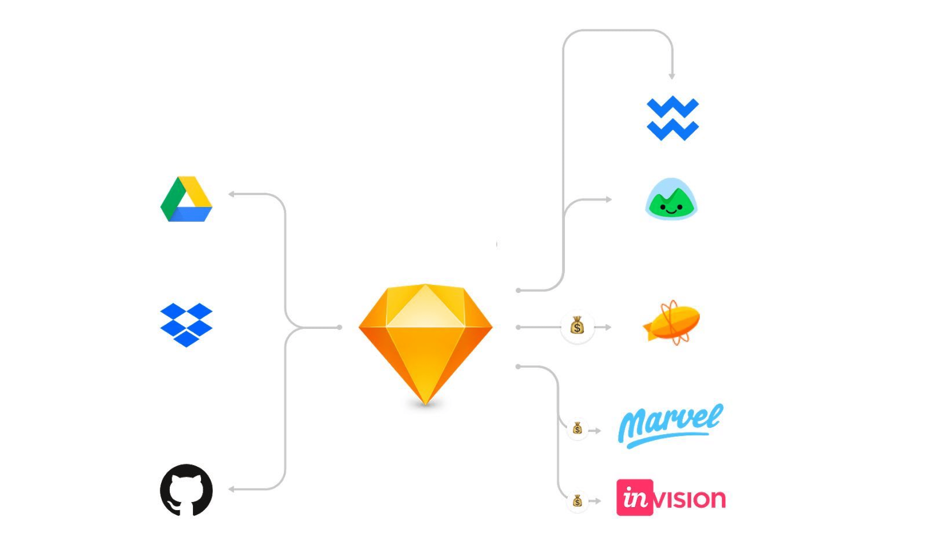
As we visualized the tool ecosystem we’d built around Sketch, we could see that many tools could simply be replaced by Figma – there was no longer any need for a dedicated file storage system and design handover tool.

Figma also becomes a default space for commenting on work in progress designs and doing some lightweight prototyping. All together, this saved our company money and became a strong argument for switching from Sketch to Figma.
Why not?
What turned out to be Figma’s biggest benefit was also the reason why I’d hesitated to switch before: the web-based nature of the tool. Years of using Photoshop and even Sketch taught us to be very careful about file storage. The risk of an unstable internet connection added to that phobia. Your software of choice has to be reliable.
As a stress test for Figma, I decided to work remotely for a day, using only a mobile phone hotspot. And by remote, I don’t mean from the comfort of my living room or a cafe – I decided to really stress-test Figma by working on the beach. I loaded up all of my necessary files just before leaving home. I didn’t expect to have a good experience working from a beach – I thought the tool would be slow and laggy.

It turned out to be an absolutely seamless experience! Even using a hotspot to download updates was enough for work. That convinced me almost immediately. The model of “Google Docs for design” started to make sense.
How we approached the project
After the first stress test, I and fellow Intercom designer Davey Heuser, who had initiated the project, decided to work in isolation using Figma on a few existing projects to uncover issues that may block us from switching.
In that case, all went smoothly, and we didn’t encounter any significant issues beyond the expected friction that comes from using a new tool.
The next step was to trial Figma among our entire product design team. Our request to designers was to use the tool on at least one test project. This would give us insight into how Figma might suit our team and give everyone a chance to share their feedback.
We set a hard deadline for our test, deciding that if Figma met our needs after a month, we’d adopt it as a team. I started porting our design system to Figma in advance to ensure people would have all the necessary assets ready to go.

Again, this trial was successful. Designers were able to successfully work in the new tool, without being blocked or dramatically slowed down. The impact of Figma was even greater than we expected. PMs and engineers loved it. Of course, there were also some complaints around the unavoidable pain of switching tools and inevitable moments of frustration as we adapted to new workflows. Even so, we didn’t see any strong signs that we shouldn’t make this change.
After flipping the switch, we officially discontinued the support of our Sketch library and communicated that, from now on, designers were expected to create new work only in Figma. The group behind the project organized a class to teach the basics of the tool to everyone and provided support during the first months after the switch.
What didn’t go well
Changing your primary work tool will cause pain no matter how much better the new tool is. It’s simply a matter of habit and muscular memory. The first month or two is going to be a bit frustrating as you get used to it.
In our case, beyond these expected downsides, we’ve struggled with some Figma-specific issues.
Imperfect UI
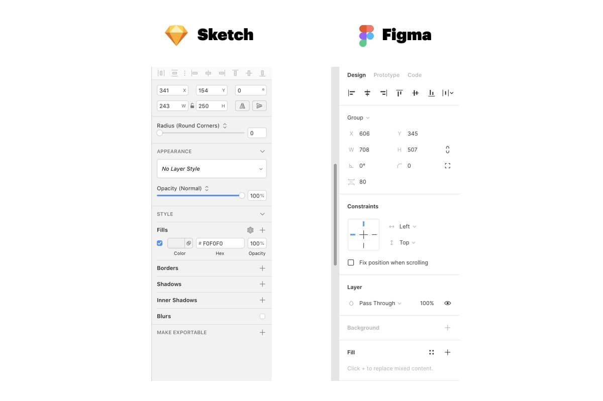
Figma smartly decided not to reinvent the wheel, so their UI is broadly comparable to other design tools. More importantly, Figma’s UI is similar to their primary rival – you won’t be completely lost coming from Sketch.
However, similar doesn’t mean the two are equally as good. A year ago, when we made the switch, Figma’s UI was noticeably unpolished. After a subsequent redesign, that UI became even worse in some respects, such as low contrast and blind controls.

Feature shortfall with Sketch
The inability to find common functions, e.g. search in layers, provoked a degree of rejection among our peers. Later on, Figma filled in some of the gaps, but there’s still no parity with Sketch. To illustrate, Figma is missing (or intentionally descoping) some generic functionality like “search in layers,” causing predictable frustration.
Absence of plugins
Sketch has a modern, mature plugin ecosystem. While Figma is rapidly catching up, they didn’t have any plugins at all when we switched last year. It was a huge bummer to lose all the nice features and automation we had from plugins in Sketch.
Compared to all the problems mentioned above, plugins were not an insurmountable problem, but their absence added a bit more friction to the process of adoption.
What we’ve learned
After switching the primary work tool for the relatively small but highly distributed design team, we’ve learned a few lessons.
Start with why
It’s really important before kicking off any work to deeply ask yourself: why do you feel the need for this change? Is it just curiosity and excitement or there is a clear push/pull in your design org for a new tool?
Consider it as a project
Depending on the size of your design team, you may not be able to flip a switch and head over to new software immediately. The more complex your org is, the more important it is to pick the right approach. We tackled the problem in the same way as any other work project, which helped to ensure everything is thought through well. Besides that, it’s important to find allies in the organization who will share your ideas and help to influence stakeholders.
Test it yourself
This sounds obvious, but nevertheless: no matter how exciting the new tool may seem in theory, you’ll never know if it’s the right fit for your org until you try it for real. Port some assets in and carry out your next project from start to finish.
“You won’t be as proficient in the new tool from the beginning as you were in your previous one, but you’ll see whether the pain is too high”
Stretch it hard and see where it breaks. You won’t be as proficient in the new tool from the beginning as you were in your previous one, but you’ll see whether the pain is too high.
Run a trial
Switching your primary work tool is not for the faint-hearted, so don’t flip the switch right away – allow for a transition period. Use that time to collect candid feedback and stay objective.
Support your team
As designers start to rely on the new tool completely, it becomes more crucial than ever before to have consideration and empathy for your teammates. Make sure your peers know where to address their questions and provide them with all necessary support and education.
Check the community
There are going to be situations when you don’t have an answer. Don’t struggle! Like many tools, Figma has a wonderful community of users where the majority of answers can be found. They also have a responsive support team, which can help to clarify the unknowns.
The tools we use shape our work
It’s important to recognize that the tools used by one team may not suit the jobs done by another team. And just like any tool, Figma may or may not be the right fit for your team.
It’s a truism that the tools you use will shape the work you do – often in unpredictable ways and with unforeseen consequences. No matter the nature of the work, it’s vital to be thoughtful and careful when planning to switch your primary work tool, and strive to consider ways in which your output might be affected. For us, the benefit of a truly collaborative tool, helping to harmonize the work of designers spread across the globe, was absolutely worth the inevitable headaches caused by embracing change.


