Fresh perspective – how we invented our Custom Bot chatbot builder
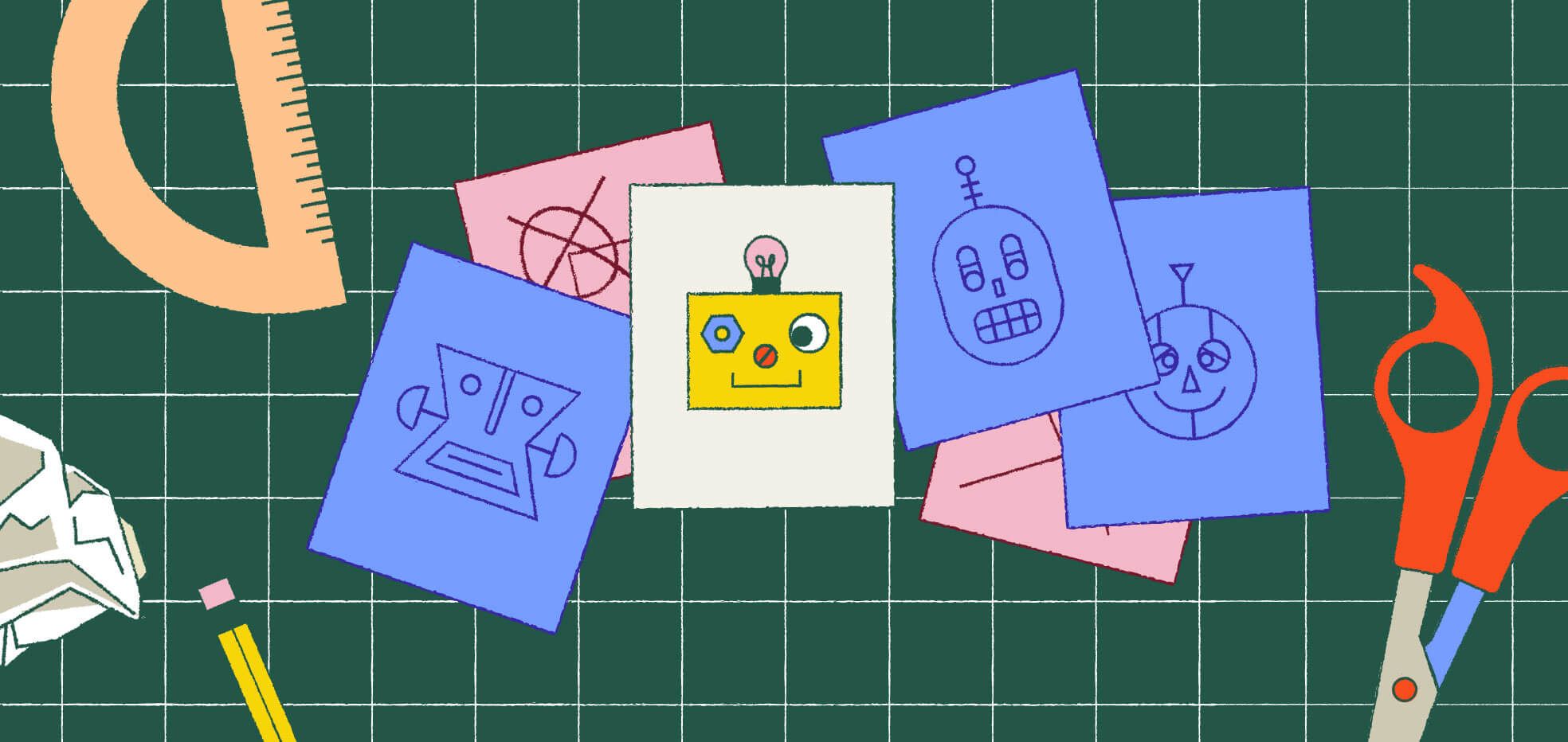
Main illustration: Olenka Malarecka
A unique characteristic of our species is our enduring drive to represent the infinite richness of the real world in other mediums – from art to mathematics, we strive to capture and record the world around us.
For instance, one of the most distinguishing aspects of Renaissance art was the gradual evolution of techniques to convincingly represent the 3D world on flat surfaces – elegant, clever tricks such as perspective and chiaroscuro developed slowly as the result of experimentation by a huge number of artists over many decades, until those techniques came to seem inevitable and obvious. We had passed a threshold in our ability to represent the real world.
Capturing the complexity of conversations
How can we represent all the rich complexity of human conversation?
Today, we face different types of representative challenges, as we discovered when we began the process of designing Custom Bots, our recently released chatbot that allows people to design highly customizable conversation flows, or paths, for the bot to interact with customers and leads, all without needing to know any code.
The challenge was significant – how can we represent all the rich complexity of human conversation, with its bewildering multidimensionality, in a form that users can easily grasp and build with. Flattening the infinite dimensions of a human conversation into something that can be programmed visually poses all sorts of incredibly complex questions. Tackling that was immensely difficult, and immensely fun.
The first fork in the road
The beginnings of projects are always filled with a bit of chaos and ambiguity. To start clarifying, we faced our first run against complexity as we contemplated the high level structure our bot builder would take.
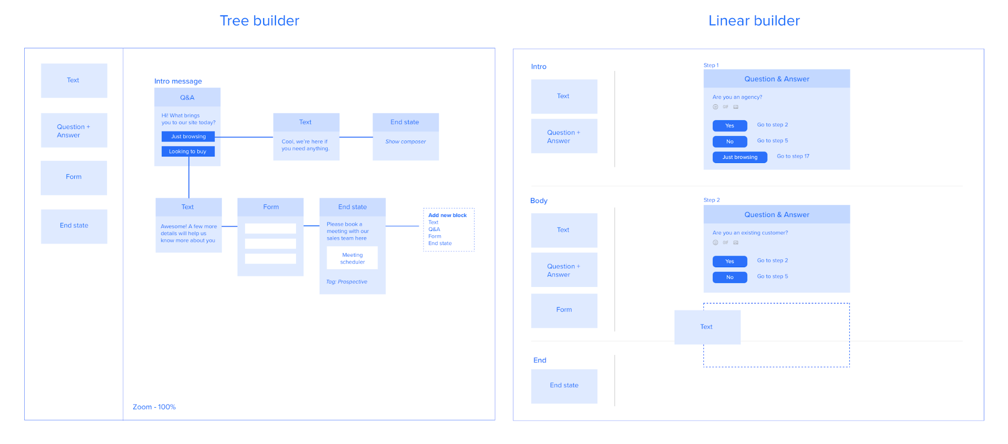
We were faced with two options. One was a tree-like builder, mapping directly to the way customers sketched out their conversation flows on paper. While the direct mapping was a huge plus, we realized this layout quickly became overwhelming with larger, more complex flows that our customers wanted to build – it meant that set up and ongoing maintenance could be challenging.
As we were optimizing for clarity and consistency in all cases, we ultimately decided on another approach – a linear builder, which felt both simpler to understand and maintain, and more in line with our design patterns.
Building on this approach, we broke down our linear builder into two key aspects:
- A “nav” or bird’s eye view, so teammates could quickly grasp the entirety of the flow
- An “editor” or focused view of part of the flow, so teammates could zoom in and manage any part of the conversation
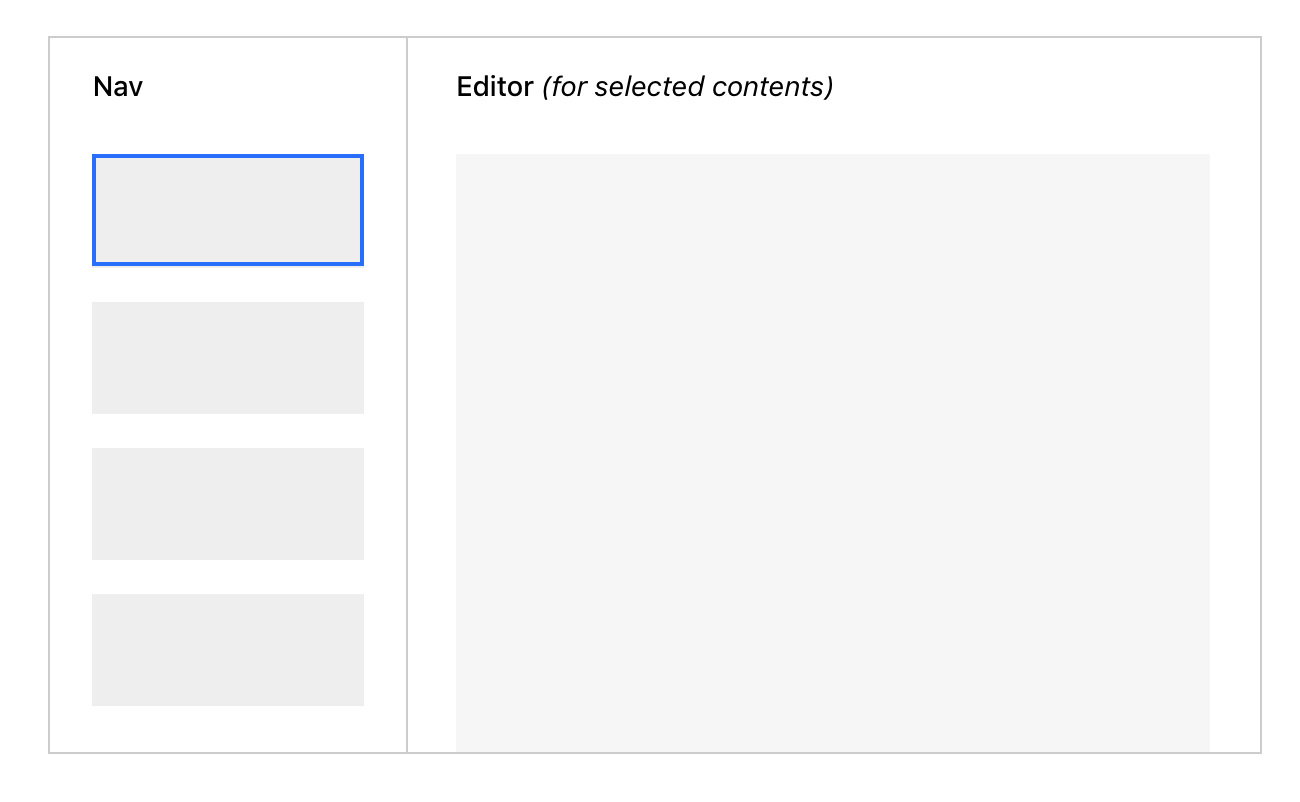 The two views of the linear Custom Bot builder
With those foundations in place, our main challenge was how to help teammates intuitively build and visualize complex flows within this linear structure – condensing a multidimensional conversation flow into a flat one-dimensional view.
Building from the ground up
At Intercom we think in systems, so to begin we asked ourselves what were the core objects that would make up this bot builder? We considered the smallest element here to be a single piece of content that could be sent by a bot in a conversation: a chat bubble, reply buttons (that could branch the conversation in different flows), an attribute collector and an app.
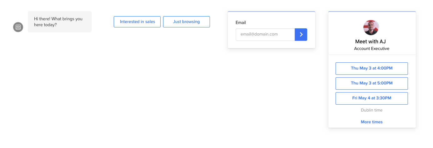 The different elements that a Custom Bot can send in a conversation: chat bubble; reply buttons; attribute collector; and an app
Paired with some logic here and there, these elements could be grouped together in different ways, and then connected flexibly to create a full conversation flow. Spoiler alert: the way we grouped together these elements was the crux of our final solution.
Starting simple: our initial approach
In some of our earliest design explorations, engineering constraints limited how we could group the different elements of a conversation. Keeping to the system of our linear builder, our approach to organizing these groups was simply to arrange them in a flat one dimensional list, and show how each group could lead to different stages of the conversation flow through concepts like numbers and lines.
This was the simplest first solution, which mapped to how we represented these structures in code, and functionally it could allow teammates to flexibly create the flows they wished.
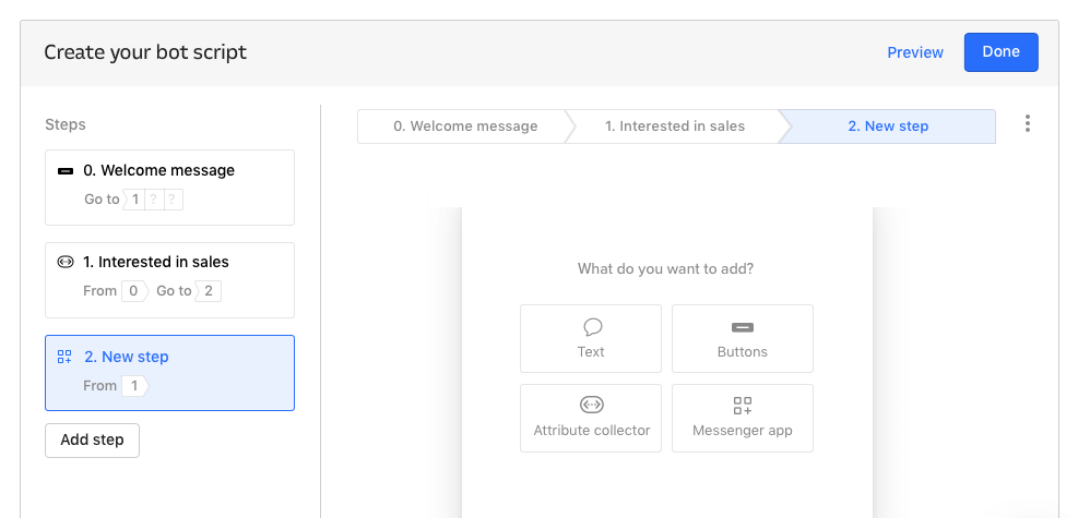
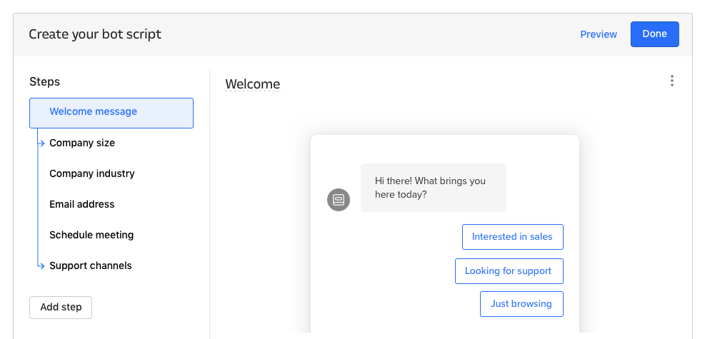 These designs used a flat, one-dimensional list showing paths with numbers and lines
However, when we tested these ideas, we found that teammates had a tough time translating the flat unorganized structure into the rich conversation flows they had mapped out. The linear list made all the groupings feel equal so it was difficult to see relationships and hierarchy – all in all, the navigation system felt too reductive in its representation of the conversation.
Teammates said they wanted to see a nested structures to represent the different paths a conversation could take more closely. The lines to indicate relationships were also either confusing or unnoticed by teammates, so we deemed them a bit over-designed, more clever than functional.
Adding complexity to clarify
The initial direction we explored had fallen too flat, and so we realized we needed to add a sense of depth with the intricate combination of more extensive groups of elements to better match the way teammates naturally understood the different paths in their flow.
To clarify and simplify our core experience, we actually ended up introducing more system complexity as a way to structure how elements were grouped together. As John Maeda says in his book “Laws of Simplicity”, “establishing a feeling of simplicity in design requires making complexity consciously available in some explicit form.”
To do this, we made three significant decisions:
- We paired a letter with the title of each path as a shorthand to refer to the grouping, and to help teammates mentally chunk content, helping them identify the structure of conversation flow and key anchor points.
- We also worked through some of the initial engineering limitations, allowing us to group together multiple chat bubbles and attribute collectors – while it added project scope, ultimately allowed us to offer a more understandable experience.
- Finally, we created limitations such as each path could optionally end with branching buttons which point to another path, or with follow up actions.
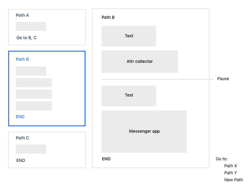 A letter is used as a shorthand for each path
These constraints were added rulesets that meant additional logic for us to design and engineer, but we realized we needed these necessary complications in our system to scaffold the experience for teammates.
From our research and testing with beta customers, we found that developing these constraints actually shielded teammates from complexity and helped them manage their full conversation flow within our linear bot builder UI in a sensible manner.
The design itself
After nailing down the core system of the page and validating the direction with early user research, we polished up the builder’s visual and interaction details.
We designed the navigation of the bot builder to function as a kind of preview for the full conversation flow, so we structured it in an object-oriented way such that each path visually represents a minimized version of the full path shown in the editor on the right. Earlier iterations of this design also explored visual differentiators for different elements in the nav, but in our final approach we stripped back any unnecessary parts of the UI so teammates could better focus on the conversation paths themselves.
Here is the final result:
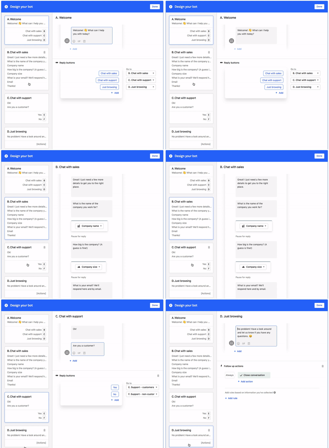 Final design of the Custom Bot builder
Embrace your constraints together
This project was challenging because of the nature of the problem we were seeking to solve – finding a way to represent the complexity of human conversation, or at least a simplified version of a human conversation, in a flat, visually comprehensible manner. And yet, it also had to encompass enough flexibility that it could be customized by the user.
Key to overcoming this challenge was identifying the ideal constraints, and reducing scope to meet them. It was a mammoth design challenge, but the process highlighted how engineering, product and design all need to be partners in working out those constraints and reducing that scope.
As we all discovered, it’s okay to wrangle with complexity sometimes. Designing something simple doesn’t mean it’s not powerful under the hood. Indeed, as those pioneering Renaissance artists once proved, the more invisible the technique appears, the more inevitable the result will seem.

