
Designing Series: How we built our customer messaging orchestration tool
Main illustration: Joshuah X. Miranda
Last week we released Series, a brand new way to orchestrate customer messaging campaigns in Intercom.
Series is a visual campaign builder with a very flexible and interactive design – you can easily build out sophisticated customer journeys using the intuitive drag-and-drop interface, making your customer engagement campaigns much more powerful and effective.
“Series is so intuitive that it feels natural and obvious – and yet, the design was not inevitable at all”
Indeed, Series is so intuitive that it feels natural and obvious – and yet, the design was not inevitable at all, as we considered numerous different approaches to solve the problem of orchestrating customer messaging.
Here, I’ll explain how we weighed up those different approaches and how we arrived at our final design – and I’ll share some of the lessons we learned along the way.
Our first customer messaging solution
In 2016 we released Smart Campaigns, which addressed the same problem of message orchestration.
We took a very opinionated approach with Smart Campaigns, putting simplicity at its core and hiding the underlying logic of the messaging customer flow – as such, we eschewed the visual builder approach. You could just craft each message, put them into a campaign and relax, as we’d automatically determine how to send those messages to the right person at the right time.
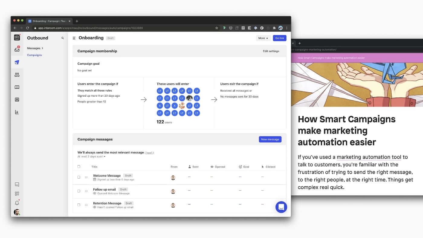
This approach resonated with a number of customers. But with time, we found out that for many others, instead of making things easier, it made them more complicated – we had hidden too much of the logic behind the flow of messages.
When describing the process of creating their campaigns, many customers mentioned that they start by planning out their orchestration visually in digital tools or on a physical whiteboard.
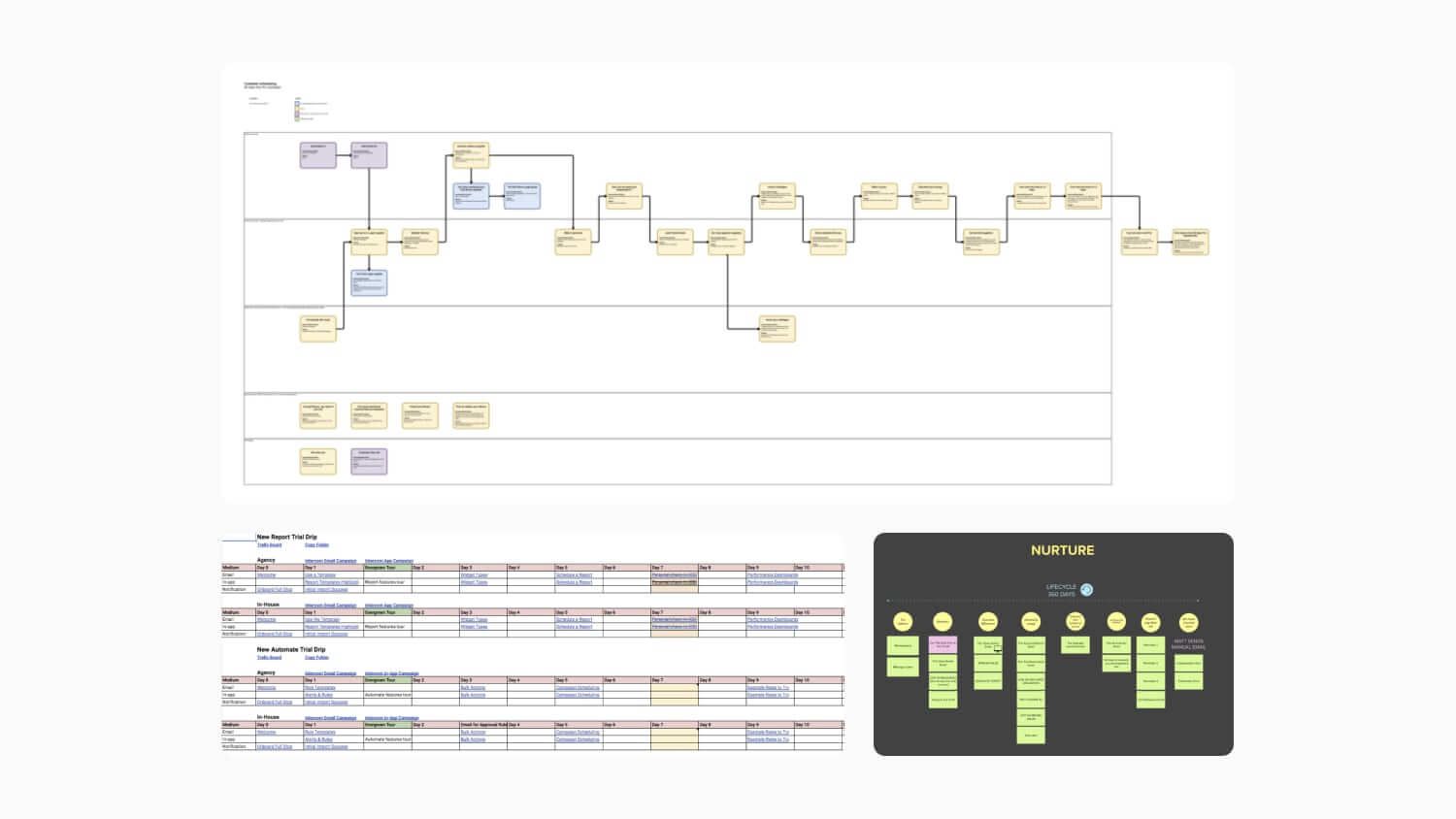
Some of the visualizations our customers shared with us
This visual approach would give them confidence in how the orchestration should work, but afterwards they had to spend painstaking hours trying to “translate” those visual flows back into a non-visual Smart Campaign.
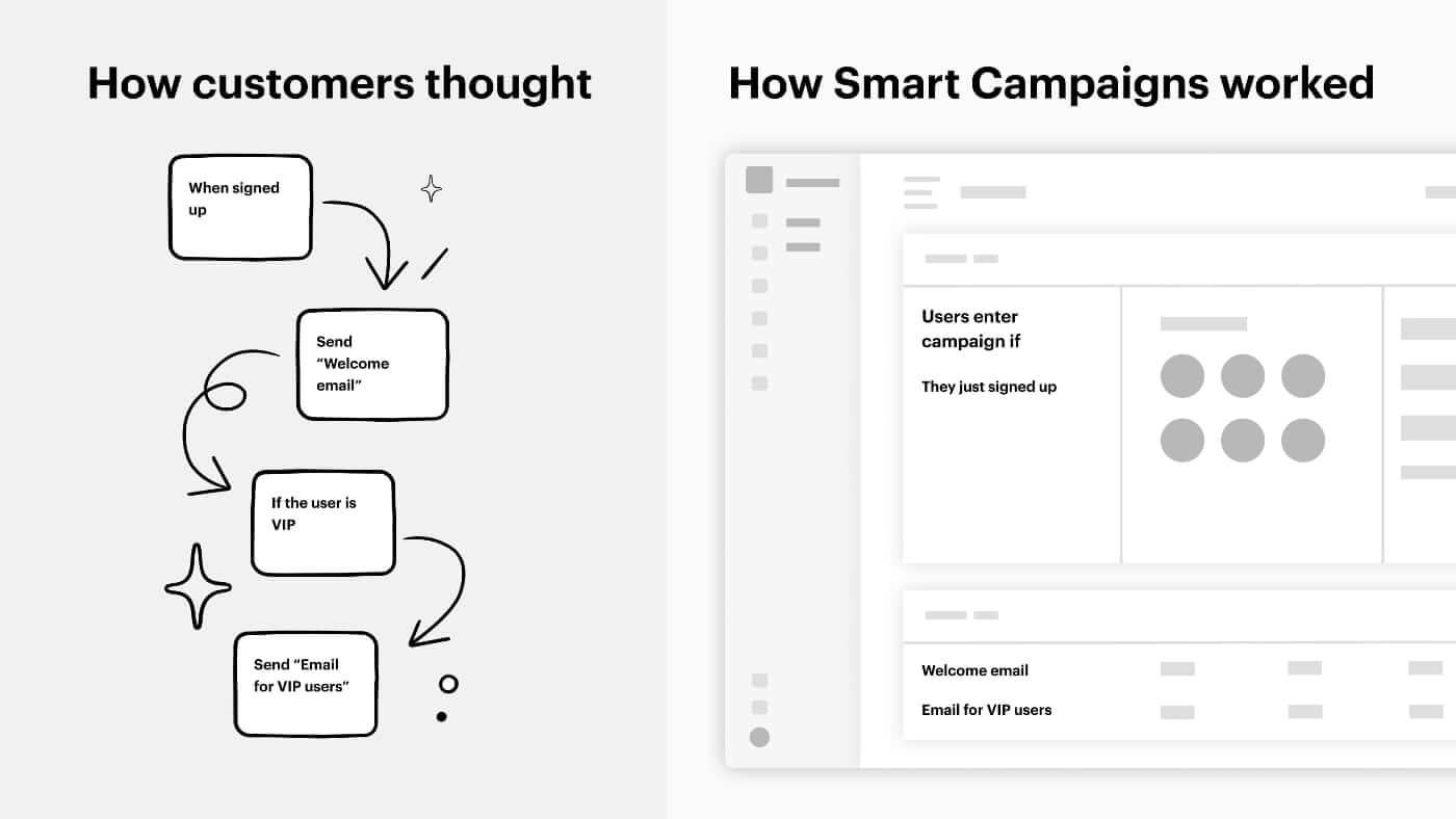
Customers were getting lost in implicit logic and struggling to understand their orchestration, which led to problems with adoption and churn. We knew something had to be done.
Exploring the future of orchestration
After many deliberations, we decided to go back to square one and think about the future of orchestration in Intercom and what it could look like instead.
We ended up evaluating a number of key directions:
Direction 1: Evolving Smart Campaigns
It seemed the simplest thing we could do was to spend time addressing each problem with Smart Campaigns.
In theory, if we could make things easier to understand in some places and more explicit in others – the idea being we would be able to fix everything with evolution, instead of revolution.
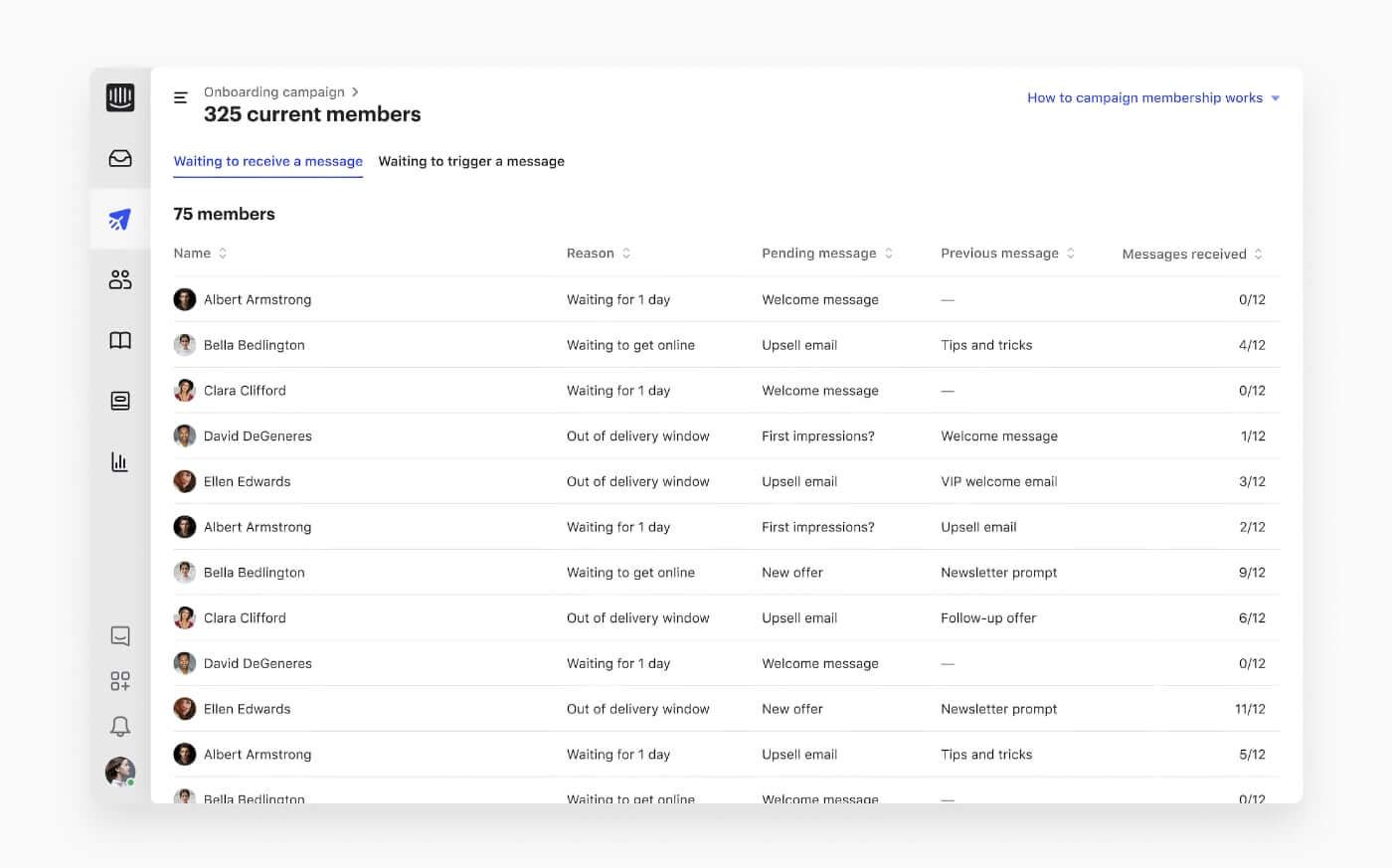
Direction 2: Creating a rigid visual builder
Alternatively, we could start looking beyond non-visual flows and provide a visual builder, but limit its level of flexibility.
By being visual, a rigid builder should be more understandable, but, similarly to Smart Campaigns, by not providing a lot of freedom of interactions, it would make the setup quicker and more straightforward.
Direction 3: Creating a semi-flexible visual builder
Our third direction was to take that visual builder concept, but bring it up a notch by providing more flexibility, while still maintaining the structure.
With this approach it would be possible to move everything around and have a higher level of freedom, but at the same time there would be a predefined structure to ensure the campaign building process remained straightforward.
Direction 4: Creating a fully flexible visual builder
Finally we also looked at a completely flexible approach that would behave just like those digital tools and physical whiteboards that customers were originally using to create their orchestrations.
It would take a 180-degree turn compared to Smart Campaigns and embrace the fact that in order to create an understandable orchestration, people required a full freedom of actions: they needed to be able to place everything where they wanted and how they saw fit.
Gaining confidence in the direction
In order to make a confident decision on which direction out of those we should pick, we ended up doing three core things.
Establish guiding principle
First, to take subjectivity out of our design decisions, we aligned on the key principle to guide our thinking: “No black boxes”.
This meant that whatever direction we decided to go with, customers should know what was happening in each part of a series without ambiguity or need to guess.
“It turned out the ‘black box’ of logic hid too much, so we resolved to avoid that risk”
With Smart Campaigns we took the opposite approach and hid all of the logic to make the experience as simple as possible. This has led to customer feedback that they don’t know what’s being sent, when, how, or why – it turned out the “black box” of logic hid too much, so we resolved to avoid that risk.
Look outside your product
Second, in order to “unbias” our understanding of the problem, we decided to take in a lots of diverse inputs to guide our thinking:
- We looked through past conversations with our existing customers which helped us to better understand their processes and needs.
- We analyzed exit feedback from people who churned to understand what’s missing.
- We played with dozens of digital visual builders such as Lucidchart, Miro, Whimsical, Plectica, and many more, trying to understand what makes all of those tools great.
- We signed up for dozens of competing products to get a glimpse of what works in their solution and what doesn’t.
- We summarized reviews about each of those competitors on sites like G2 and Capterra to see what their customers highlighted.
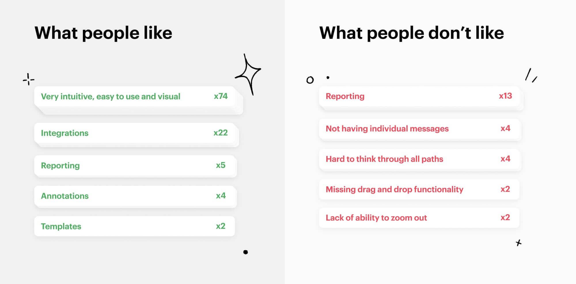
Had we chosen instead to only rely on our own thinking or only on the inputs from our existing customers, we would likely fail to understand why some people churned and why others decided to not even consider Intercom for their orchestration needs in the first place.
Test your assumptions
Finally, having made a number of assumptions based on the guiding principles and the learnings, we wanted to set time to properly test them.
After playing with a few prototypes created with Principle and Marvel, we realized that for customers to be able to provide proper feedback something more “real” was needed.
So we partnered with Eoin Nolan, a principal engineer on our team, to build a throwaway prototype of Series and later test it with dozens of customers from different segments.
The early prototype used to test Series with dozens of customers
And as a result, we managed to discover dozens of use cases, needs, and confusions we hadn’t previously considered.
Making a decision
Establishing the guiding principle, looking outside our product, and testing our assumptions made the choice of direction so much easier for us.
Regardless of improvements, the non-visual nature of Smart Campaigns was too hard to understand and too far from people’s workflows. Rigid visual builders failed based on tests and feedback in the market. The semi-flexible approach ended up confusing customers more than helping them.
Contrary to all of those, the flexible visual builder ticked all boxes. It was understandable, it resonated with the mental model of the majority of people in the market, and it tested really well.
The final version of Series
Lessons learned on this journey
There were a number of lessons to take away from this process:
- Even though iterative improvements to existing products are usually a safer way to solve problems, you need to be aware that, if the foundations of those products are broken, you will quickly hit a local maxima. Taking a step back to understand a big picture may allow you to get to a much better place.
- Sometimes it’s worth looking beyond challenges only your existing customers have. Consider opportunities that may lie in understanding people who chose your competitors. Doing that may dramatically increase your product’s adoption and activation, while preventing churn.
- Getting enough resources to experiment and test is not always easy. Yet making wrong choices may cost much more in the long run. So consider increasing the level of realism of your prototypes, even if that would require building something bespoke. Deeply integrating feedback loops into the process may give you the level of clarity that would be otherwise hard to get.
Ultimately by going through this process, we were able to achieve a much more objective confidence that Series would be the easiest, most flexible and, hopefully, most pleasant way for businesses to orchestrate their outbound communications. Give it a try.


