Know Your Customers and How They Decide

Everything you design—from slide decks to email newsletters, from marketing sites to company t-shirts—has a goal, and that goal is to get someone to decide to do something that benefits you or your company.
To achieve this with a design, you need to understand two variables: who are they, and how do they make their decisions.
Who are your potential customers?

What your customers have in common, more than demographics or daily routines, are jobs that they need done. The definition of a job can be as abstract as “I am bored on my 40 minute subway journey every morning“, or as well articulated as “I need to know what my employees are doing with the time I’m paying them for“.
The first job is quite vague, so there are many unrelated competitors: Quora, Email, Twitter, mobile games, newspapers, conversation, Facebook. All of them can potentially solve a commuter’s boredom, yet if you try to find a common category they just don’t share one.
The second job is well specified, so all the competitors are very tightly grouped and all pitch themselves along similar lines. Time tracking is a very well understood task, users know what features they want from it.
Ignore Non-Consumers

When your product is tied to a well specified job, marketing becomes less about creating demand and more about creating awareness. Someone arriving on your site either needs time tracking or they don’t. If they need it, you need to be confident that you’ve designed a site that convinces them to hire your product.
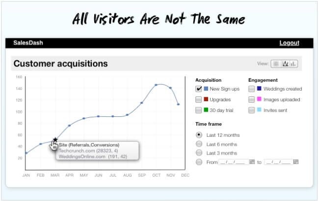
If they don’t need it, then your best hope is that they will understand what you do and maybe tell their friends about you. We see this all the time online when a product is linked up for the wrong reasons. If a web app for wedding discounts gets Techcrunch’d they’ll get heaps of traffic, but most Techcrunch readers don’t have the problem of finding wedding discounts. It’s likely they won’t hire the product, regardless of hype. This causes alarm
Studying these non- or never-gonna-be consumers skews all of your conversion and possibly your A/B test data, and leave you scratching your head.
37Signals received 105,000 visits from Hacker News and won 14 paying customers. Amy Hoy has had Gary Vaynerchuk tweet about her products to over 900K people, many times. The effect? Negligible.
Attracting the wrong type of visitors leaves you with dirty data which can skew your tests or lead you to believe that your site needs a new design. Who can argue with data, right?
You can argue that all of these visits bring a value other than conversions, that they draw awareness of your product and brand that can’t be easily tracked. This is the fallacy of funnels. However if you are studying conversion rates then don’t look at a global average, study it by referrer. That’s the only place where there’ll be insight.
Pair Your Product With a Problem

If you pair your product perfectly with the problem that it solves, then the role of marketing shifts from generating demand down to generating awareness. You no longer have to convince people that they want your product. You just need to help them decide that yours is the best one. In the example above, soup companies found that simply pitching “cup a soup” wasn’t working as there weren’t too many occasions that people felt they had a problem that it would solve. By advertising it against a daily problem (that is, a slump in productivity in the afternoon), they saw an immediate increase in sales. People had that problem every day, and now they had a product saying it could help them.
How They Decide

To influence customers’ decisions, you need to understand the decision-making process. Customers can decide quickly or slowly, and their decisions will be guided by facts or by emotions. Future Now published a study where they joined these two axes together to gives us the four ways that people decide. You can’t categorise people in one of these four ways for everything they do, as a decision process is always unique to any given problem. For example, when I purchase a new television, I’m slow and logical about it; when I buy a flight, I’m fast and logical about it. Clothing purchases are typically fast and emotional, and luxury items (cars, jewellery, holidays) tend to be slow purchases based on qualitative data.
Designing a Marketing Site for Different Types of Decisions

All your customers don’t fall into the same category of decision-maker, so you need to cater for each of them on your landing page. You should have information supporting all types of decision processes, though you should optimize your landing pages for your most frequent customers. For example, let’s look at Dell and Apple.


It’s also worth noting that Apple pitch different products towards different types of decisions. For example, the Macbook Pro gives specs in the tagline, whereas the Macbook Air speaks emotively about the product you will love.
These decisions can apply to smaller sections of your site too. We’ve all drawn a big box on a wireframe labelled product shot, but few take the time to explain what type of product shot. There are 7 different types of product shots you can show, and each has their place depending on how you’re selling.
There’s No Right WayTM to Design a Marketing Site
Beyond common sense and good design there are no tips and tricks that will guarantee you conversions. If something works well for your competitor, it’s usually because they aligned their product with a problem, and designed a site that worked well for the types of visitors they attract and the way they decide.
Copy that process and you’ll do really well, but copy their design and you’ll get what you deserve.


