On magical software…

Software is most impressive when it gives you things for free. When just a simple few taps or clicks delivers instant value you’re in awe. It’s magical. And then you come to expect it.
Web 2.0 era products can be characterized by users entering data into unnecessarily large text areas, and then viewing it on the following screen displayed using badly chosen gradients. At the time it was amazing, but today not so much. The bright colors & big font style of these products stood out dramatically at a time when every product looked like a dreary Windows 2k/XP settings screen. The “magic” back then was that you could “access your data everywhere”, with “no need to install software”. That magic grew old, it’s now assumed behaviour.
Product design is at core about cost-benefit analysis. How much does the user have to do, versus what benefit do they get in return. Whenever you find a way to dramatically reduce the cost, you’re creating something magical. Lately I’ve seen three ways software feels magical. The new magic, if you will.
1. The era of Uber-fication
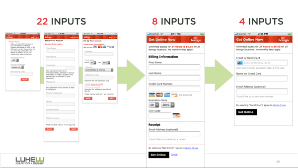
We’re in a new era of customer expectations. Long messy processes are now dated, as Luke W shows, every flow needs to be pared down to its minimal task.
Killing unnecessary form fields and aligning text areas has been the bread & butter of UX designers for about a decade. But this is the application of UX principles, it alone never created magic. The magic comes from using smart context-aware defaults, offering restricted choices, and using single purpose screens to reduce your product to a single step.
An example: In a world pre-Uber, the design of a “call me a car” app would default to some version of this…
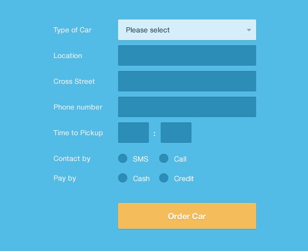
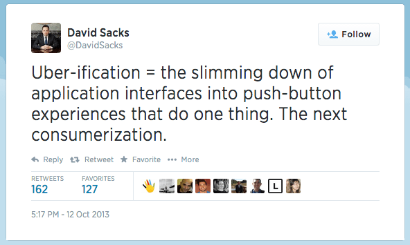
It’s not wrong, but it’s not magic. In a world post-Uber if a task isn’t do-able in a tap or two it’s dead to us. David Sacks called this in 2013, labelling it Uber-fication, and the process is well underway.
Today a single tap or swipe gets you a date, some flowers, a car, a movie, a restaurant, even a hotel. After that it’ll get you a job, an apartment, a wedding, even a dog. It goes on.
This is your life, and you’re living it one tap at a time.
For business products Uber-fication isn’t always immediately achievable. Most mature products must unbundle first, in effect replacing their primary navigation choices with a set of single purpose apps. Much like on the consumer side, where Facebook unbundled into Messenger, Pages, Paper, and now Slingshot, we’ll soon see established B2B companies ship suites of standalone apps.
Unbundling of the enterprise is still at an embryonic stage with few companies making significant movements. Google’s productivity tools (Gmail, Sheets, Docs, Hangouts, Drive) are the earliest example, but there will be more; large suites of software decomposed into focussed apps designed for specific jobs, all held together by a common identity system.
In short, if there’s repeatable behaviour in your product, whether it’s checking in to a place, or checking in on a project, placing a bet, sending a message, ordering lunch, or running a report, you should strive for it to be nothing more than a couple of taps. The user’s context (time, location, device, previous actions), combined with behavioural analytics and user preferences can all be combined to offer smart quick actions.
2. The end of data entry
For as long as the web has existed, products have asked you to enter data about yourself or your business. That data already exists in lots of different places. Expense trackers ask you what you’ve spent recently, reading apps ask you what books you’ve bought, project management tools ask you who you work with, discussions sites ask you what you interests are, marketing products ask you who your customers are. Data entry is a fundamental component of web products and it is clunky. Thankfully it’s going away.
The first improvement was the shift from recall to recognition. Rather than asking users to recall and enter items, you simply let them pick from options.
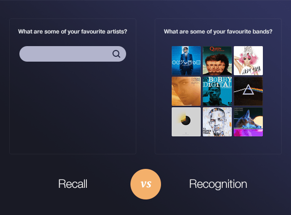
That is now the least we expect. The real magic comes from removing these steps entirely. Want to know who my friends are? Connect to my Facebook. Want to know who I work with? Use my email domain. The money I spend? Connect to my bank. My revenue numbers? Just connect my Stripe account. The trips I’ve booked? You’ll find the receipts in my email, same for most things I’ve bought. With products like Gmail launching powerful APIs, the opportunities become endless.
Sometimes the data your product needs isn’t readily available. In those cases create the simplest integration possible (for your customer) to get it going forward. For Intercom that means we offer a tiny snippet of code that is installed once, and removes the burden of data entry from that point onwards. There is no “New user” form, they’re automatically gathered now.
3. Ambient awareness
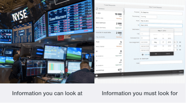
Most products are set up as destinations, places you go when you need certain discrete pieces of information. You buy them because they collate data, insights, answers and actions, but unless you chase them down those answers will sit on a shelf untouched. Much as living next door to a library doesn’t make you a regular reader, having data on a reports tab in a product doesn’t make you any smarter. Creating a destination your users can visit for insight is different to creating a system that ensures your users get insights. This relates closely to Paul’s argument for designing systems, not destinations.
As a customer, if you’re using a product that collects information, whether it’s user data, analytics, marketing figures, sales results, or more, it’s because you believe that the data and its analysis is important. If you really believe the analysis is important then it should come to you automatically, there should be no onus on you to go chasing it. As a customer ask yourself “How I can make sure the right people always get this information at the right time with no input required?”.
As a designer, if you’re creating a product that generates valuable analysis, you must also design how customers will receive this analysis with no actions required on their part. Customers only find your product valuable when they benefit from it. It’s a metrics-driven mistake to tie that benefit to “usage”, or even to equate usage with “logging in”, and thus require users to visit your product daily. Ask yourself “How can I ensure that every users gets value from this product, even if they forget to log in?”.
In Intercom we’ve only started scratching the surface of this value. One clear win is our daily report which tells every Intercom customer how many new users signed up yesterday, which valued users are slipping away, and who is still actively using the product after one year. More about how we designed that here. For your product this might mean deciding how, when, and what systems you integrate with, it might mean push notifications, or SMS alerts, it could mean daily reports, it could even mean delivering pre-configured Raspberry Pis to your premium customers to help them set up dashboards. The one thing it doesn’t mean is sticking your most valuable insights behind filters buried 14 clicks deep in a product rarely visited. That’s not magic at all.
Recap: Kill data entry, deliver value automatically, and reduce repeated actions to a tap or two. Magic, right?
Want to read more of our product best practices? Download our free book, Intercom on Product Management. It’s recommended by folks like Ryan Singer, Hunter Walk, and Dharmesh Shah.


