Prioritising Features: Who’ll Use It & How Often?

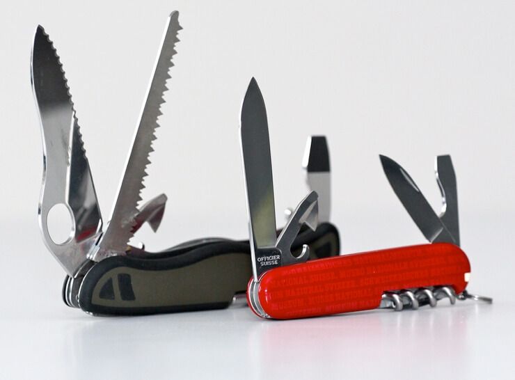
The Swiss Army knife is a remarkable product. By combining many products of low utility, it becomes a product of some utility. This is one of the rare occasions where a core product gets better by adding mediocre features.
Some look at a Swiss Army knife and see power and flexibility. They argue that it can do everything. Why buy a USB stick and a nail clippers? Just get the Swiss Army knife that has both!
Others see a collection of useless tools. A two inch saw. A blade that Crocodile Dundee would laugh at. A dirty toothpick, a tiny scissors, the worlds worst screwdrivers. The killer feature for the knife is portability. This model doesn’t work as easiliy for software. It’s not feasible to carry around eleven separate tools, but it’s very easy to carry about thirty or forty apps.
There is lots of software claiming to be a Swiss Army knife. You know the types. “It tracks bugs, time, feedback, and even project updates.” Sometimes being bloated is the killer feature. This is something many folks miss when they slam Word or Excel. They’re successful precisely because they can do everything, albeit in dismal ways.
When you’re drawing the line around your software, be sure you’re not leaving in marginal utility features in an attempt to add more value. These little wannabe-features hang around unloved, bloating your app, hogging the UI and adding to maintenance costs. Microsoft might not have to worry about horrendous UI, high support and maintenance costs, but you’re not Microsoft. These things can be fatal to start-ups.
Prioritising Features
To make sure your features are worthwhile, look at how many of your customers will be using the feature and how often. This gives you a sense of where the value is. Let’s start with the following diagram.

Next we plot out the features being discussed, I’ve put in features from a typical project management app as an example.

It’s clear to see that some features are more important than others. Below I’ve color coded certain areas to highlight this. Note: I usually exclude administrative features, such as login, password reset, edit profile etc., and focus only on the activities the user actually wants to do.

Focus your efforts on the top right. Doubling down on those features there adds far more value than bolting on more toothpicks. If “Upload file” is something everyone uses all the time. then it’s worth making sure you’ve got a great file uploader—whether it’s drag and drop, or progress bars, or whatever else helps.
The amber sections represent danger. If you’re building features that only a small sliver of your customer base heavily depend on, your product is doing more than it should. These customers won’t be happy if you remove these features, but they’re worth very little to you. You can try hiding them behind preferences but you know where that leads.
The road to bloatware is sign posted Just this once for just this customer and you know you’ve arrived when you start telling people your product is a Swiss Army knife.
Chopping features is hard, and there’s much more to it than this post covers, but a simple first step is just “Who’ll use this, and how often?”
Image credit: Schweiz-Russland


