Intercom’s product principles: Following design fundamentals to leave space for innovation
Designers at Intercom work in cross-functional teams that strive to consistently ship great products.
We design simple systems that solve complex problems for our customers. That doesn’t mean we don’t obsess over user interfaces; it means spending time on the right things. Our strength lies in knowing when we should follow standard best practices for design and when we need to innovate and create something new.
“We try to default to existing design conventions, but if those don’t exist, or if they’re not good enough, we create something new that does solve the problem”
We believe there’s no value in innovating if it doesn’t solve our customer’s problem. We focus on the problem and finding the right design to solve it. We try to default to existing design conventions, but if those don’t exist, or if they’re not good enough, we create something new that does solve the problem.
This is the second post in a series exploring our principles. Here, Charlotte discusses our design principle of “Follow Fundamentals”.
Psychology is at the core of design
Design fundamentals are a set of patterns that are commonly followed to make products easier and more delightful to use. They are also extremely empowering for designers, enabling us to focus on solving problems quickly without getting lost in re-inventing the standards. They can take the form of visual design rules, interaction design standards, or content design best practices. Most are based on human psychology, like the Gestalt principles of perception which describe how we group certain elements together in our minds depending on how they are surfaced on an interface.

Gestalt’s principle of proximity
Design fundamentals make designing interfaces easier. For example, we know that the color red is ideal for error messages because it catches users’ attention. People find it easier to navigate through menu items if they are composed of a combination of an icon and a short label. A clear information hierarchy using font size, weight, color, and white space allows people to scan the content of a page faster.
These fundamentals can be challenged and updated. Some emerge gradually from increased usage; for example, a lot of people now expect to be able to pull to refresh a page on mobile.

Good information hierarchy makes it easier to scan the content on a page
Fundamentals are the starting point of great design
I joined Intercom after two years as a design manager, feeling it would be the best organization to get me back to designing full time. I had been overseeing a team of designers, but as is often the case in management, I wasn’t doing much designing myself. I realized I was missing my craft, and I felt I still had a lot to learn about product design – so I decided to return to an individual contributor role.
“Revisiting the fundamentals of design has helped me design better experiences and focus on innovation where it’s needed”
Thanks to strong R&D and design principles, my transition back to an individual contributor role was much smoother than I expected. Revisiting the fundamentals of design has helped me design better experiences and focus on innovation where it’s needed – to solve complex problems. I was able to deliver value to our customers only a few weeks after joining Intercom, which boosted my confidence from the outset.
We follow 9 fundamentals
At Intercom, we follow 9 fundamentals of great interaction design. We want all of our customers, new and existing, to get value from Intercom quickly. Following design standards enables us to deliver value in many ways:
Customers become familiar with Intercom more quickly
Intercom is a powerful tool that offers our customers an abundance of ways to meaningfully engage with their users, but that can be overwhelming at first – especially for our newest customers.
Using design fundamentals to build a logical and familiar structure or an iconography set is the best onboarding aid you can offer. It allows customers to apply knowledge they have gained from using other digital products, without the need for an instruction manual.
Most of our customers use a variety of tools in their day-to-day work, and are accustomed to common design patterns. Following those patterns in our design reduces the learning curve. This is why at Intercom we often take inspiration from consumer software – products people use in their everyday life.
“Changing a settings icon into something cooler and more on-brand can be tempting, but most of us are expecting the settings icon to be a cog”
Browsing a table, selecting multiple objects, tagging items, managing your account from a settings page – these are standard experiences in most digital tools, and we avoid placing a cognitive load on our customers by reinventing these well-known interactions. Consistency is important within our product, and in the way it relates to other products in the market. It makes a difference regarding accessibility as well: a lot of people rely on established digital patterns to be able to carry out their tasks online.
Changing a settings icon into something cooler and more on-brand can be tempting, but most of us are expecting the settings icon to be a cog. This is just not the right place to innovate: usability comes first.
![]()
Using familiar icons improves accessibility and can help new users become comfortable with a product faster
We innovate where it matters
We care deeply about innovation. Our capacity to know when to follow fundamentals and when to innovate is one of our major strengths, allowing us to build easy-to-use products that our customers love. Instead of spending time and energy on interactions that already exist and work well, we spend time thinking about new paradigms and features to delight our users.
I’m a member of the team that focuses on our automation products, designing experiences to help customers automate their conversations and create an amazing, personalized support experience for their end users.
“Design is about making the complex simple”
Part of my job is to make Intercom bots easy to use and understand. An example of this is Resolution Bot, which is powered by machine learning. It’s complex technology, so relying on common patterns made it easier for us to build a feature our customers would understand.
We decided to present Resolution Bot answers in a simple table, where we could have picked a more innovative layout like cards. It allowed us to easily add more complex functionalities to answers – like the ability to sort them to compare performance – in a way that makes sense to our customers immediately.

Choosing a simple, instantly recognizable table view meant that we could focus on innovative functionality
Following design fundamentals is about making the complex simple. We use recognizable patterns and experiences to empower our customers to create bots that are extremely complex under the hood. In the end, it’s our job to handle the complexity, not theirs.
We move faster
Following design standards makes us faster. Shipping is our heartbeat – software only becomes valuable when it’s delivered to customers, so we ship fast, ship early, and ship often. Avoiding reinventing common design patterns speeds up design and development.
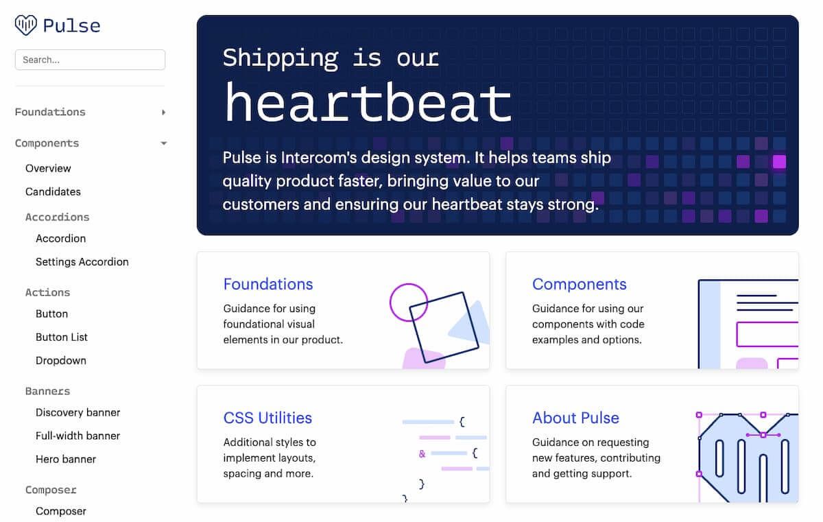
We rely a lot on our design system, Pulse, that references common patterns we can reuse across the product. When there are many designers and engineers working on features that sometimes overlap, Pulse improves consistency and helps us build things faster. We can move much faster as a team by not having to build and maintain multiple patterns and components which are similar yet slightly different.

At Intercom we use Pulse, a design system which helps us stay consistent in our design across our product
Applying design fundamentals also brings more objectivity to our design critique sessions. We go with the most common pattern by default – the one most people understand.
Following fundamentals leads to stronger design
Following design fundamentals is not a lazy shortcut – on the contrary, it respects your customers’ time and makes it easier for them to succeed.. Knowing when to follow common design patterns and when to innovate is one of our biggest strengths at Intercom. Ultimately, this principle helps to focus on what’s most important: building the right product to solve our customers’ problems.
Do you like the sound of the way the Intercom Product Design team works? We’re hiring – check out our open roles.


