Design principles: in-app messaging
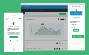
We recently released the second generation of a core Intercom feature, in-app messages. Redesigning a core-feature is always high risk, high reward. You have to be careful.
Intercom’s in-app messages are unlike other Intercom features because they are seen and used by our customer’s customers. Even the tiniest change needs to be extremely well considered, researched, and planned. So a ground up re-imagination of the feature was always ambitious.
Thus far the results have been very positive – you can see see some of the feedback here. There were lots of benefits for our customers as we innovated on three areas of in app messaging: how our messages look and behave, what they can be used for, and how customers can reply. Here’s the design principles we followed.
1. Designing conversations, not transactions
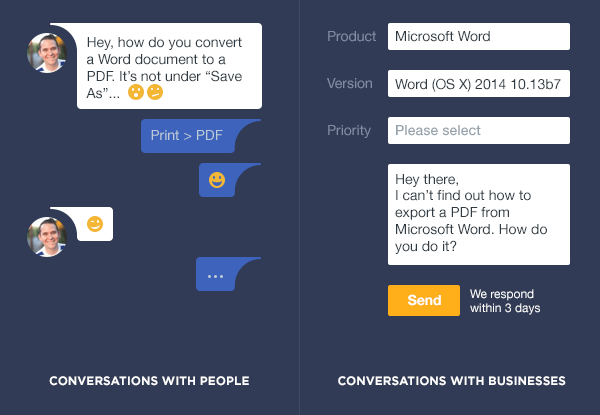
We believe in the value of personal conversations between businesses and customers. We believe the future of customer communications will be much more like the chats you have with friends, and much less like tickets, applications and transactions that you formally submit to siloed departments.
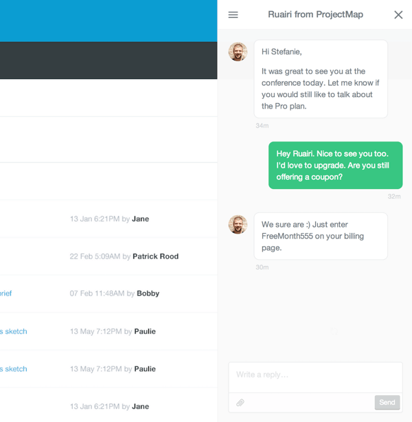
The redesign brings us far closer to personal conversations with a business and further away from the database driven web forms we see everywhere. Since messaging has displaced email and IM as the new medium of communication it’s logical to follow its conventions. Logical, but not simple.
Our In-App Messenger is designed as a layer inside an app, it’s summoned with a tap or click, and can persist while a user continues to use the product.
Designing a messaging layer that fits inside thousands of different mobile and web apps but also feels native is incredibly difficult. The aesthetic challenges are obvious: too much design and it feels foreign, too little design and it’s not attractive enough for companies to install it. Like most design work there’s a delicate balance between conflicting requirements. You can see some of the design work here.
The technical challenges are significant too. While Intercom might not have to deal with IE5 on OSX 10.6, we can’t make that assumption on behalf of all our users. There are no edge cases at scale.
2. Supporting the Spectrum of Interruption
When you create a new way to communicate you don’t yet know how it will be used, so you put it out into the world and learn.
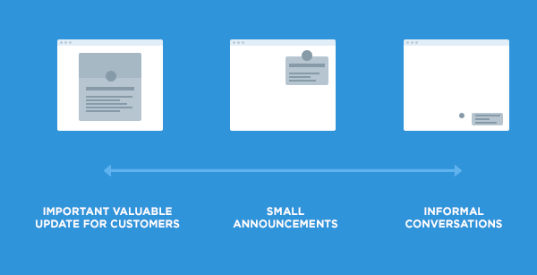
We’ve learned a lot about how businesses like to communicate with their customers. For example the importance and value of a message to a customer closely correlates with how much a business wants to interrupt the customer to send it.
If your favourite coffee place was giving away free coffee, you’d understand why a greeter said it to you right as you walked in the door. It’s valuable information, likely of interest to everyone at that time. But if you were similarly interrupted by that same greeter to announce a new blend was available, it’s less interesting, more self-serving, and ultimately less respectful.
The interruption level and value of a message live on a spectrum, so we design different styles of communication along it. As always we start with the customer experience and work backwards to the technology needed, this led us to three messages styles:

Big announcements are full screen, attention grabbing messages to let you introduce new features, share important product updates, and make significant company announcements. They often share jobs with emails, but with the added benefit of being delivered in the right context.

Small announcements: Most product and company announcements are not epic. They don’t merit a user’s undivided attention so they shouldn’t demand it. Small announcements are great for sharing an article, updating customers on a small feature or fix, or introducing new customers to a new feature.

Chats: Our least interruptive message type is also the least formal. Chats are great for starting a personal conversation with a user, but doing so on their terms, not yours. They represent a respectful “When you have a moment, I’d love to chat”, as they don’t prevent customers from using the product, and they can happily move from page to page, keeping the conversation open.
3. Supporting non-verbal communication
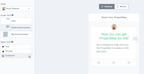
Human communication is mostly non textual, and non verbal. It’s gestural, it’s emotional, it’s contextual, it’s in the eye movements, the nods, winks, smiles, and more. A raise of a chin can mean “Another round please” in one situation or “I have some thoughts on that” in another. We want communication through Intercom to feel natural, people don’t speak in multi-paragraph discussions. It’s fluid, and fast. Our new reply types are a step towards reflecting how people often communicate; in short gestures. A quick thumbs-up or a smile is often sufficient, not to mention a lot easier to analyse at scale.
Rolling out a core redesign
Large releases require a lot of management to mitigate the risks that accompany them. To make this release smooth there were three important steps. Firstly we ran an extensive private, and then public beta which let us find the vast majority of unpredictable teething issues. Secondly, rather than bulk migrating our customers, we released it on an opt-in basis. Lastly everyone switching to the new in-apps goes through a mandatory review and edit phase where they can address any inconsistencies or issues the switchover might have created. This process minimises the fallout, ensuring that the most common end user experience is one closer to Wow, than it is to Ow.
As always in software, what you release and how you release it are equally important. Take a look.


