
Sweating the details: Designing improvements to our product navigation
We recently shipped a suite of new features to dramatically uplevel Intercom’s support capabilities, including advanced ticketing workflows and richer reporting.
In addition to those features, we also took the opportunity to improve the main product navigation of the Intercom app in order to make it more usable, intuitive, and polished.
The main navigation is a critical area of the Intercom app, and it helps ensure Intercom feels simple to use. It’s how customers access the workflows they need on a daily basis to do their job. It also shapes their mental model and general understanding of Intercom by communicating what the product is and does through how it’s named and organized.
Complexity creep
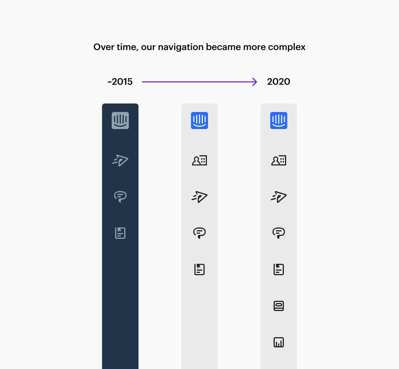
Over the years, however, a degree of complexity crept into the product navigation. We built a ton of features which made Intercom more powerful, but our navigation struggled to accommodate.
“It became obvious that we had reached a tipping point of confusion, and some simplification was required”
A couple of years ago, the navigation contained only a few items, and it looked pretty different, too. Over time we shipped more things, we renamed things and we reorganized things, and the navigation became a bit muddled.
Recently, we were hearing more and more feedback around increased levels of friction stemming from the product navigation. It became obvious that we had reached a tipping point of confusion, and some simplification was required.
Understanding the problem
Guided by our principles, we started as we always do, by gaining a deep understanding of the problem.
Initially, we believed that we needed to rethink our product’s information architecture from the ground up and explore a fundamentally different navigation pattern. However, when we talked to customers, we found that there were actually two discrete problems which were the source of most of the confusion. Those problems were that the icons were not clear and the ordering of items within the navigation was not intuitive.
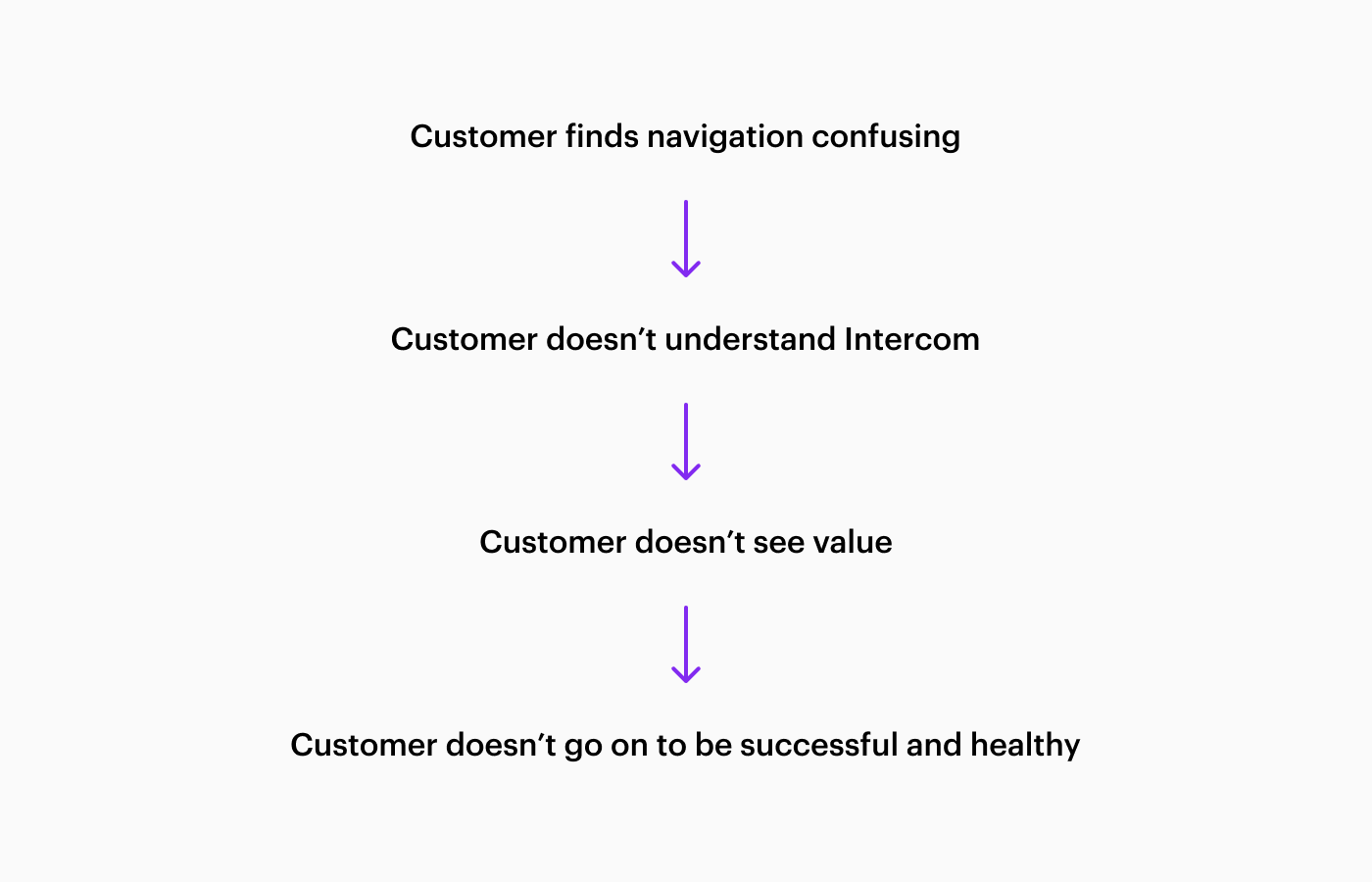
“Customers who are confused early in their journey won’t go on to understand Intercom or see value, and therefore won’t be successful customers in the long term”
This learning allowed us to focus. We zoomed into these two acute areas, and our goal became to solve for the bulk of the confusion, whilst limiting the blast radius of the changes so as not to overly disrupt customer workflows.
Another learning was that fixing our unintuitive navigation was an important problem to solve for new customers especially. That’s because customers who are confused early in their journey won’t go on to understand Intercom or see value, and therefore won’t be successful customers in the long term. Making sure that the organization of our navigation is clear is a really important lever in ensuring healthy, retaining customers.
All of this led us to the decision to make two simple, but impactful improvements: to reorder our navigation and to redesign our navigation icons.
Reordering the navigation
First, we analyzed product usage and found that Inbox was the most frequently used area of Intercom. We also knew that it’s primarily where support happens, which is the use case that we were focusing on improving with the other features we were shipping at the same time. So, because of both of these things, we reordered the navigation, to make Inbox the topmost item.
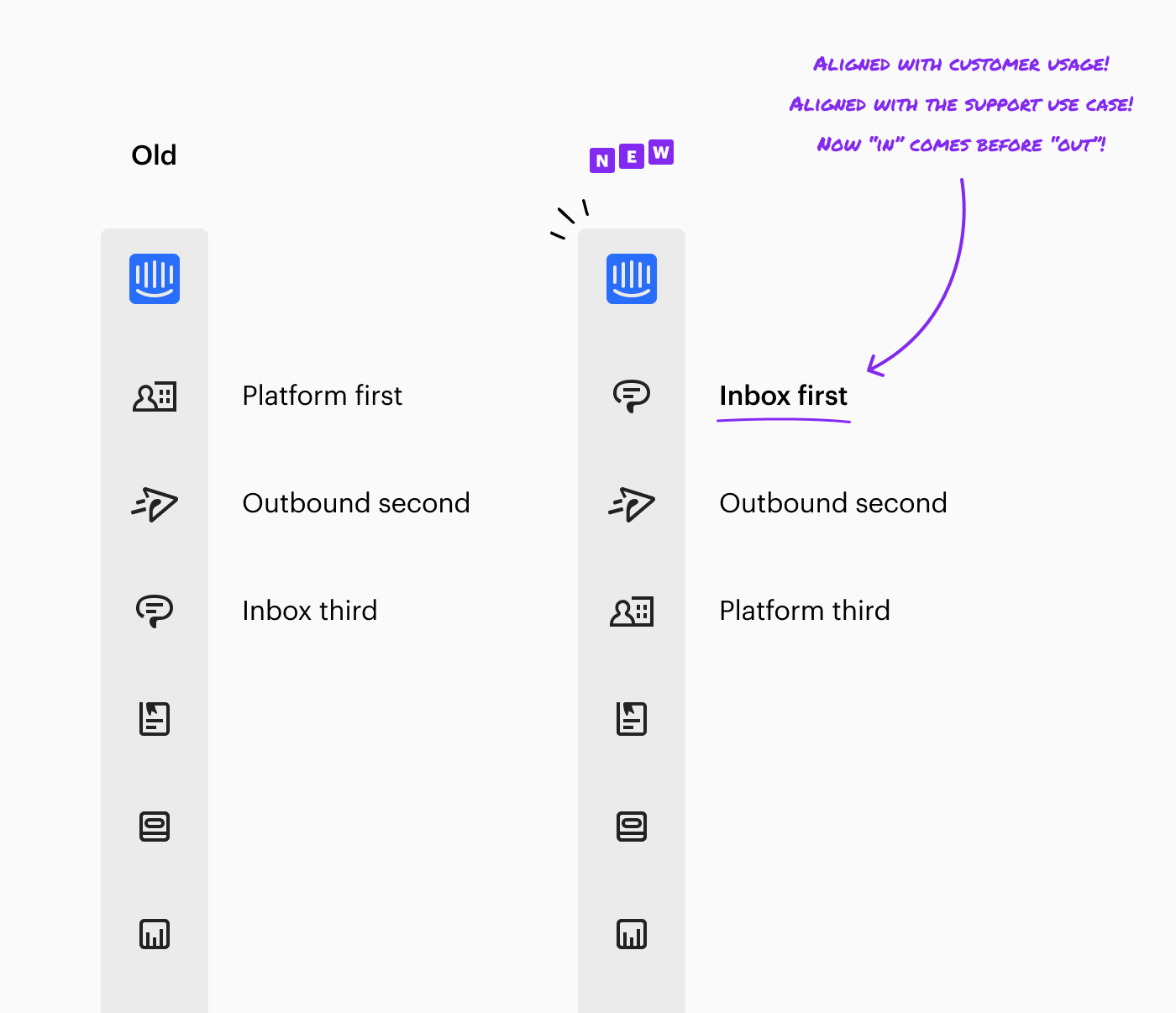
Furthermore, by ordering Inbox above Outbound, “in” finally came before “out,” which made for a more naturally intuitive ordering. Previously, we saw that the unexpected placement of Outbound above Inbox caused minor but repeated dissonance for customers as they navigated through the product — it always just felt slightly wrong.
Redesigning our navigation icons
It was also obvious from talking to customers that the icons that represented the different parts of the app needed to be much more clear.
To help us make decisions about what a better set of navigation icons would look like, we defined four principles. These principles made sure that we were solving for the actual customer problems that existed and took much subjectivity out of our design decisions.
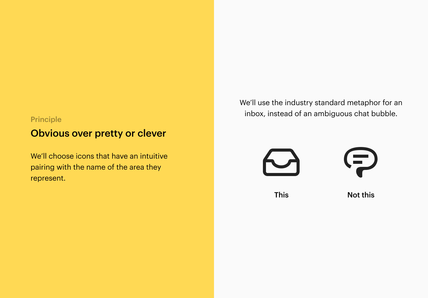
Principle 1: Obvious over pretty or clever
“We’ll choose icons that have an intuitive pairing with the name of the area they represent.”
This principle led us to use the industry standard and ubiquitous metaphor for an inbox, as opposed to a more ambiguous chat bubble metaphor which we previously used.
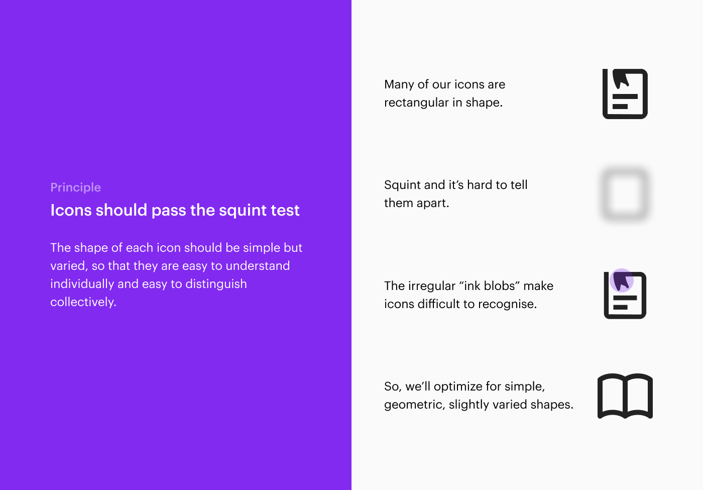
Principle 2: Icons should pass the squint test
“The shape of each icon should be simple but varied, so that they are easy to understand individually and easy to distinguish collectively.”
This principle led us to intentionally design icons of varying shapes in order to make each one more distinct at a glance, as opposed to the many similar rectangular shaped icons which we previously used. It also led us to use simple geometric forms, as opposed to the “ink blob” style treatment that we previously used, which made the icons difficult to recognize.
Principle 3: We’ll draw from our logo
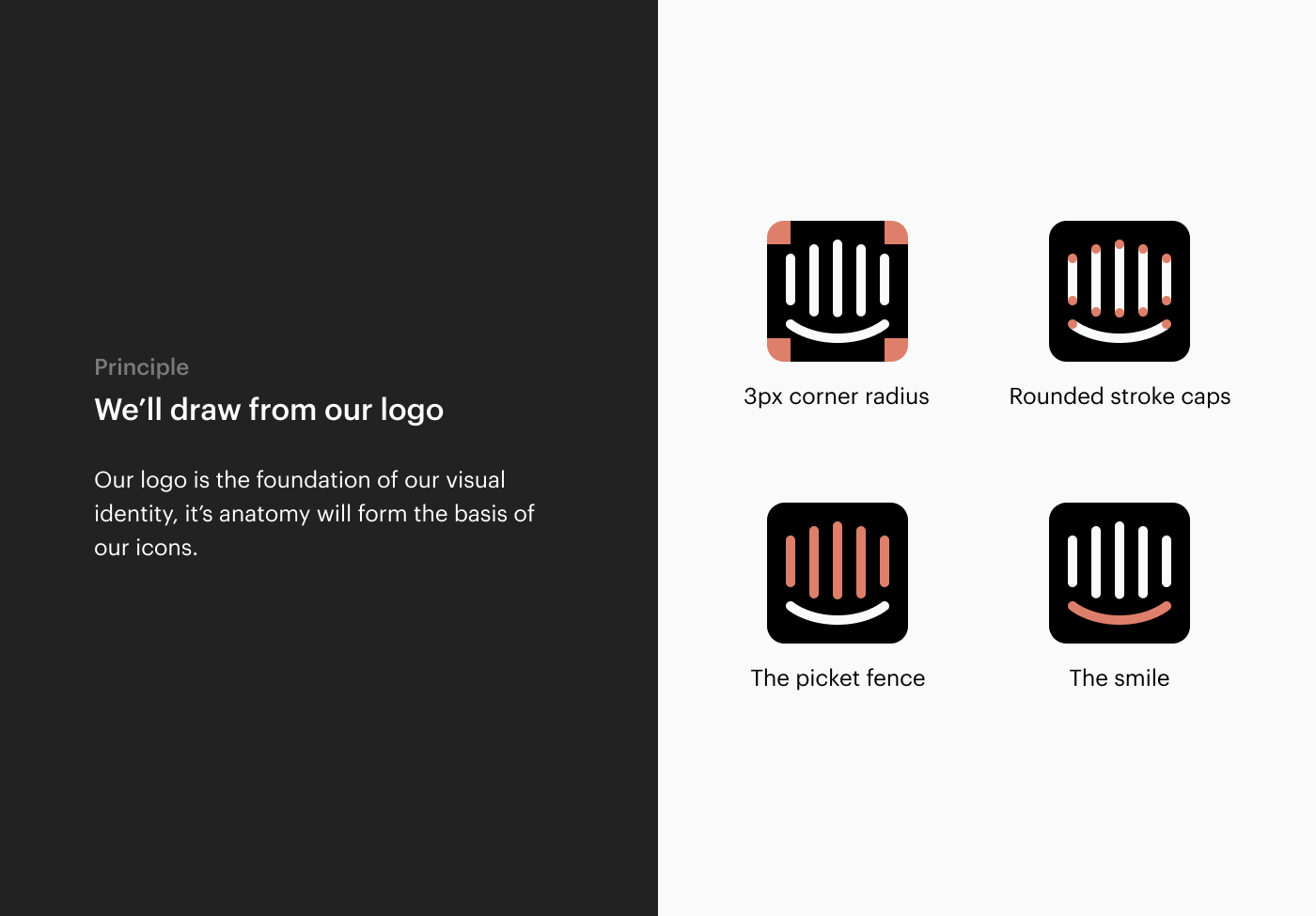
“Our logo is the foundation of our visual identity, its anatomy will form the basis of our icons.”
This principle led us to deconstruct the various forms within our logo and create a visual system for our icons around it. This was in contrast to our previous icon set, which was misaligned with our visual identity.
Principle 4: We’ll sweat the details
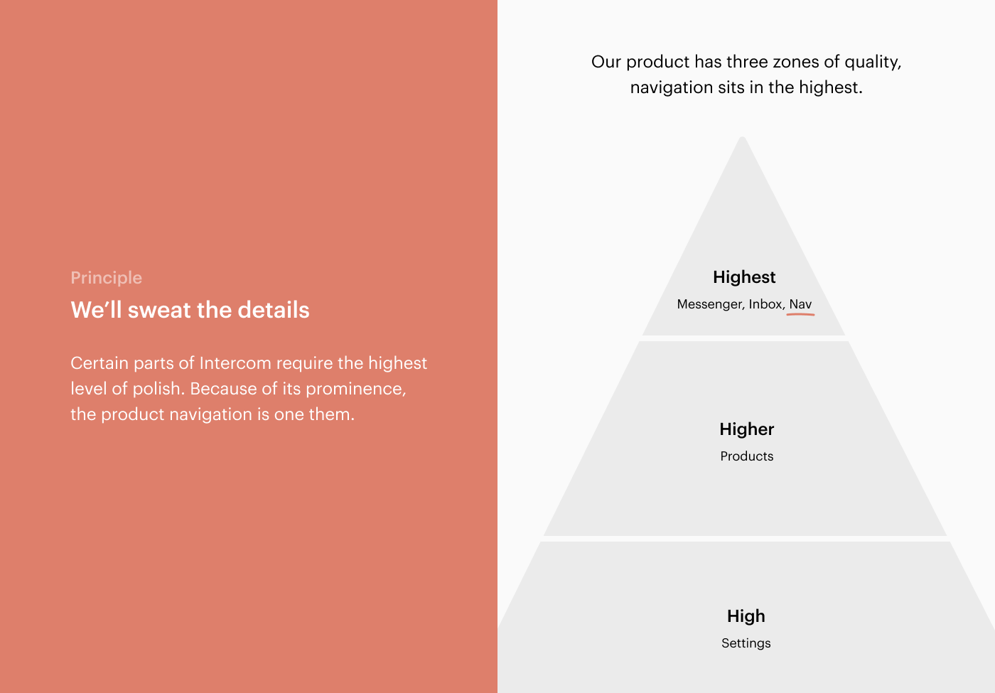
“Certain parts of Intercom require the highest level of polish. Because of its prominence, the product navigation is one of them.”
This principle led us to iterate on the details until we were satisfied that the navigation was polished enough to sit in the highest zone of quality in our product.
After internalizing these principles, and exploring and iterating on multiple options, we finally landed on our new navigation icons. Here they are:
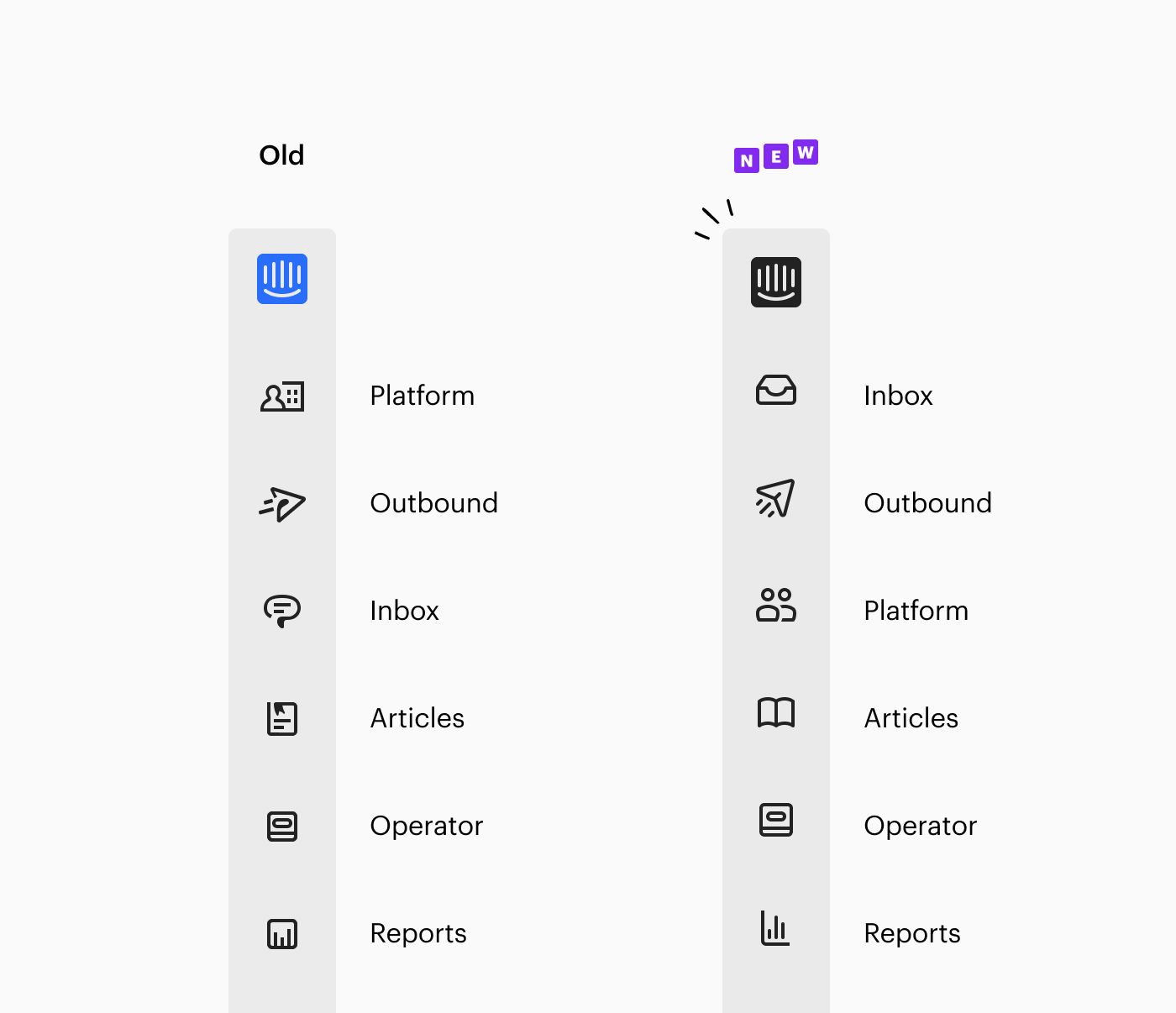
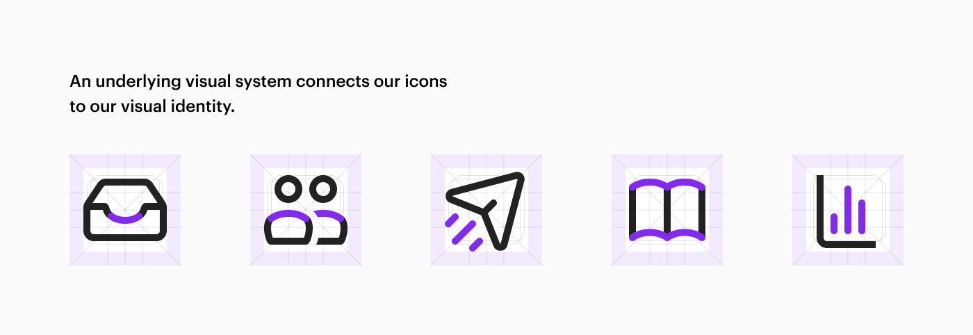
As you can see, some of the metaphors remain the same, some are different and some have been tweaked, and all the icons have been redrawn to make the navigation feel more intuitive and polished.
If you look closely, you’ll see the underlying system which connects the icons to our visual identity and aims to make them feel like a single coherent set. Or, in other words, design easter eggs!
Executional details
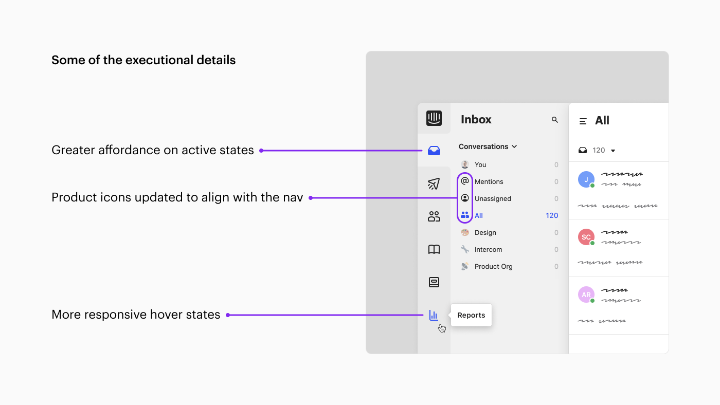
We also polished the details and micro-interactions in the navigation. We improved the affordance on active states by using a filled icon as opposed to a line icon.
“We made the hover states more responsive, by showing tooltips instantly instead of waiting a fraction of a second”
We made the hover states more responsive, by showing tooltips instantly instead of waiting a fraction of a second. We updated our product icons to align them with our new navigation icons. Lots of design goodness!
The fight against entropy
Zooming out, this work is less about these two relatively simple improvements. Instead, it’s really about combating entropy — the law of the universe which states that it’s inevitable that without intervention, all things become less organized over time.
“To avoid this slide into disorganization, we need to continually revisit fundamental parts of our product to rationalise, to simplify and to repair”
Entropy is as true in nature as it is in relationships as it is in technology. Without water, flowers die. Without love, friendships fade. Without design, software bloats.
To avoid this slide into disorganization, we need to continually revisit fundamental parts of our product to rationalise, to simplify and to repair. Just another reason why a designer’s work is never done.


