Design principles: a shared inbox for your team

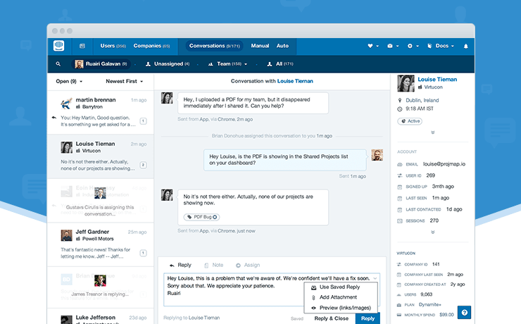
We recently released a completely redesigned team inbox for Intercom to make it even easier for companies to talk with their customers.
The concept of a “Shared Inbox” has emerged as a product category that blindsided many email clients. When we covered the future of email clients in 2013, there wasn’t a single product acknowledging the multiplayer nature of company email. Today there’s Front, Respondly, GrexIt, Taskforce, Wrike, Flowbox, to name but a few.
The spectrum of support tools
In the early days of a company you know all your customer’s names, and they often have your direct email address. They email you bug reports, and you CC your teammates on the replies. This is an ideal workflow when you are small and it gives the customer a good experience.
At some point someone forgets to CC, and boom, in that struggling moment you begin a search for “A Better Way”.
At this point you’re in limbo in the product spectrum. Suddenly too big for Gmail alone, but far too small for a full enterprise point solution replete with categorization, priority levels, and more. You want the simplicity of an email, but enough structure for a team to work alongside each other, instead of across one another. Visually you see it like this.

Enter the team inbox
Designing a tool that has all the power and simplicity of plain old email, along with new features is daunting. For our new shared inbox two important design principles we adopted were letting teams work alongside one another not across each other, and to provide full customer context along with any conversation.
Designed to support team work

Product design, even for team productivity tools, ignores the messy reality of teamwork.
How often do you post a comment and then see someone else already said the same thing. How often do you reply only to see that you didn’t need to? Or have to use a back channel like Slack to ask “Is anyone looking at this?”.
Product designers often have tunnel vision, only thinking about the current user and their actions, ignoring what might be happening elsewhere in the product. The unwritten assumption in every use case is “the entire world stands still while Bob types his reply”. The reality is that while Bob was typing his reply, Michelle already dealt with the conversation, as Sabrina had assigned it to her. Pretty quickly the designs start to crumble.
Imagine a bar designed for just one barman to serve just one customer, then fill it with 300 thirsty customers and five capable bar staff. Unproductive chaos ensues. That’s what happens when you don’t design for teamwork.
Designed to provide context

Customer context is essential for great support. Knowing who the customer is, the price plan they’re on, how many teammates they have, what they have and haven’t done in the product, lets you answer their questions in seconds, while most tools are still asking for account data. The result is less rambling back and forth, and more focussed valuable conversations.
The alternative to customer context is the horrid world where companies ask customers for every piece of information they should already have, and where every new request requires a customer to re-explain themselves over and over. It’s a waste of time for the company and a frustrating cold impersonal experience for the customer. Don’t be that company.


