Support-ify Wrapped: How can support teams make their numbers pop?
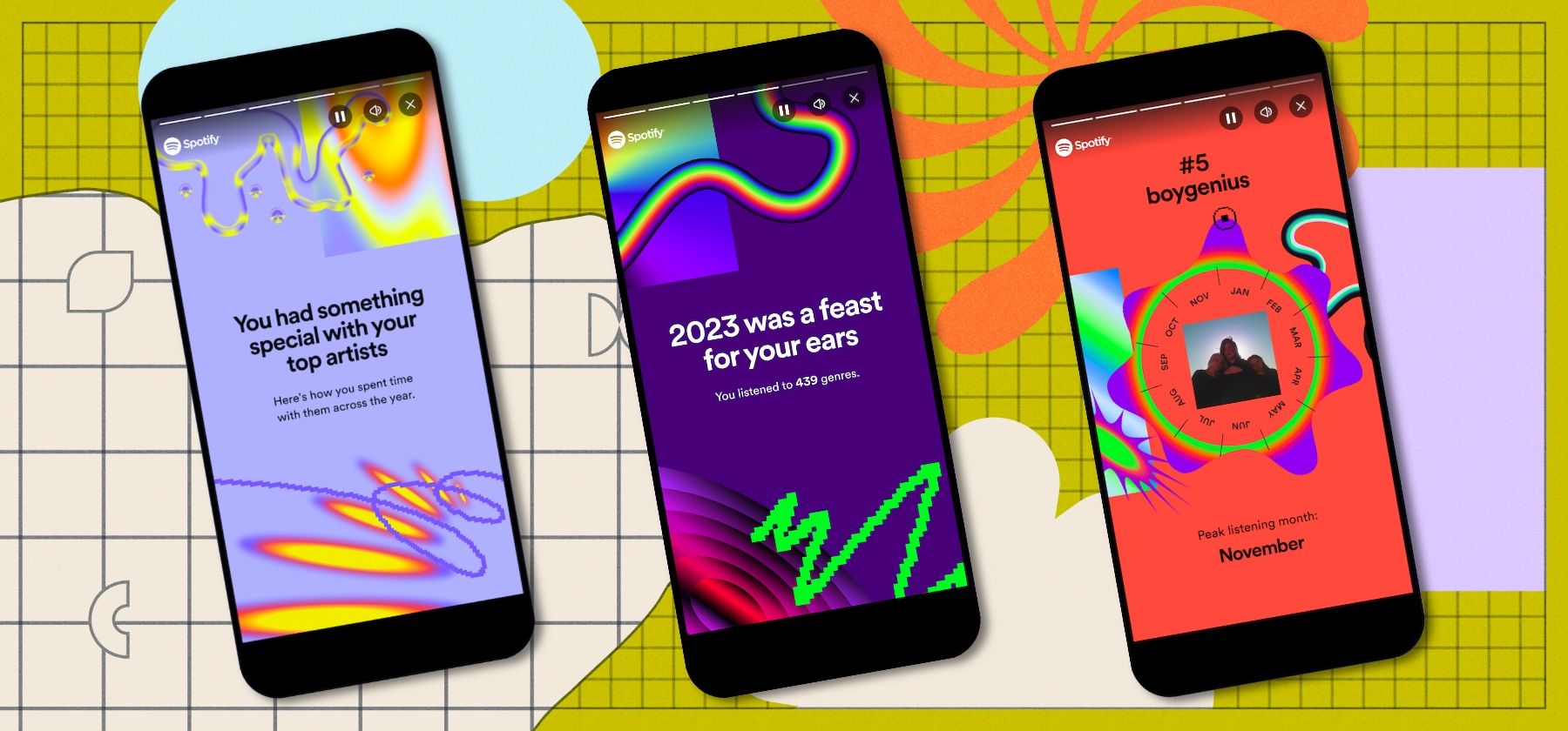
Main illustration: Product images from Spotify
We’ve just seen the release of what’s become the most iconic end-of-year compilation: Spotify Wrapped.
It’s a phenomenon that’s gripped the internet since it began in 2016. (Technically, it was 2013, but it was called “Year in Review” back then. More evidence that catchiness is key.)
So how did Spotify grab the attention of millions by simply throwing together a mish-mash of statistics? And can support teams do the same to convey their true value within their companies – and, in particular, convince other teams of the value of AI-powered support tools?
The true genius (outdated Spotify reference I couldn’t resist) of Spotify Wrapped isn’t in the numbers, it’s in the way they’re packaged and presented. And it’s a true masterclass in getting people invested in what might seem like, on the face of it, boring data.
For a long time, customer service teams have been trying to convey the incredible value they provide to the rest of the company. Support teams looking to use their data to show their impact and grow appreciation for their work can take three major learnings from Spotify Wrapped.
“Make the numbers you want people to see stand out however you can”
Personalization
It’s easier to understand things when we know how they apply to us. Spotify Wrapped tells us about our own patterns and habits – and we’re enthralled every time. You can apply the same logic when communicating your team’s performance.
It’s great that your support team has reduced first response time by two hours with the help of your AI chatbot, but what does that mean for the rest of the company? Draw the lines between quicker responses and a better customer experience, and explain how that sets your business apart from the competition.
Engagement
Spotify Wrapped uses colors, patterns, and music to make the data it’s sharing more appealing. Corporate life means dealing with more stats than we ever thought possible, so skillful data visualization is a true art form. But you don’t have to be a Tableau master to keep people’s attention – just make sure to focus on the important numbers rather than plonking everything on a slide. Make the numbers you want people to see stand out however you can.
“Numbers might seem rigid and inflexible, but they can tell a multitude of stories – you just have to choose which one works for your team”
Storytelling
Towards the end of the Spotify Wrapped story, it tells you what kind of listener you are. I was labeled an alchemist because I make lots of different kinds of playlists. Why did it choose this particular fact? Because it’s something that sets my behavior apart from other listeners, and it’s fun to compare and contrast with other Spotify users.
You’re conveying the story of your support team to the rest of your company. What do you want them to come away with? If you’re demonstrating how much your team has achieved this year, put it in context. Explain where you were last year, how you got where you are now, and where you hope to go. Numbers might seem rigid and inflexible, but they can tell a multitude of stories – you just have to choose which one works for your team.
This blog post is repurposed from an Intercom newsletter introduction. Sign up here for more insights, stories, and predictions from the world of customer service, sent straight to your inbox every two weeks.


