Wireframing for Web Apps
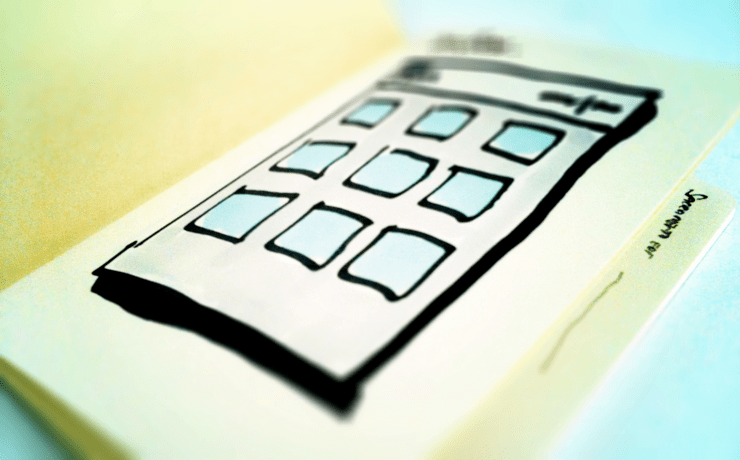
The goal of preparing wireframes is to solve design challenges regarding layout, and priority. This is usually done in wireframes through experimenting with layouts and the application of contrast, similarity and some other principles.
By applying the Gestalt principles to your components, you can quickly prepare concepts. The whole point of working at this fidelity is the speed at which you can explore ideas with a reasonable degree of precision. Over the years I’ve learned some useful ways to keep things fast, useful and timely. I’m loathe to write a “7 top tips for wireframing” but when working with less experienced designers I find the following themes occur frequently…
1. Everything means something
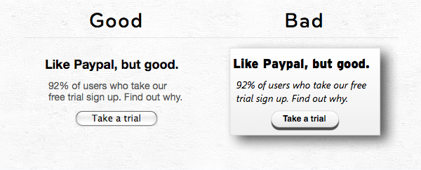
Every colour, every line, every shadow, every gradient. If your atomic unit of wireframes is a rectangle, with solid lines, a colored background and a drop shadow you’re communicating a lot, whether you intended to or not. These artefacts can be carried through to design, without anyone ever thinking why they make senes. Everything has to mean something.
2. Consistency Helps
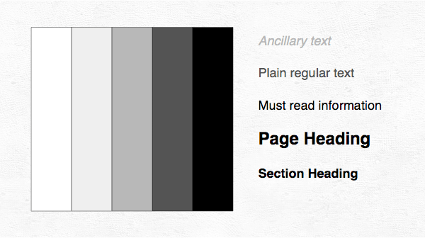
One nice thing about sketching, is that it defaults to same colour and font everywhere (i.e. you have to swap markers or change your handwriting for a difference). A frequent issue I see with wireframes is numerous different shades of a colour, or line weights, or font faces, all included without thought. This makes the wireframe more confusing to understand, as I wonder “Did he deliberately change font here? Is that label bigger because it’s more important?” etc. To avoid this, I encourage students to use a limited color set (3-5 grays), 2 fonts, default HTML components, and little else. This might result in “dull” wireframes, but bear in mind all wireframes end up in the trash anyway. They’re not what counts, you’re not delivering a PDF for visitors to “ooh” and “aah” at, you’re desigining software for people to use. A sexy wireframe is a waste of everyones time in the project.
A second point worth noting here is where you lay your baseline. Starting with black text, means you can only get bigger and bolder, resulting in a Deep Purple style wireframe with everything louder than everything else. Starting with gray text, allows you to go darker and lighter. As Ryan Singer said, in a moment of Linguistic Relativity, HTML doesn’t offer a <weak> tag, but maybe it needs one.
3. Speed and Exploration
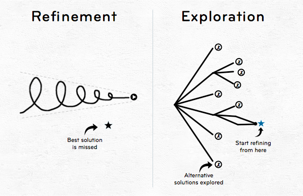
The purpose of low fidelity design, is not to polish and refine, but to explore the solution space. Initially it often appears there are many solutions to a design challenge. Only by exploring a few of them, and laying them out in front of you can you decide which will work best. Cennyd Bowles describes how chess players face a similar challenge. Early in the game there are a lot of choices. Some you can rule out by instinct or experience. The remainder you mentally explore to see how they play. Naïve designers will fall in love with their first idea and cling to it for dear life. Andy Rutledge describes this phenomena an Lord Of the Rings inspired essay title My Precious.
If you can’t produce concepts quickly, then you’re working at the wrong fidelity. If your wire-framing serves only to deliver a grayscale version of what you’ve already decided you’re building then you’re wasting everyones time.
4. Real Copy, Real Data
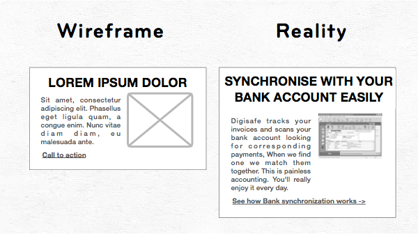
The biggest mistakes I’ve seen made in projects (including my own) comes from the designers not seeing real content up front. If you’re including a photo gallery, you have to see the photos before you can decide whether to include it, make it a primary feature or fight against it. Similarly If you’re designing a data driven dashboard, you need to know the data looks like. Dummy data leads you into a world where headings never wrap, text can justify without looking absurd, photo dimensions and orientations are always convenient, and numbers always fit in their little boxes. The path to UI hell is sign posted “Lorem Ipsum”.
5. Know your technology
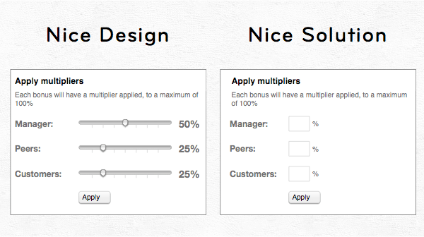
A great design can be a terrible solution. If your design includes custom HTML components, novelty size buttons and dropdowns and ajax powered live search, it’s worth remembering that every project has a budget. If you know HTML/CSS/JS, which you should, and you’ve seen what it takes to test a page on IE6/7/8/9 Safari, Chrome and Firefox, you’ll think twice about what wizardry you’ll put in your wireframes. It might just a little component, and it might even be already available in jQuery UI, but remember, there are no small changes. I’m not saying that you should never include advanced interactions in wireframes, I’m saying you need to know the cost of what you’re doing. For Hipmunk it’s worth investing weeks, even months of work into the best possible calendar picker, as it’s the guts of the interaction. In that case the trade-off is worth it. It’s when I see a fancy date picker for date of birth, or a very precise Javascript powered time picker that I think the designer should first talk to the developer.
6. Whatever Works
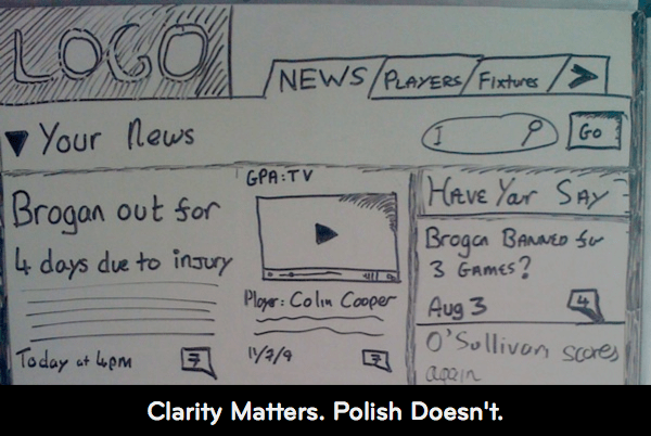
The goal is great delivery, not great deliverables. No one marvels at great deliverables except other UX designers, and even then they’re only interested when the end result was solid. If you’ve sketched something on a whiteboard that you’re confident is a good feasible solution, that has real data in it and everyone in the project knows what precisely what you mean then there is zero value in re-creating your whiteboard as a wireframe. Don’t be a slave to deliverables.
Other resources
These are lessons learned both through personal trial and error, and also from lecturing and seeing the materials that students present. Here’s a short list of excellent posts about wireframing, sketching and designing.
- Gestalt Principles – Andy Rutledge wrote a great series on the basics of design. 1, 2, 3, 4, and 5.
- Good design faster – Leah Buley has had this as her mantra for years now. Here’s a slidedeck and a podcast where she explains it.
- Sketching User Experiences – Bill Buxton wrote an excellent book a couple of years ago, that covers some of the topics here. It’s a great read, and not just for designers.


